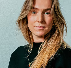
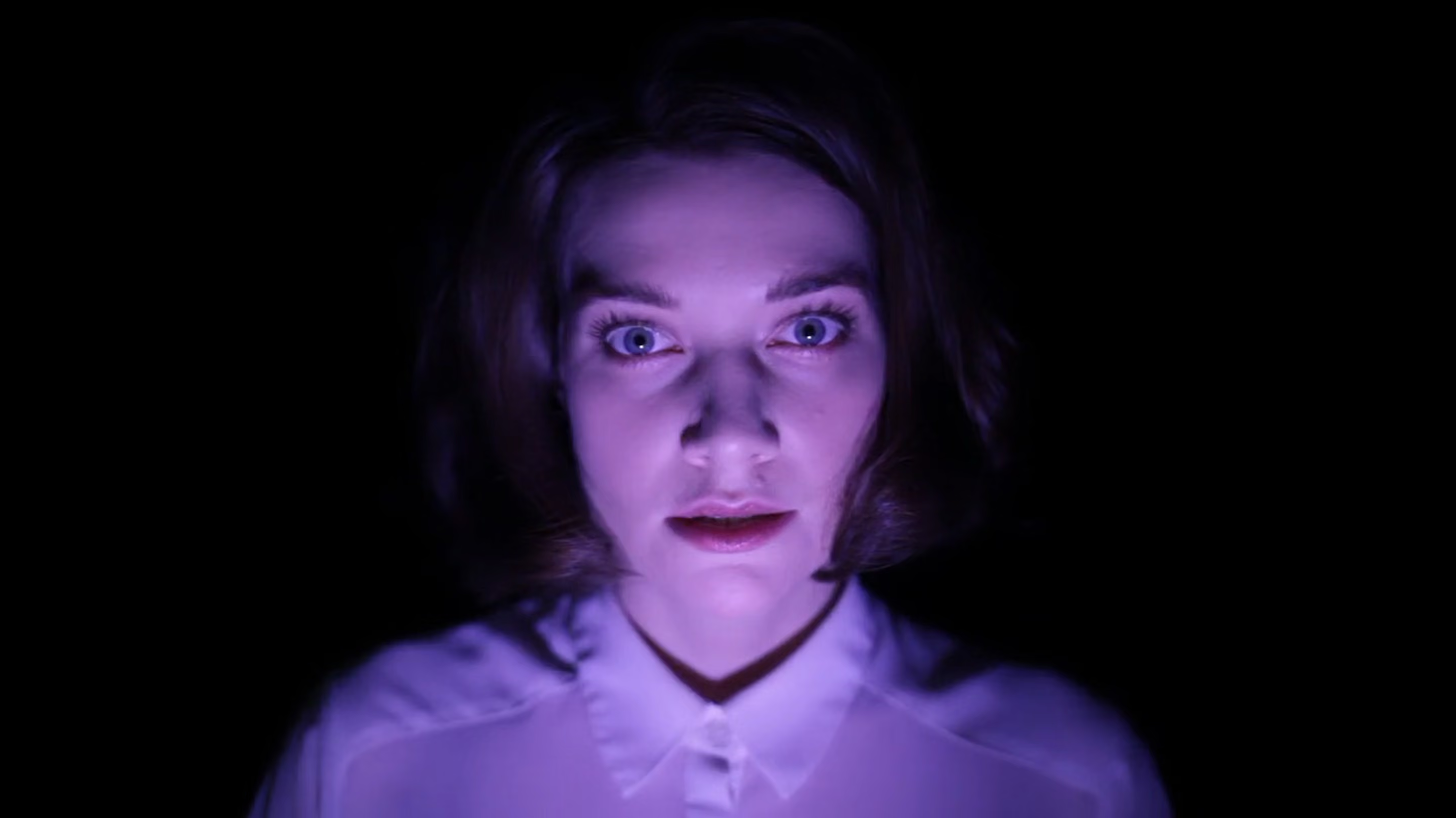
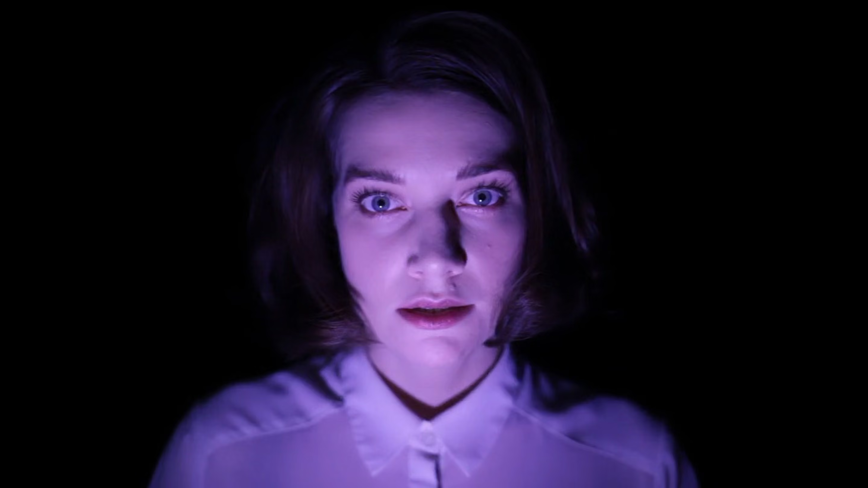
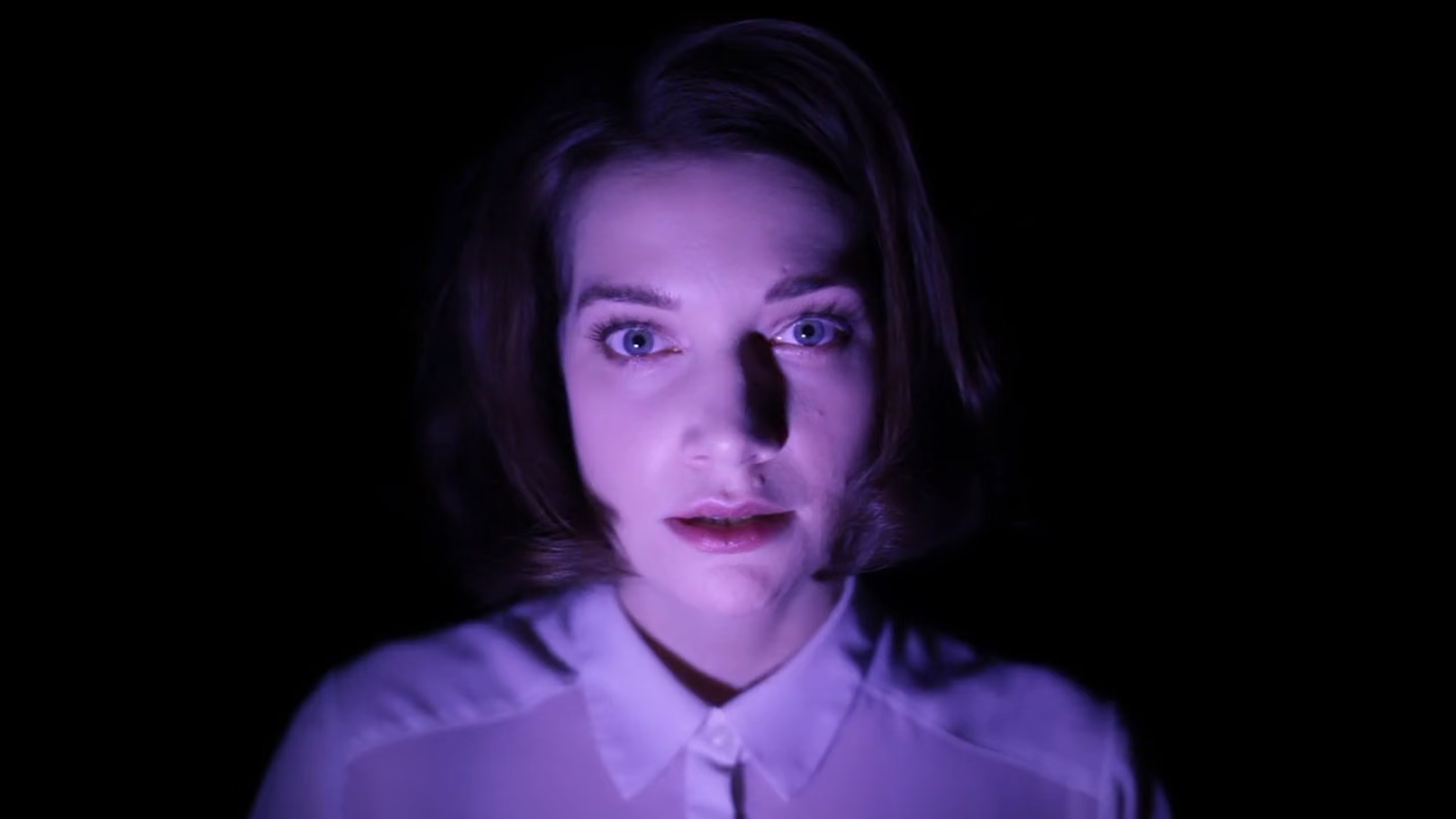
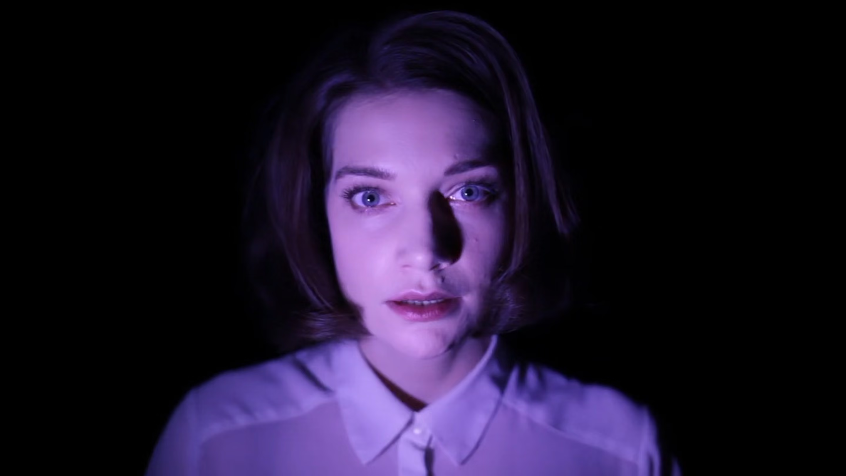
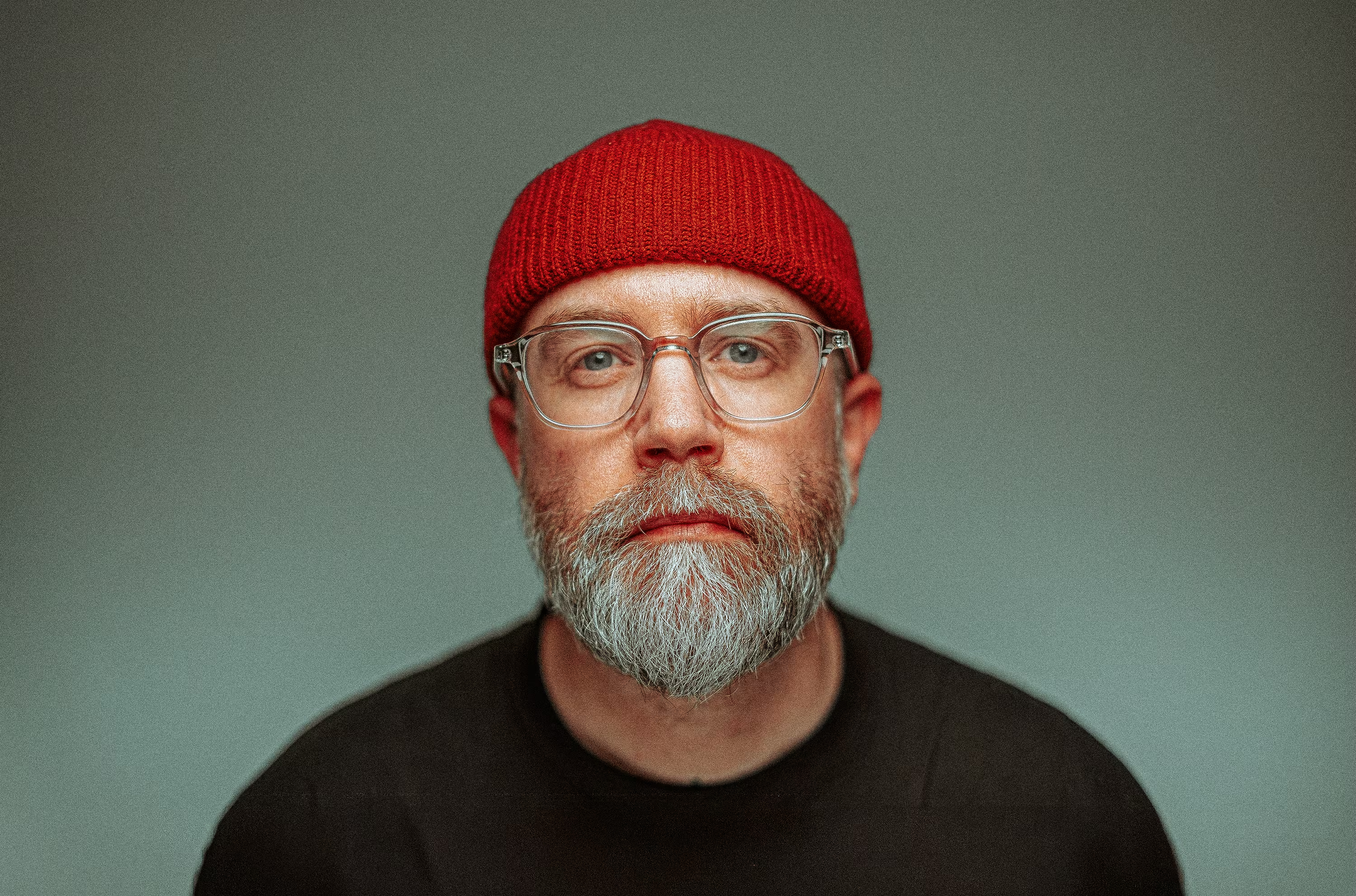
Marijn Slot.
VISUAL ARTIST
ART DIRECTION
DESIGN
Shaping good ideas
into strong visuals.
Concepts, campaigns or brand systems. From the first
idea to the final image, working across multiple
disciplines to build distinctive visual worlds.
SCROLL
TO FIND
OUT
Shaping
good ideas into
strong visuals.
Concepts, campaigns or brand systems. From the first
idea to the final image, working across multiple
disciplines to build distinctive visual worlds.
SCROLL
TO FIND
OUT
SELECTED WORKS
VOLUME I
“A comfort zone is 

a beautiful place, but
nothing ever grows
there”
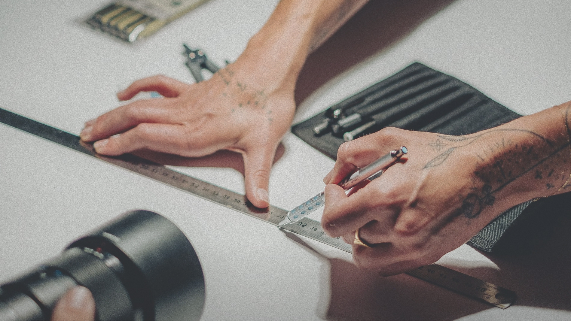
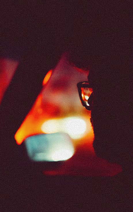
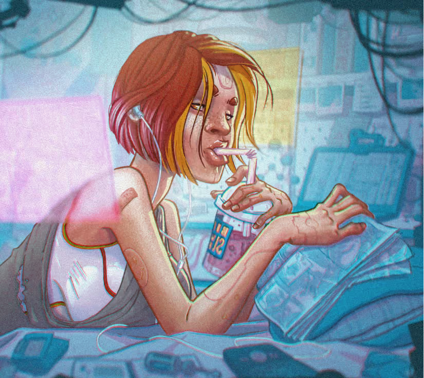
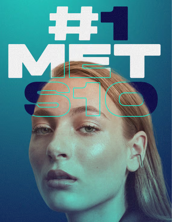
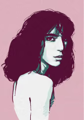
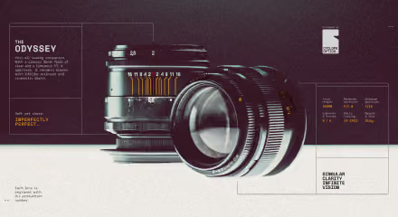
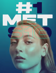
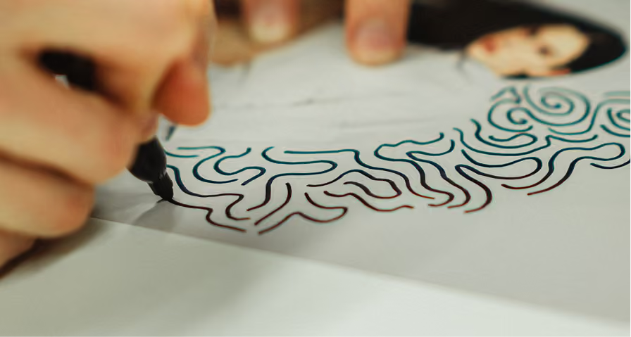
I don't believe in separating discipline. True magic happens when you break their borders and each skill sharpens the others. So nothing I make comes from a single expertise. My photographs are composed the way they are because I illustrate. And those illustrations read clearly because I have a designer's eye for hierarchy. It all comes from the same place at once, which is why it holds together.
KLM ROYAL DUTCH AIRLINES
ASICS
SAMSUNG
VIDEOLAND
LAMBORGHINI
ASN BANK
AVRO TROS
PHILIPS
BENTLEY
Porsche
ABN AMRO
BRAND Experience
2026
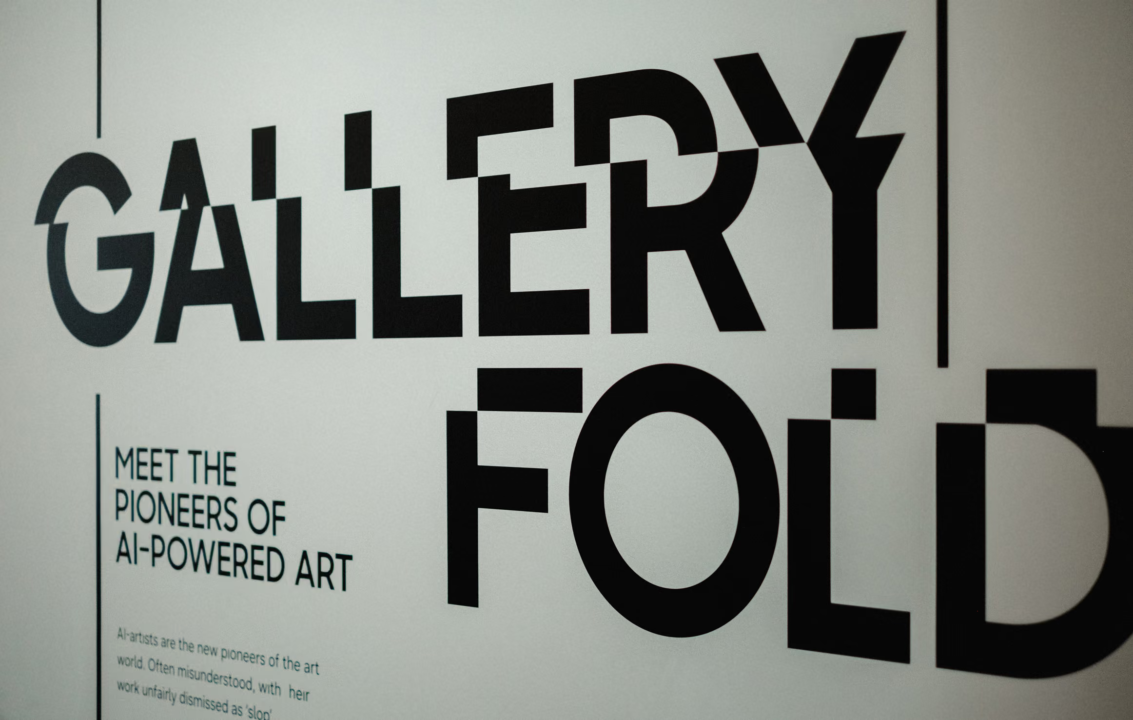
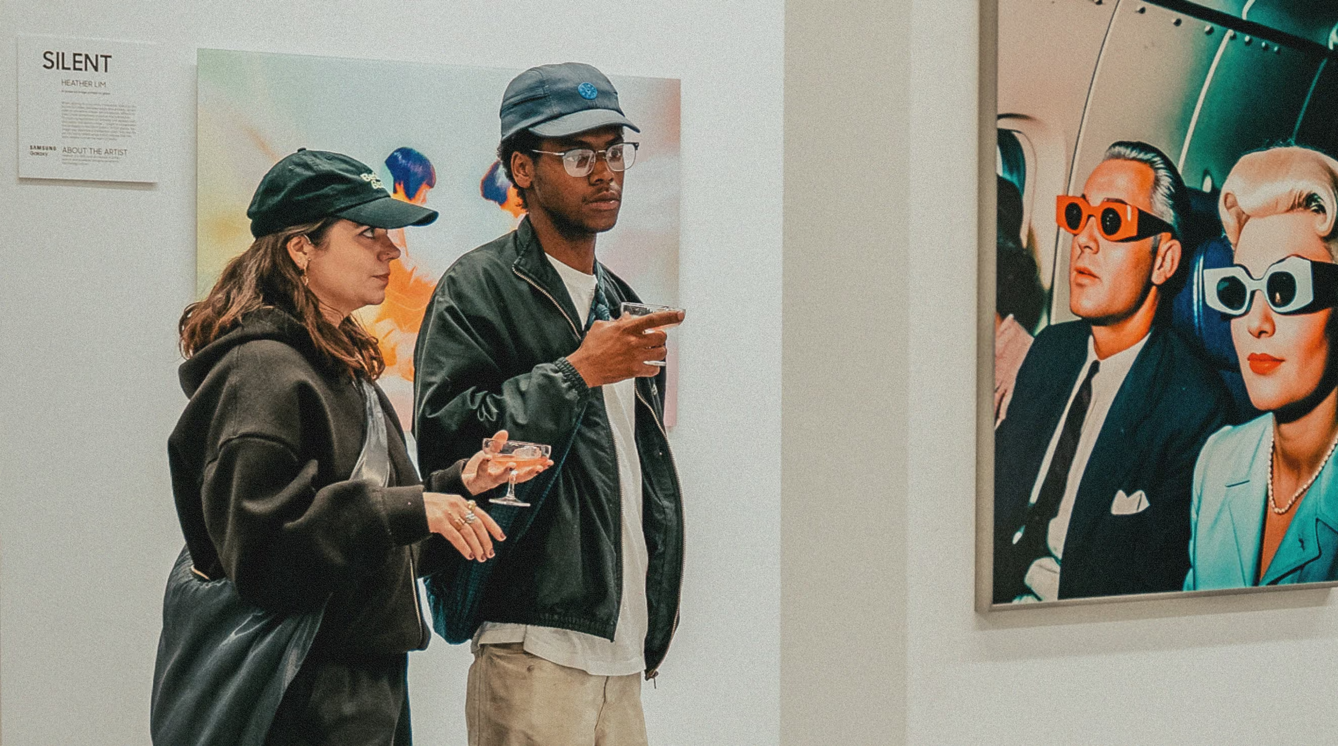
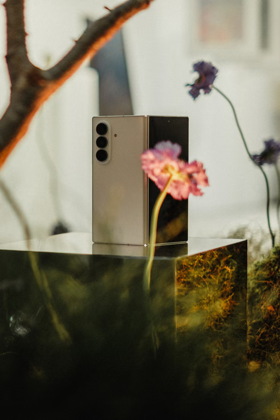
Samsung Gallery Fold.
Samsung
Raising the question of
AI's place in the art world
Is AI art real art?
A gallery to
hero AI art.
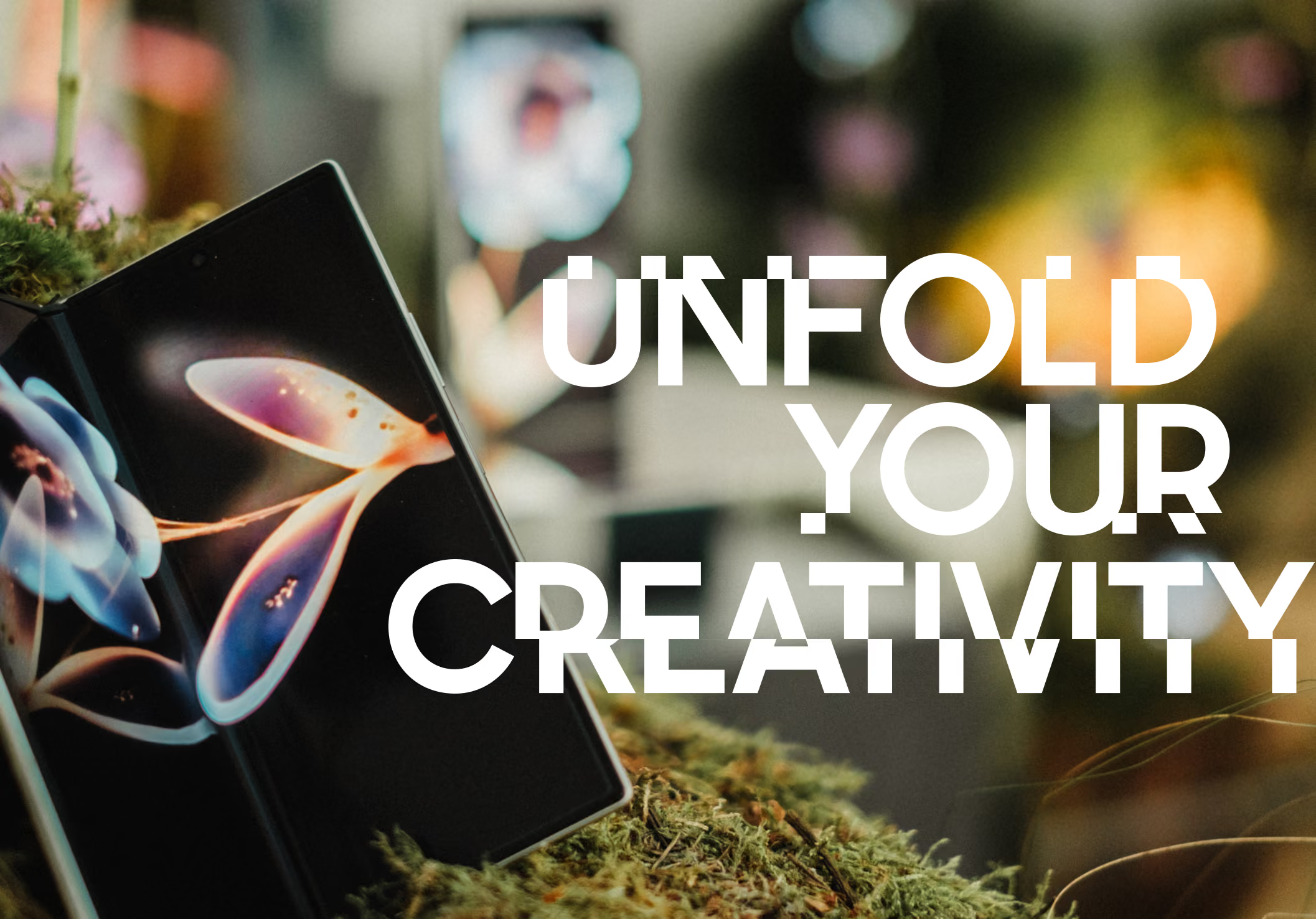
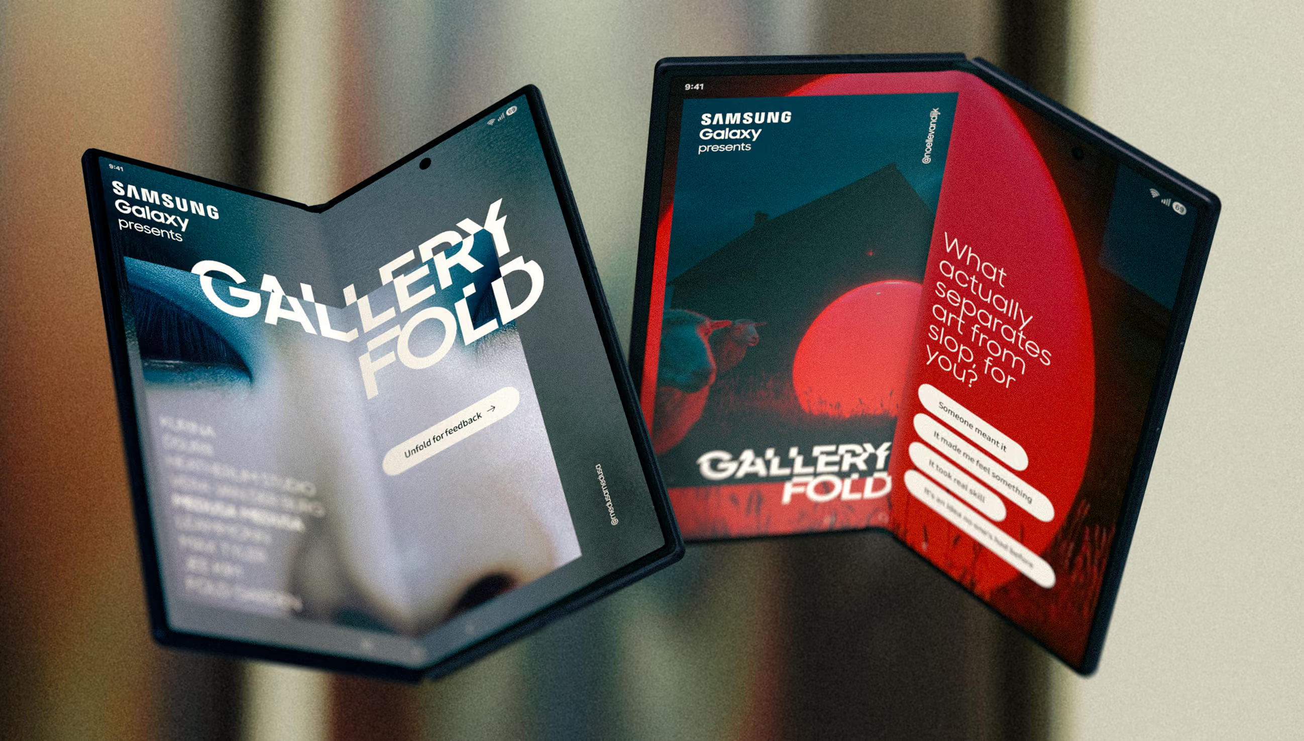
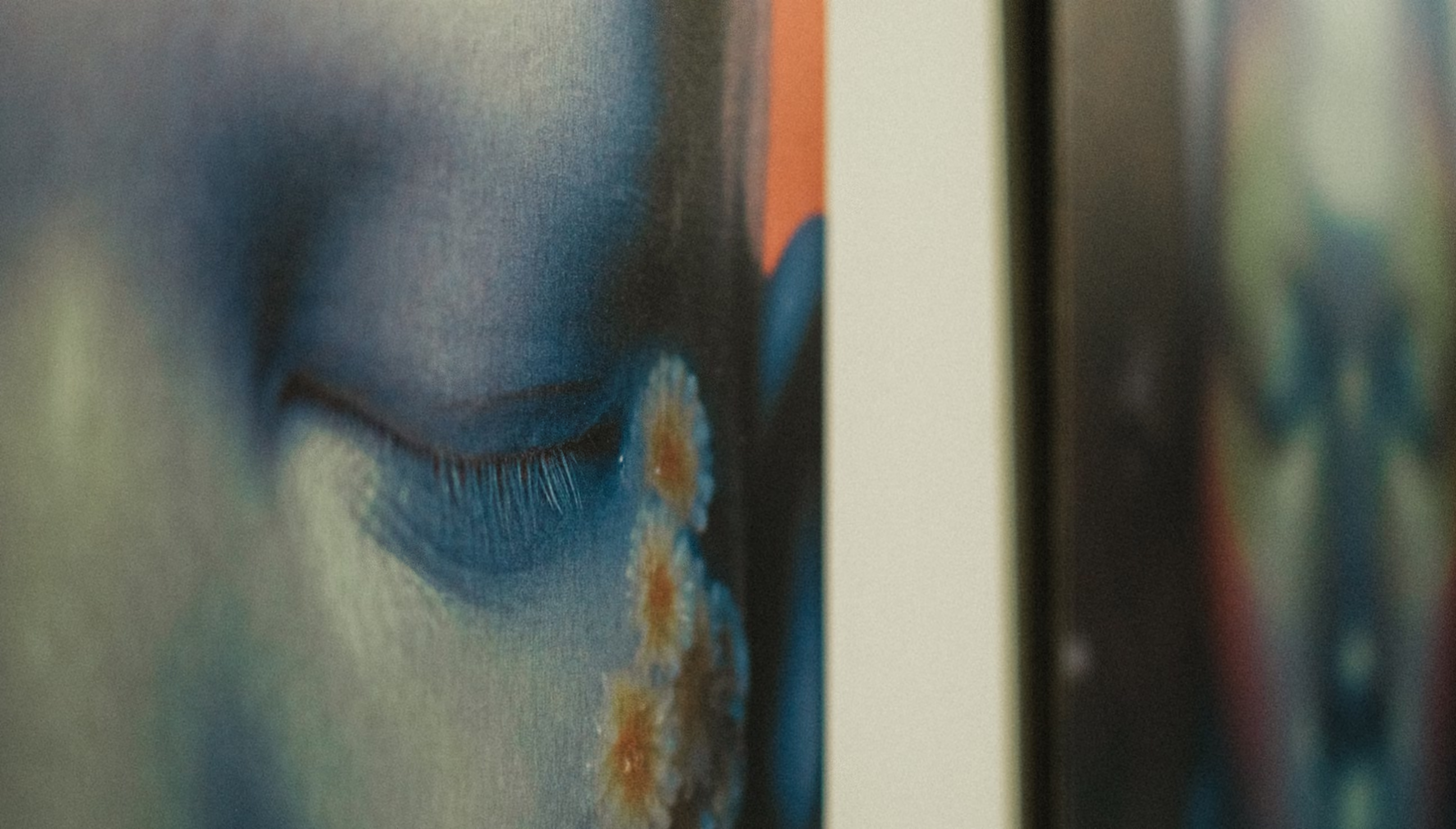
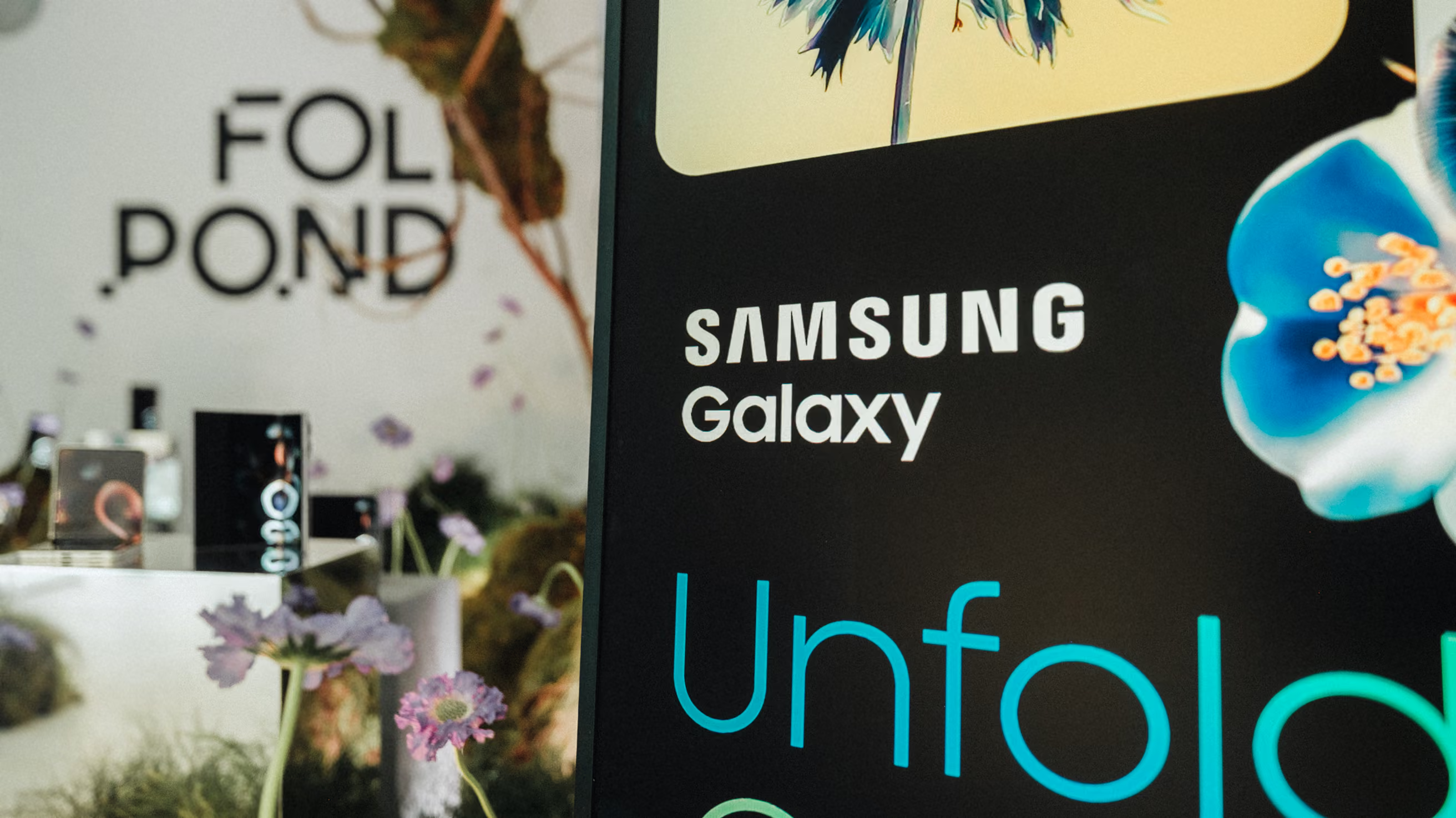
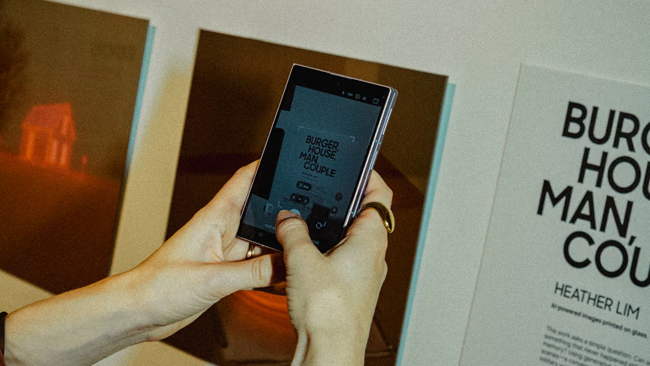
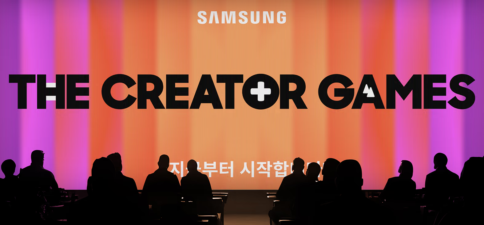
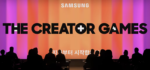
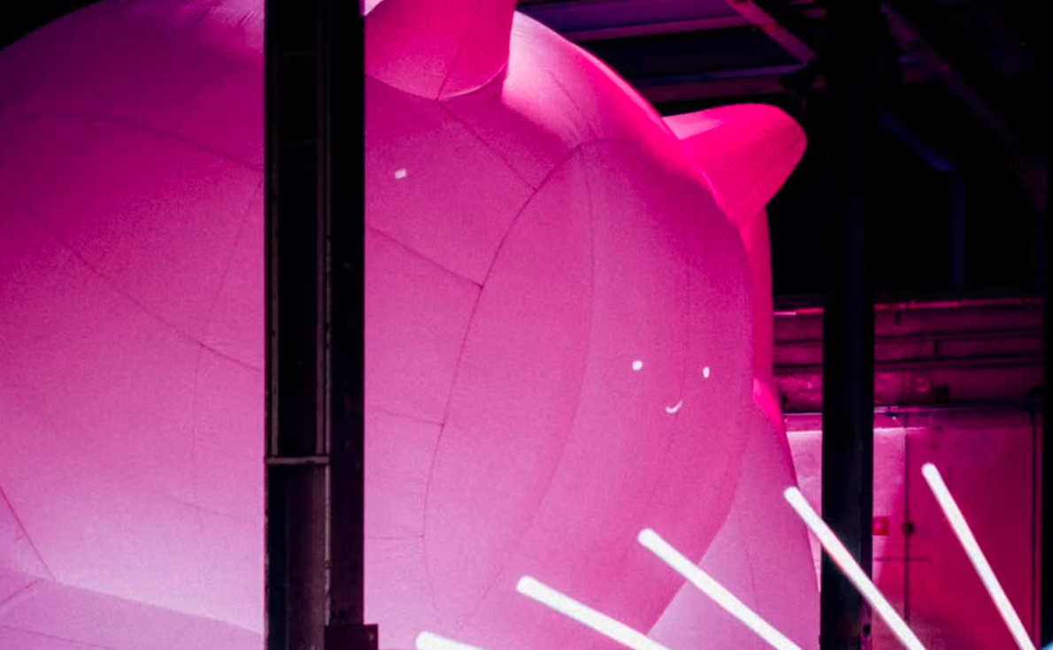
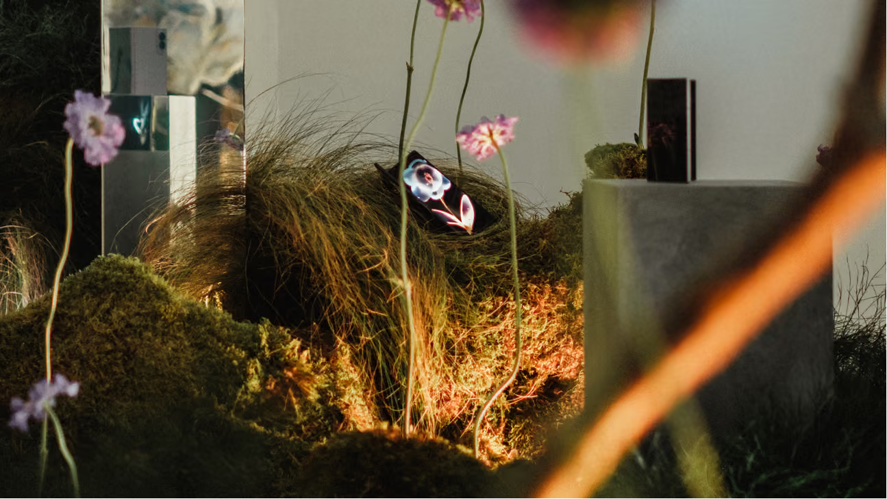
Samsung set out to show a different side of AI image-making: not the endless scroll of generic output slop, but genuinely beautiful work and the artists behind it. So we build a pop-up gallery to put that work in a room and put those people in the spotlight. A physical space making the case that the tools are only as good as the eye directing them.
My role
ART DIRECTION
CONCEPT VISUALISATION
Graphic Design
PHOTOGRAPHY
hinting at digital
Fragmented
layers
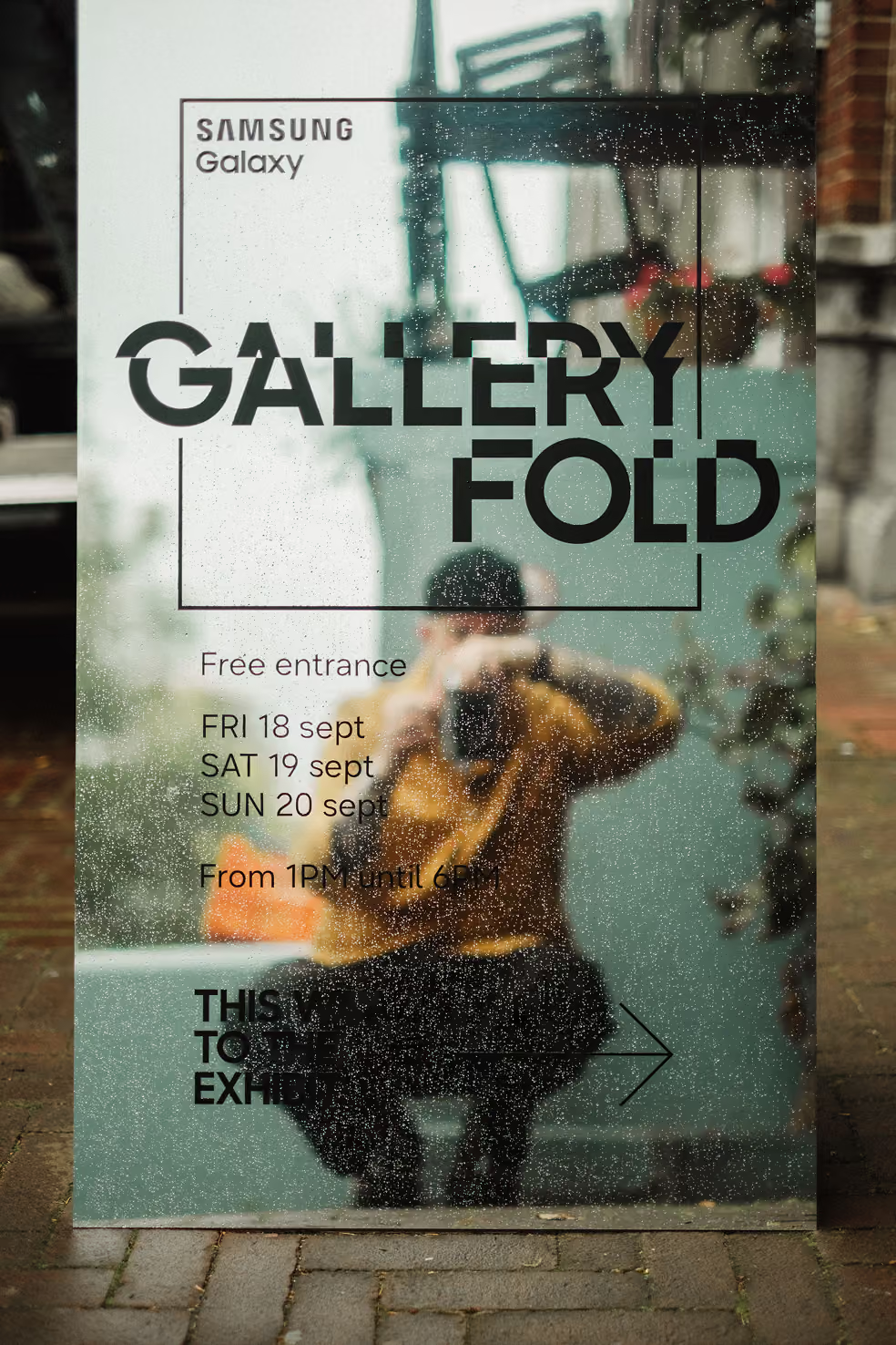
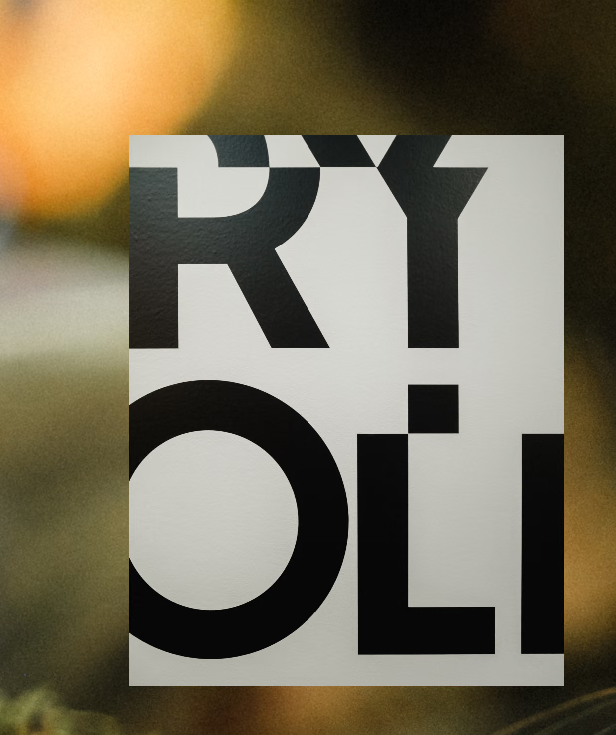
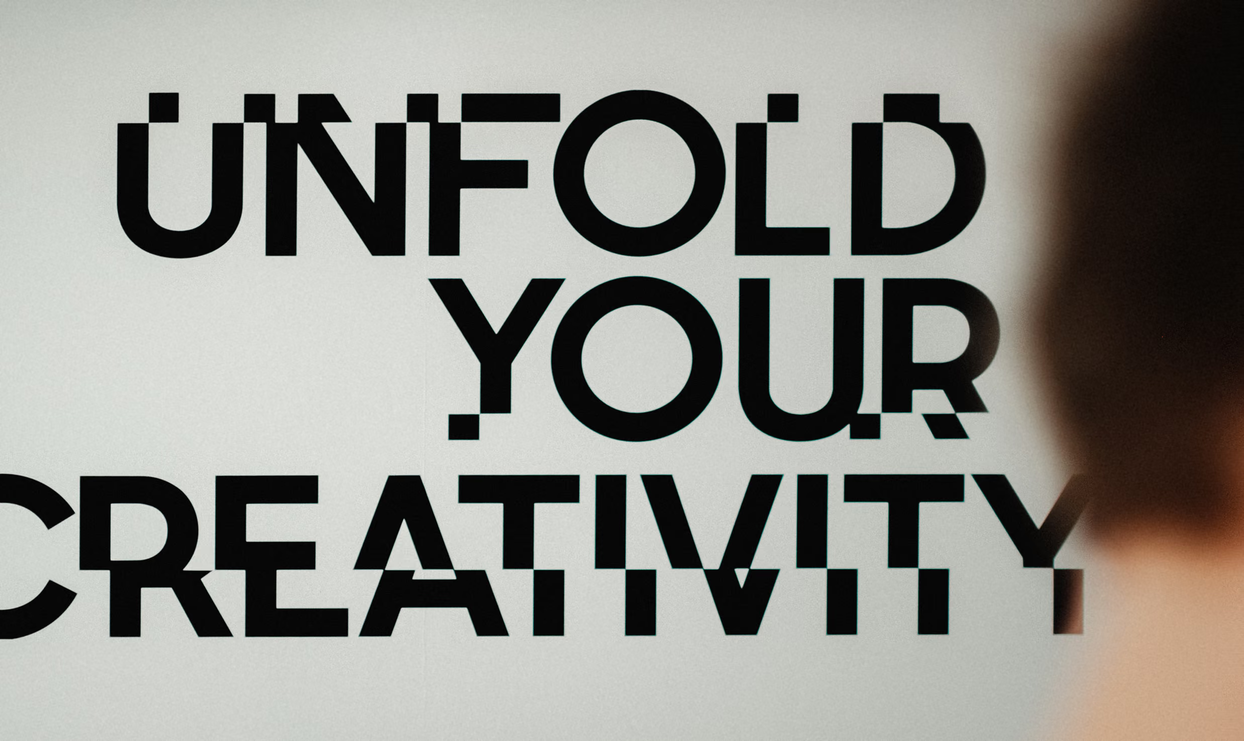
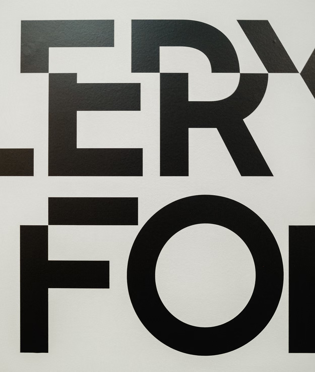
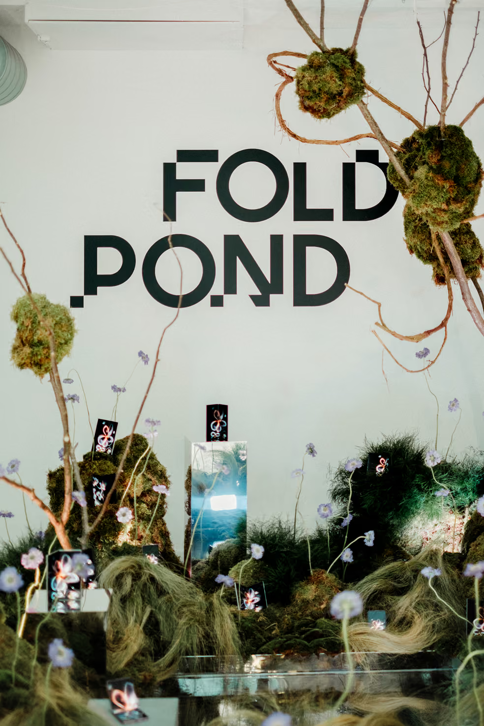
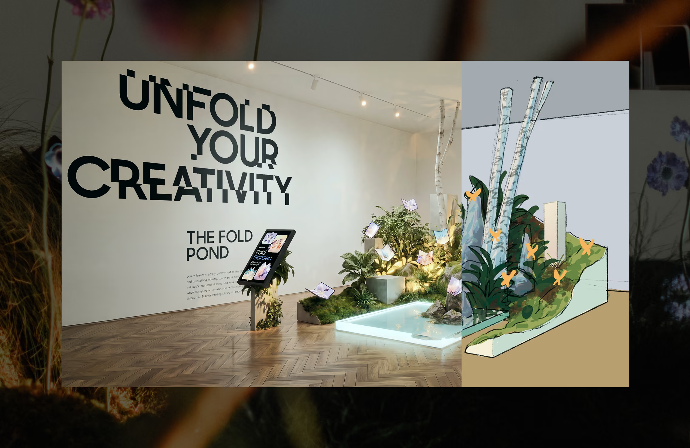
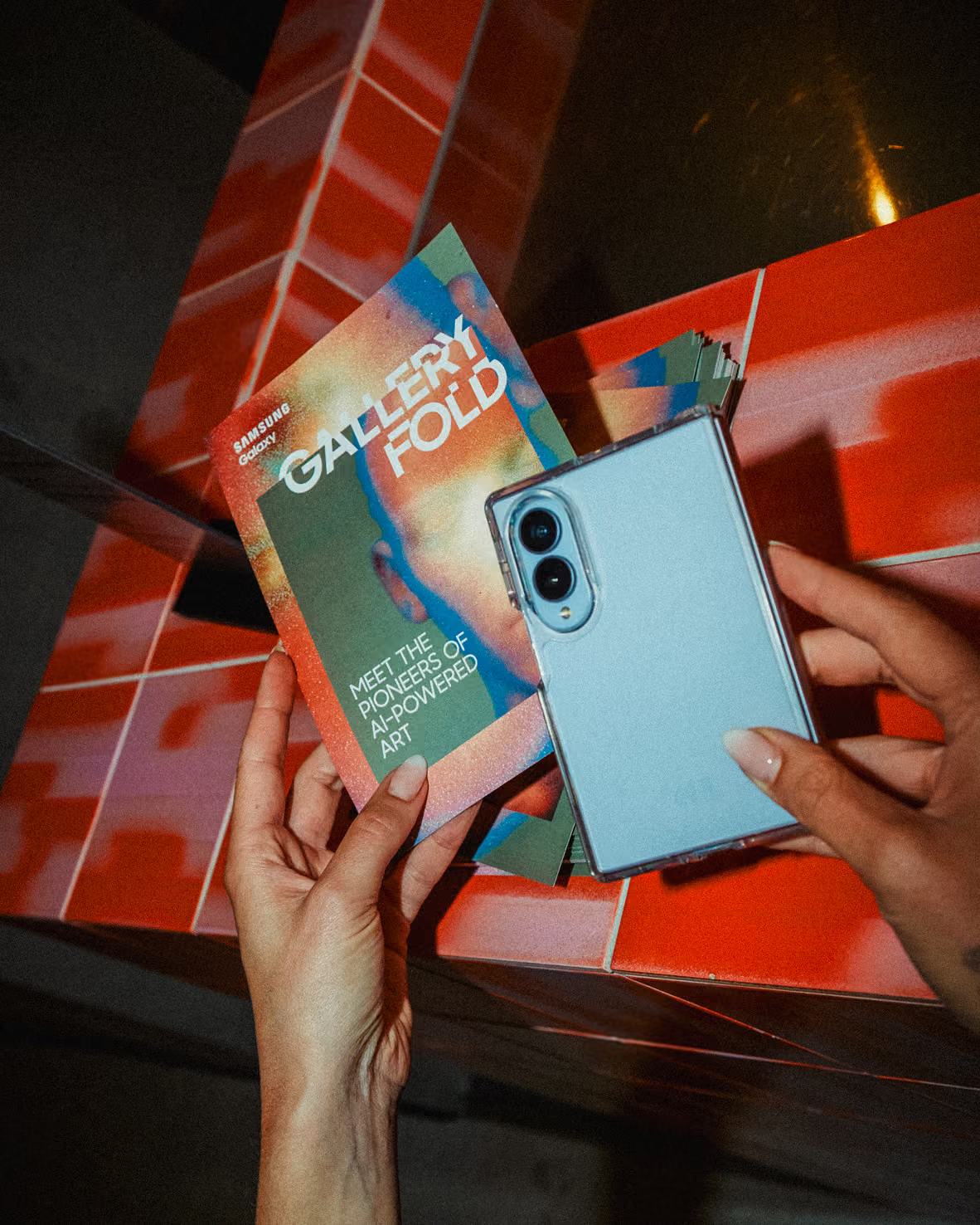
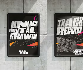
The gallery identity leans into the nature of the work it presents. Type split by a subtle displacement, a digital slip that hints at how these pieces were made. The visuals are built from layered planes, each one framing the art it holds. The result is a system that feels digital without shouting it. It steps back to let the artwork lead.
The Fold Pond
From
sketch to
installation
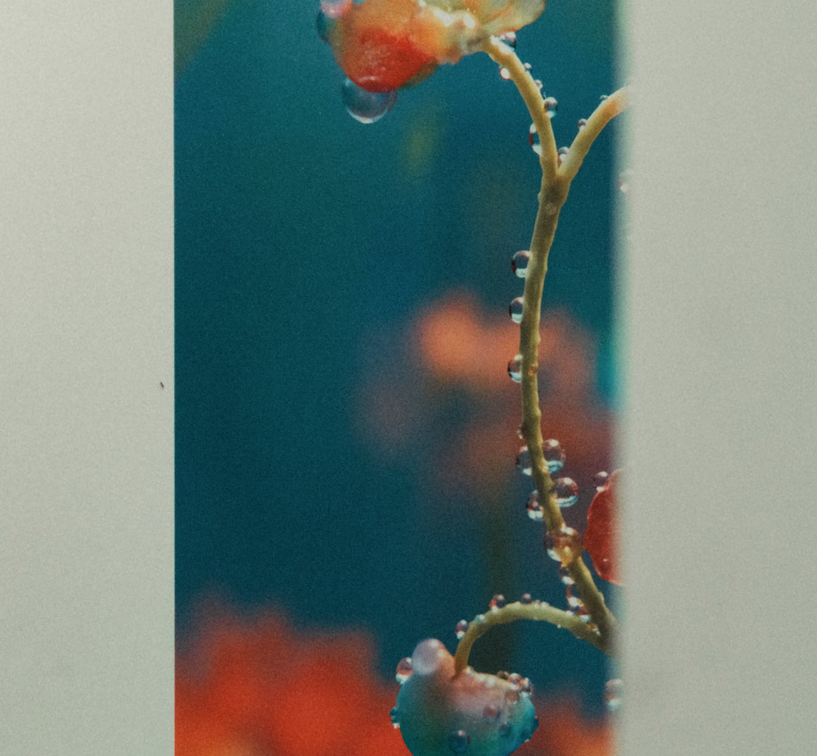
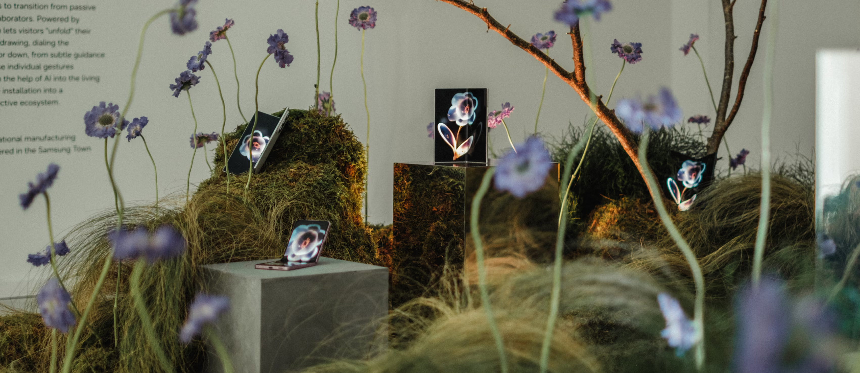
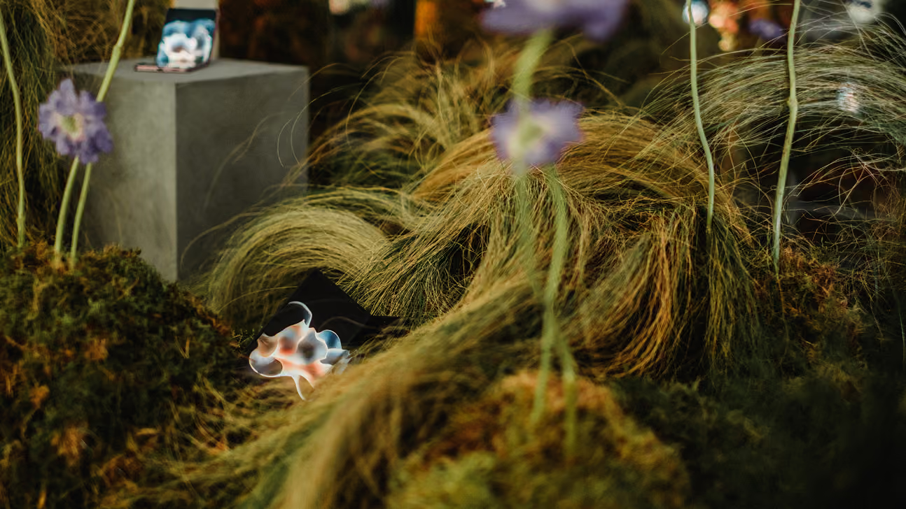
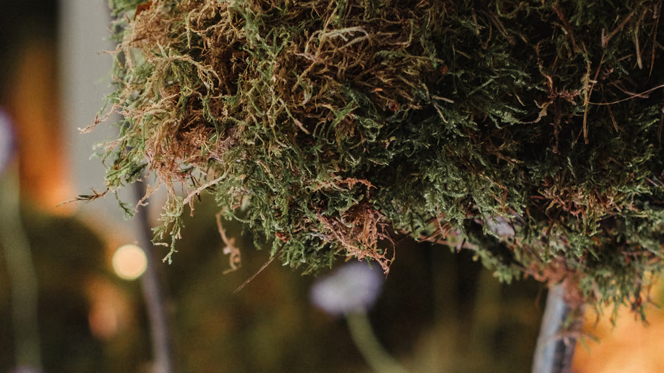
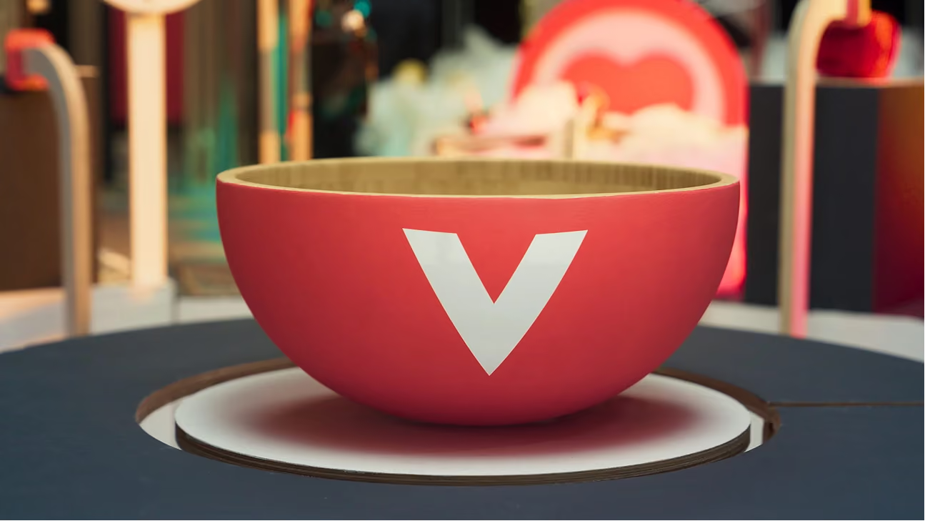
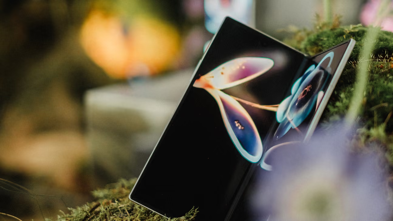
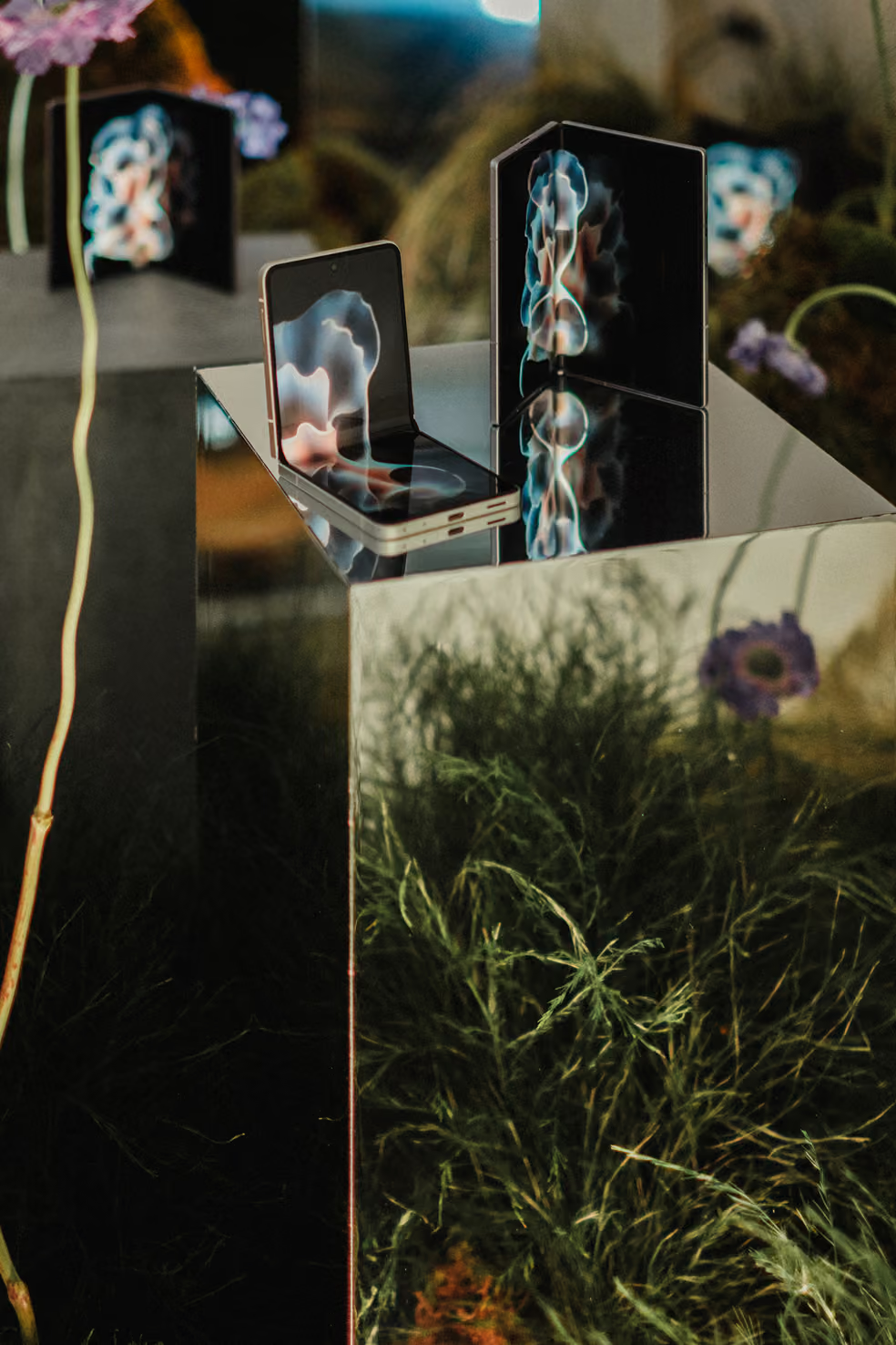
At the centre we setup an interactive installation built to showcase the newly launched Fold devices. Samsung wanted their Korean heritage represented in the piece, so the early direction answered that: birch, a square pond, wisdom stones. From there, floral studio Leone took the concept and grew it into its finished form, pushing the installation well beyond the initial sketch.
Opening night
The Gallery
in use
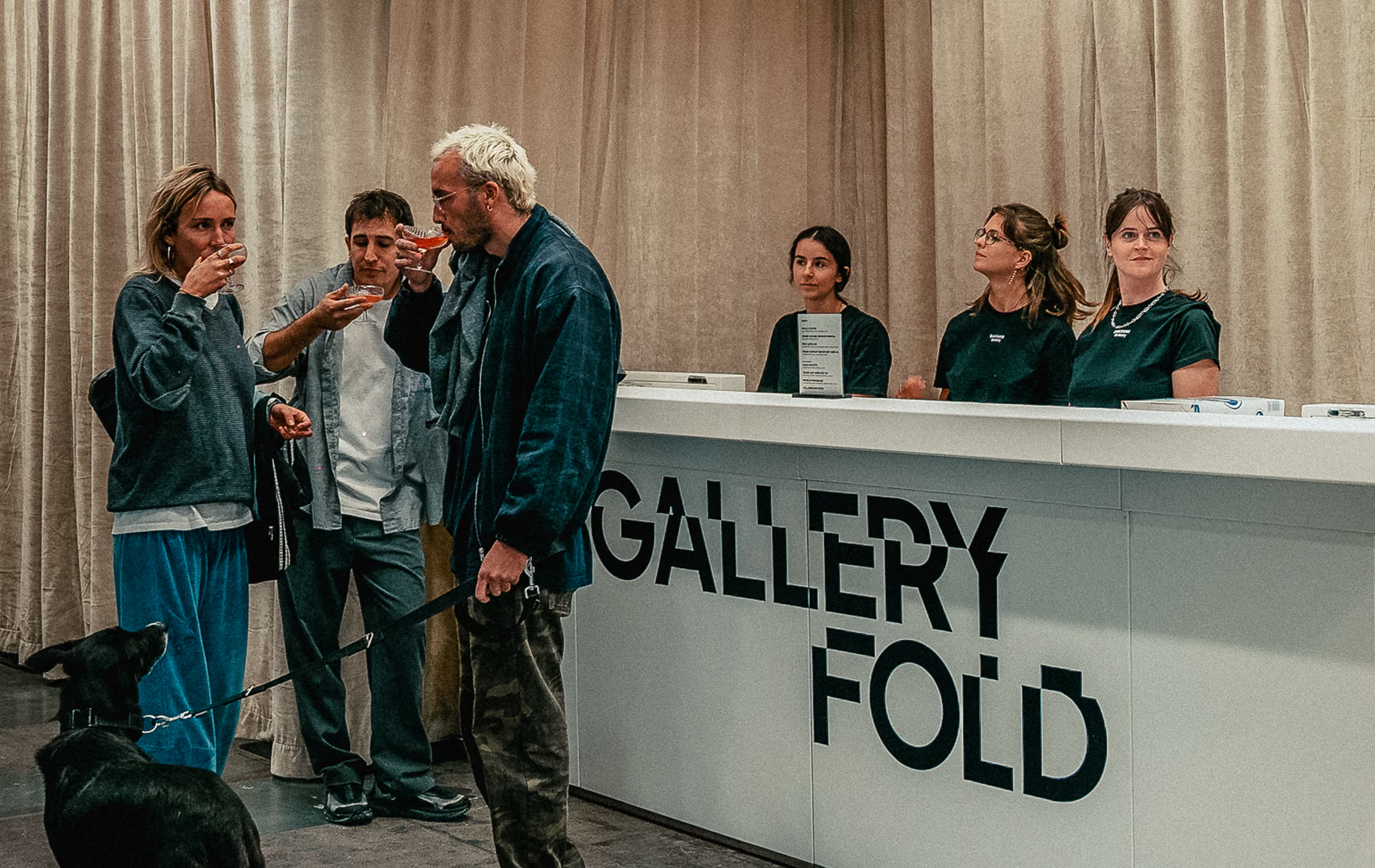
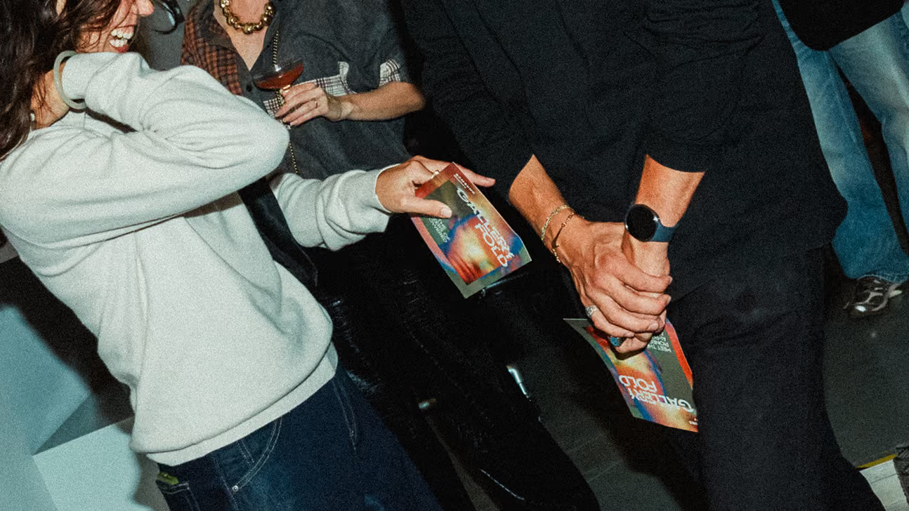
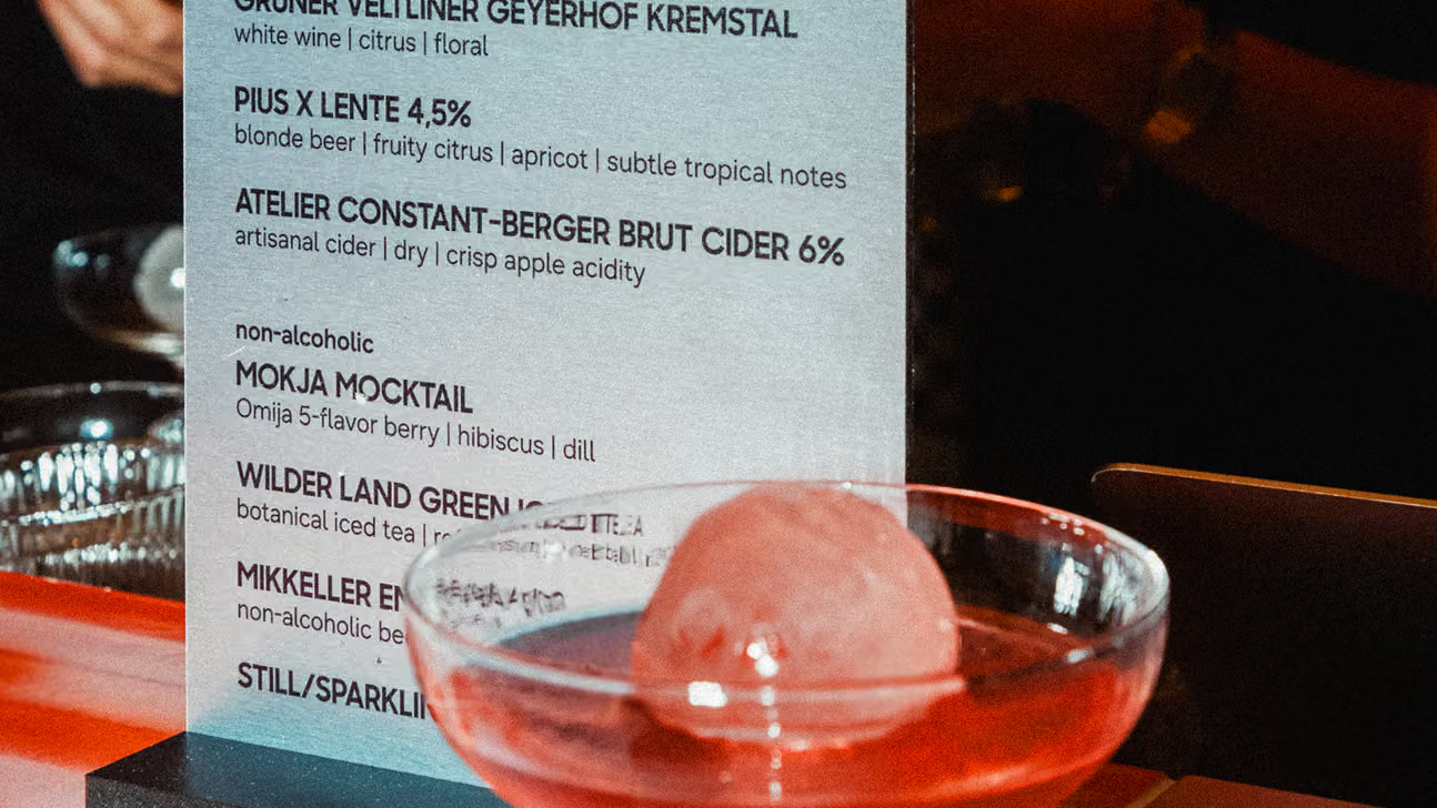
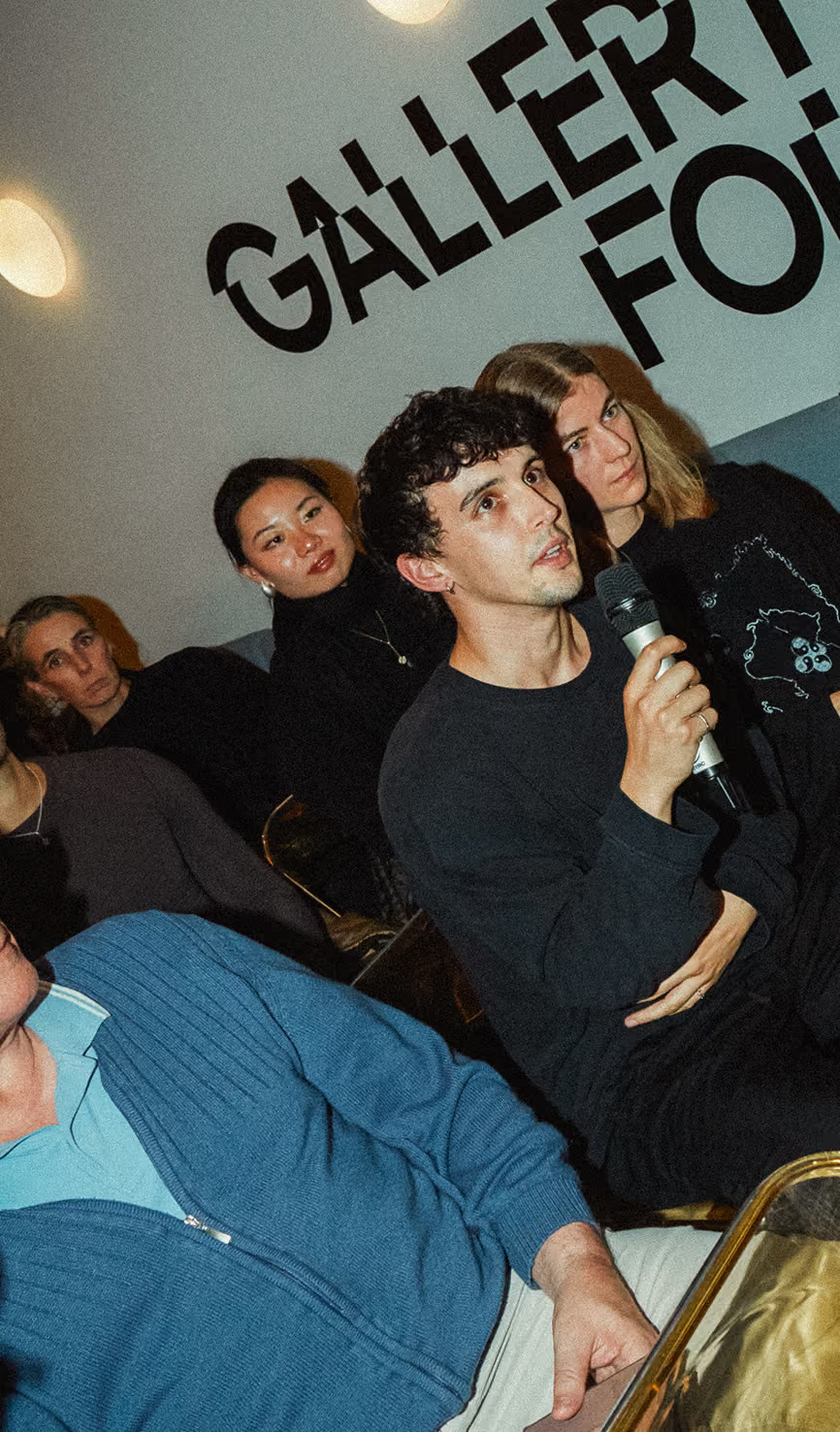
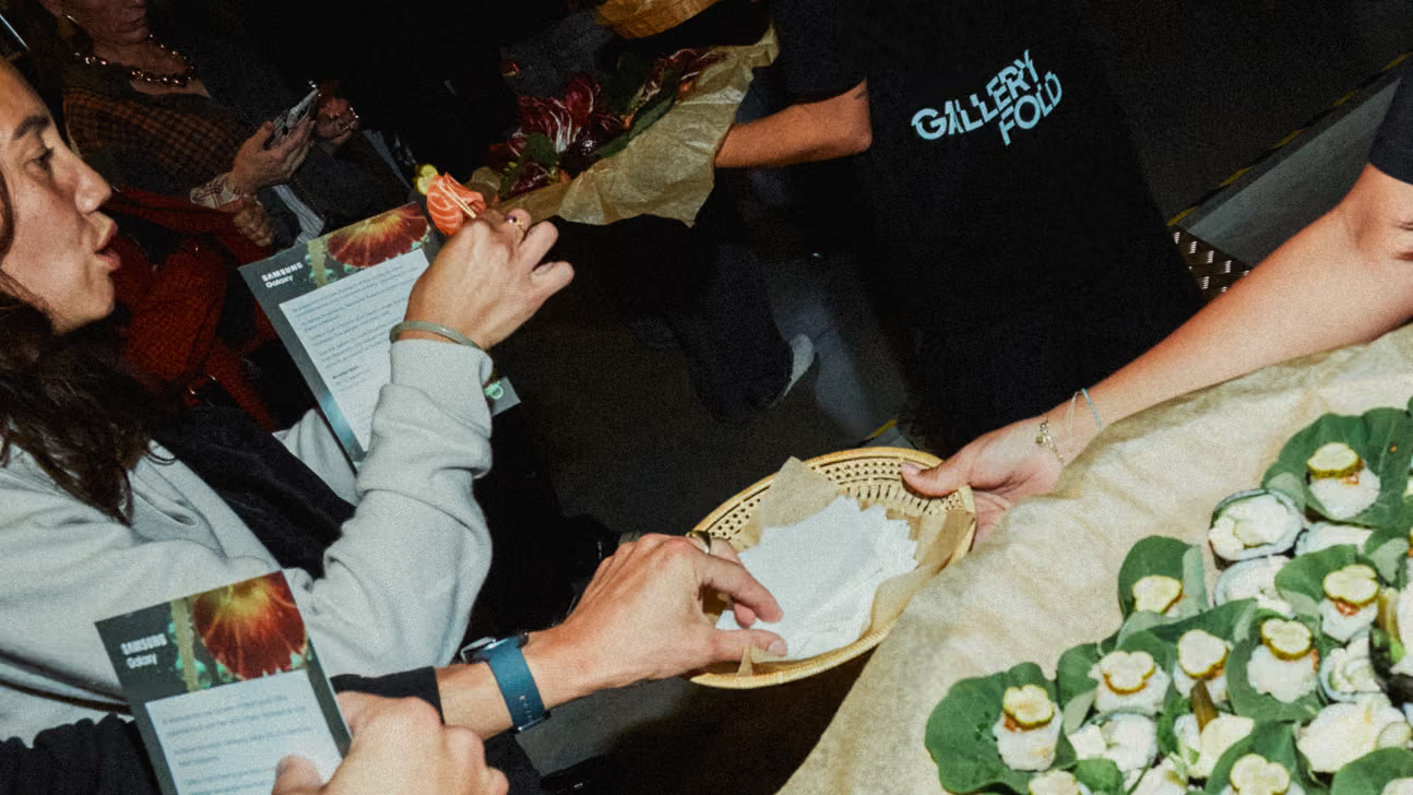
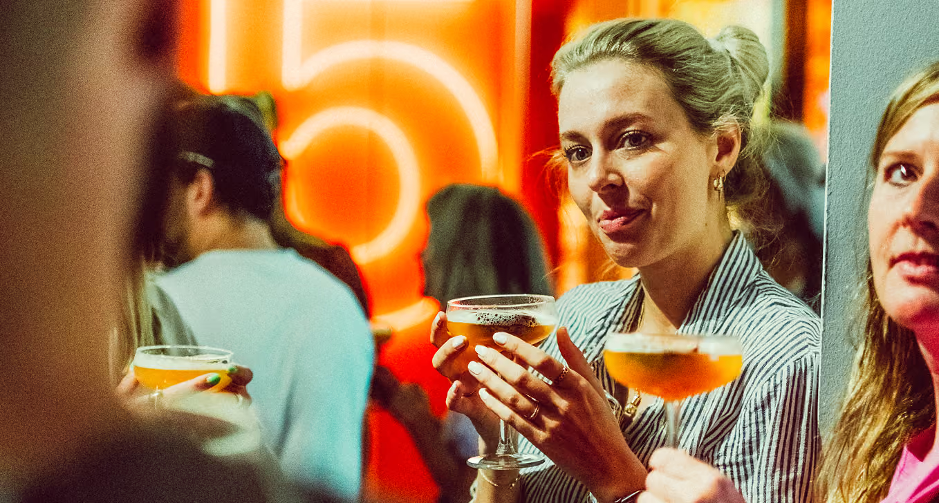
The gallery opened its doors for two launch nights in Amsterdam and Brussels, the space full and the identity finally doing its job in the room. Seen the way it was meant to be, at scale and surrounded by the work and the people it was built for.
Credits
Creative
Pia Mader
Koen De Boer
Timo Wilbrink
Realisation
WEMAKEYOUHAPPY
CONCEPT
ART DIRECTION
COLOUR GRADING
AUDIO PRODUCTION
SCROLL right TO EXPLORE
↓
BRAND Identity
2022-2026
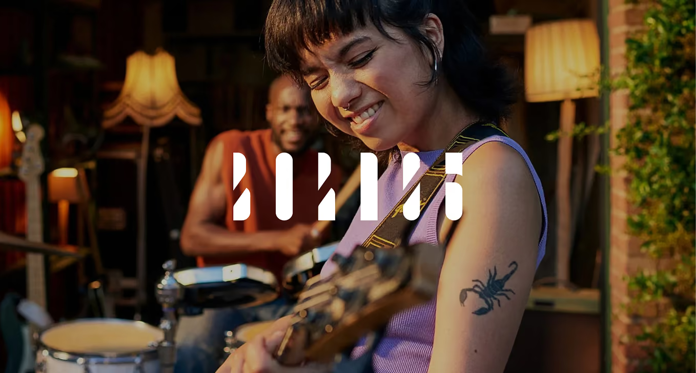
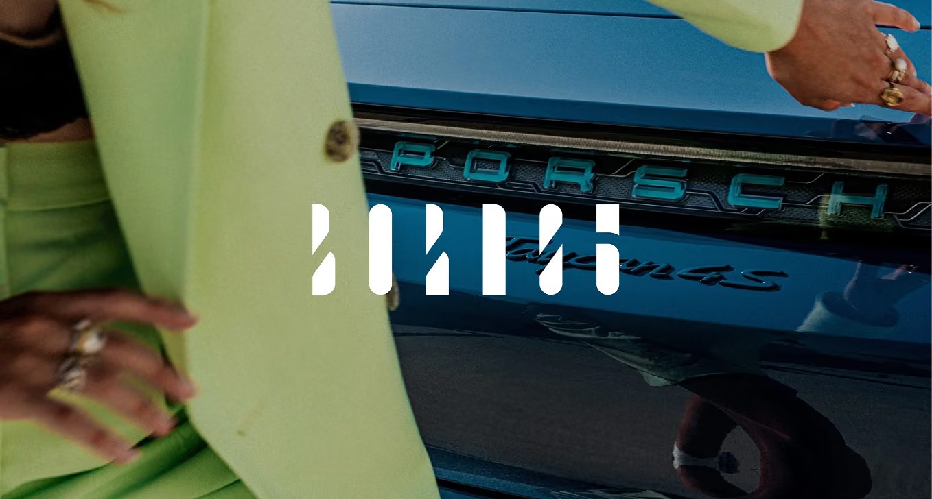
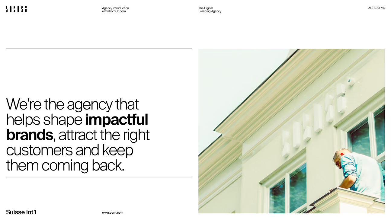
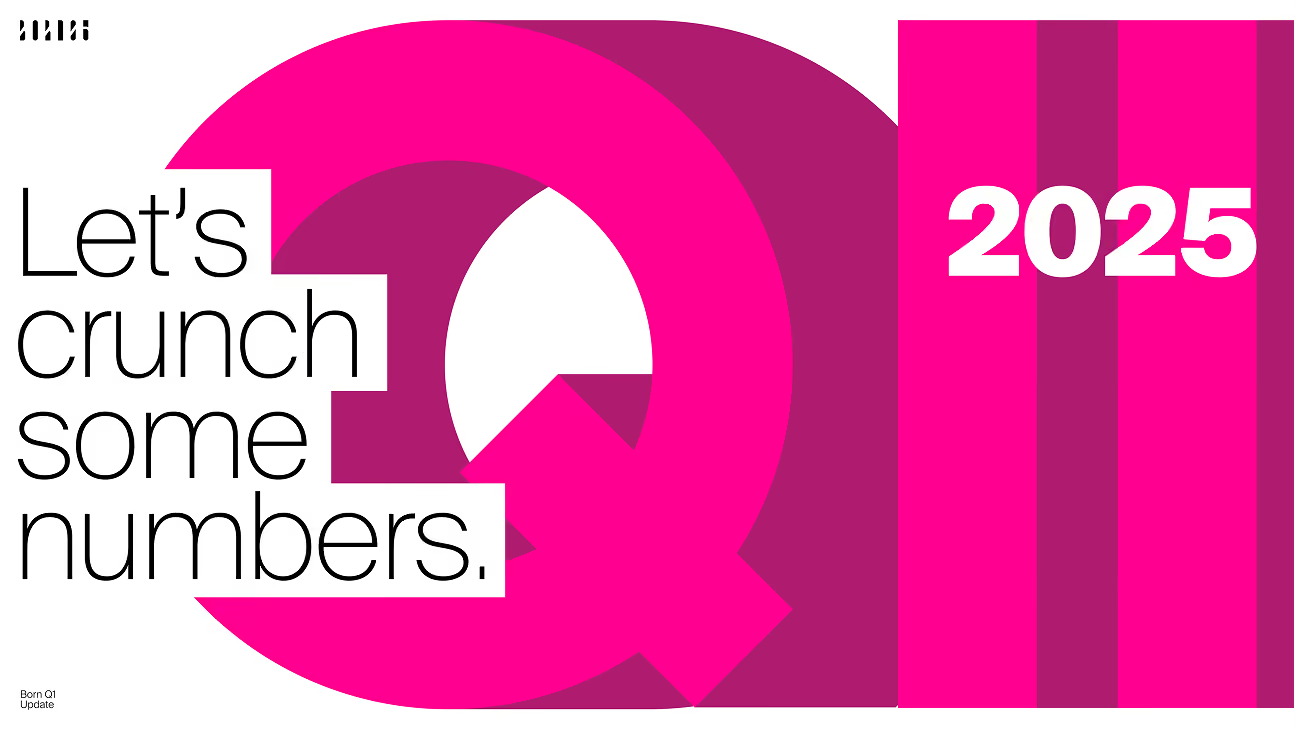
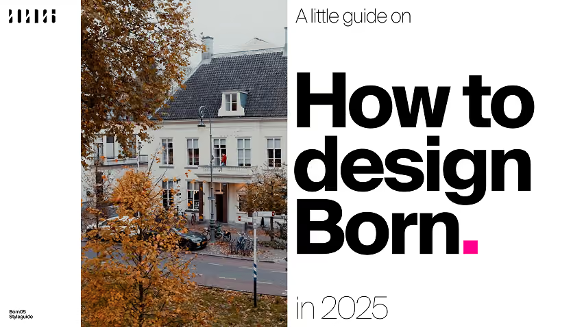
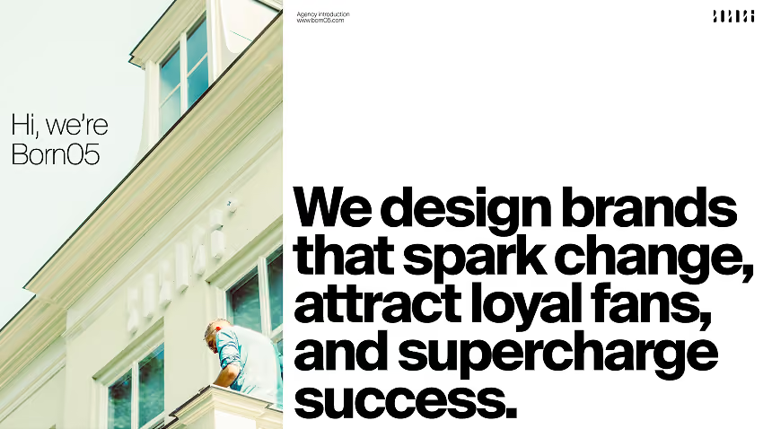
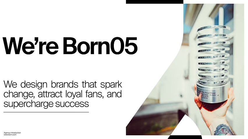
Born05 Agency Identity.
Born05
Reimagining, reinventing and
safeguarding our own identity
An inside job
(re)Design
yourself.
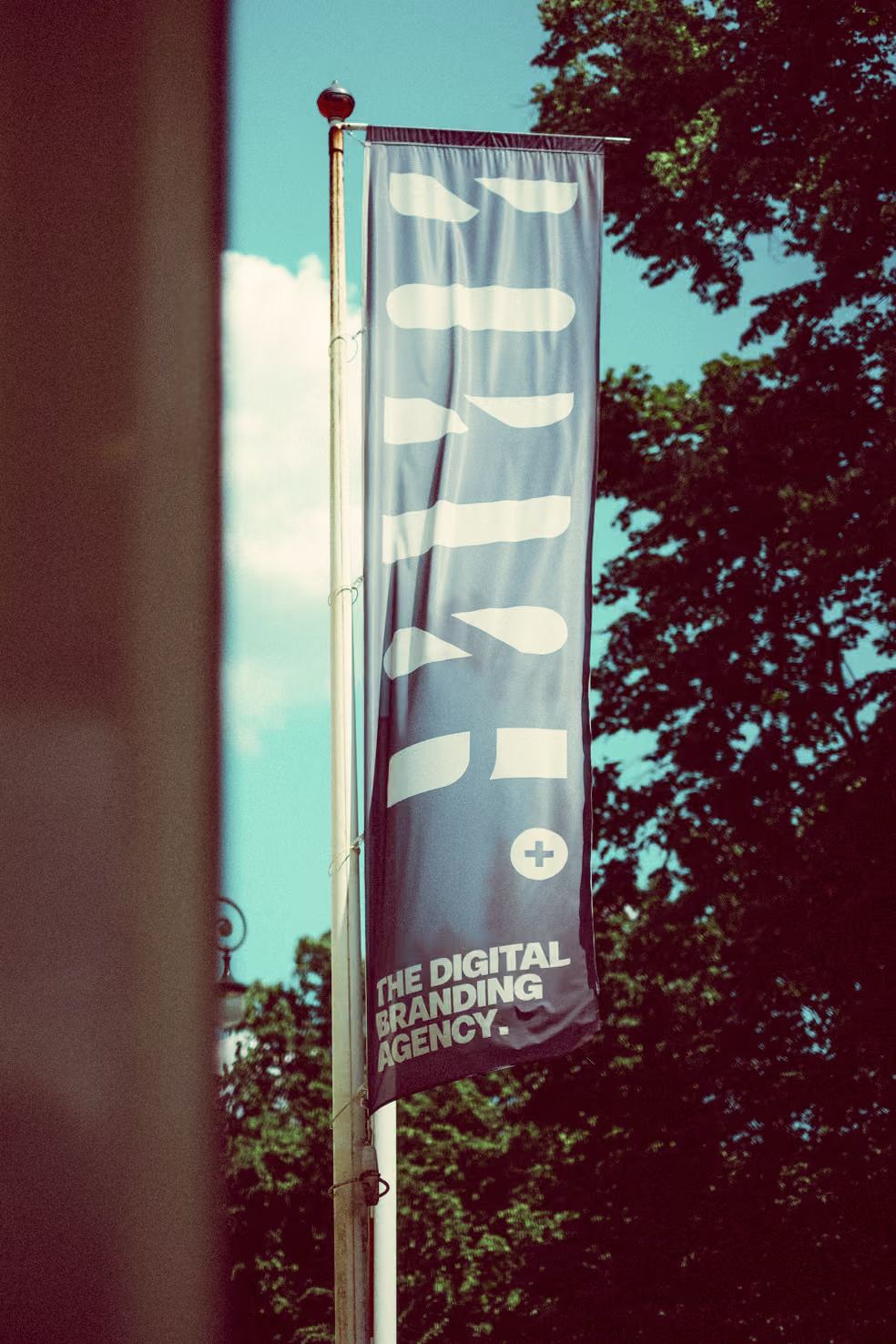
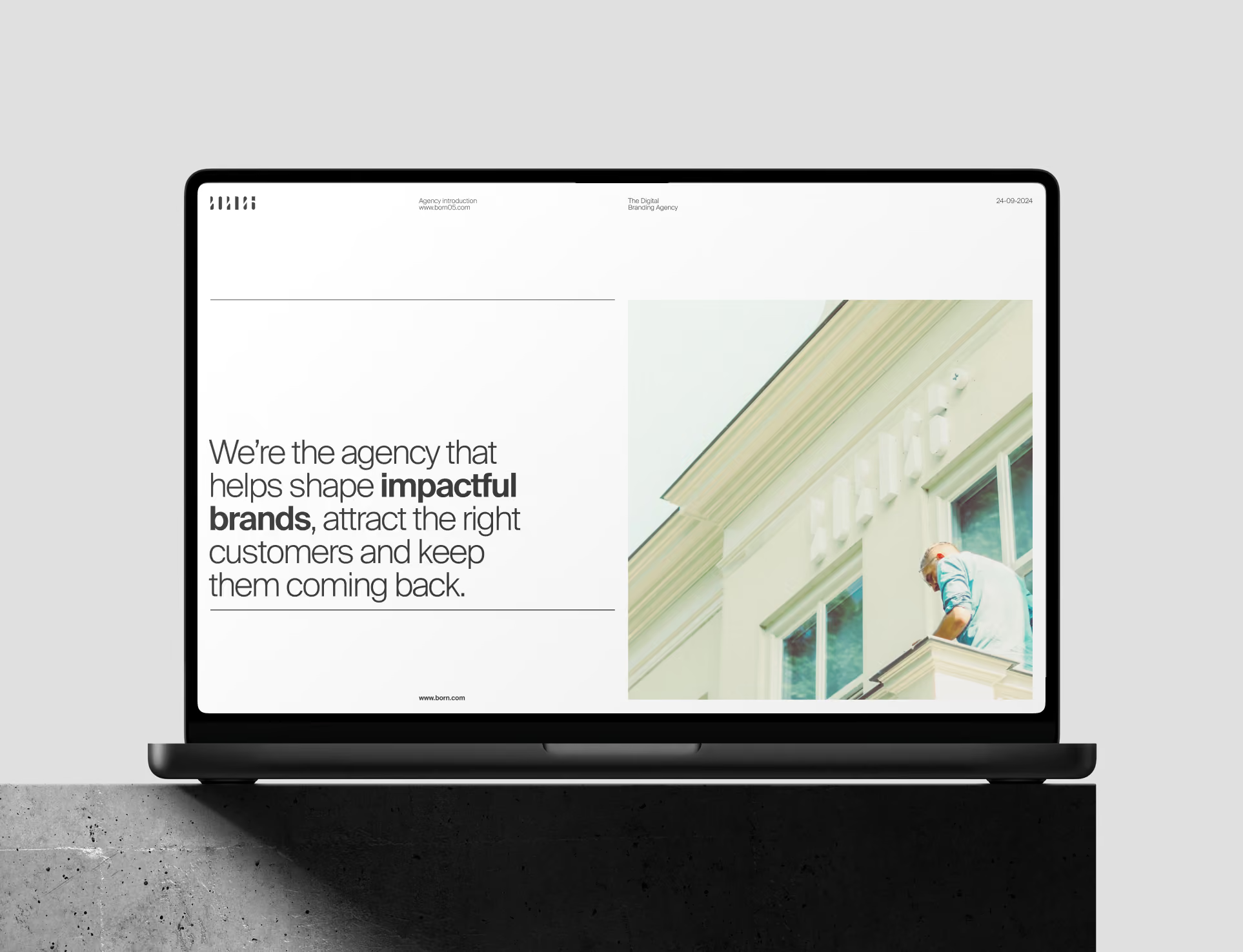
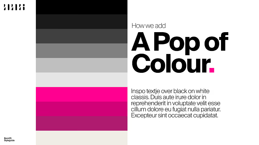
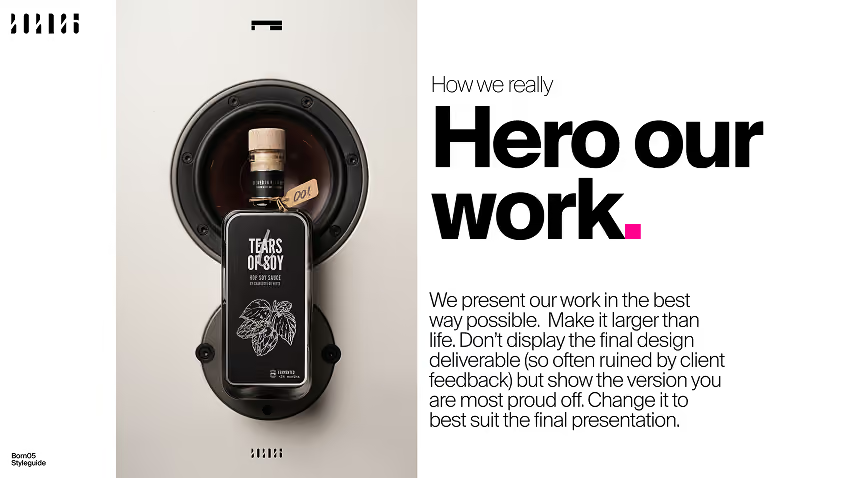
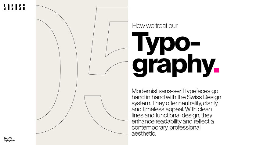
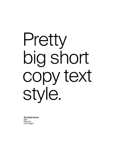
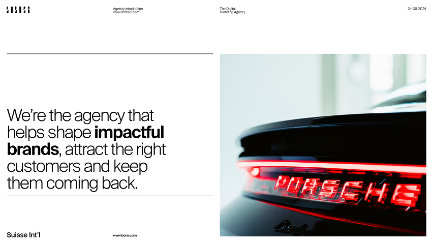
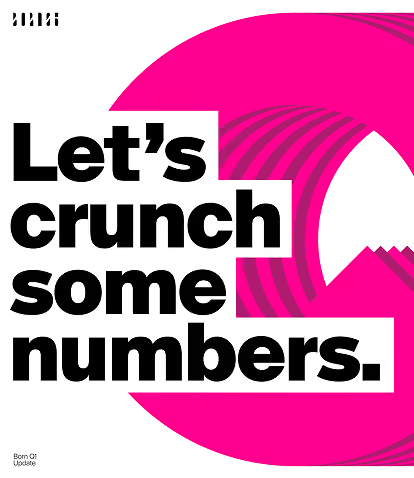
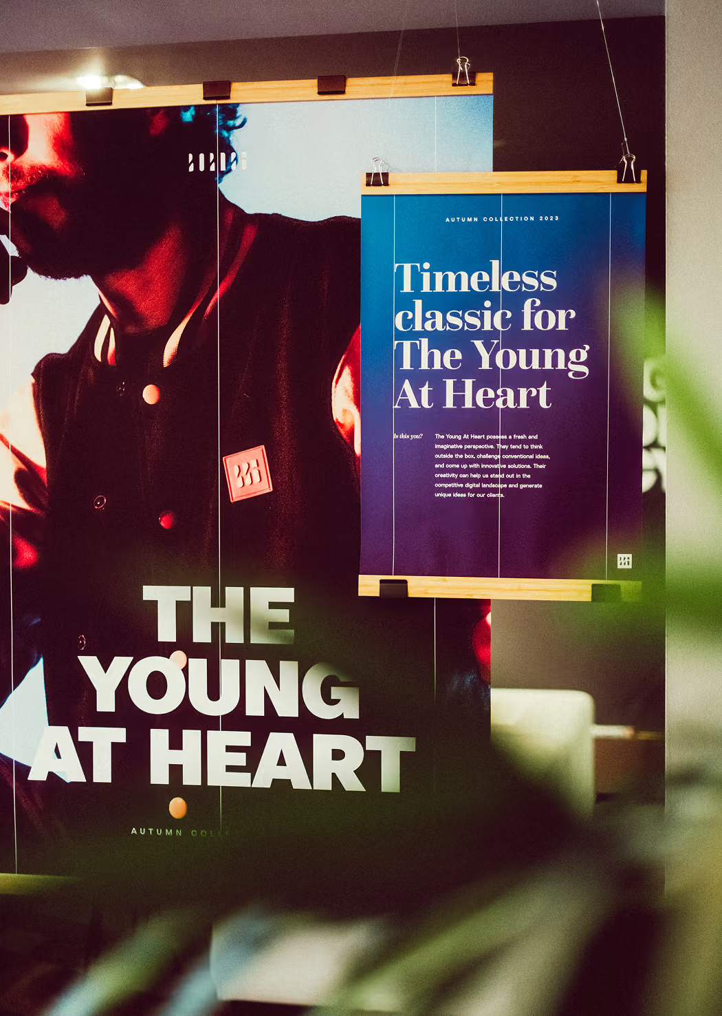
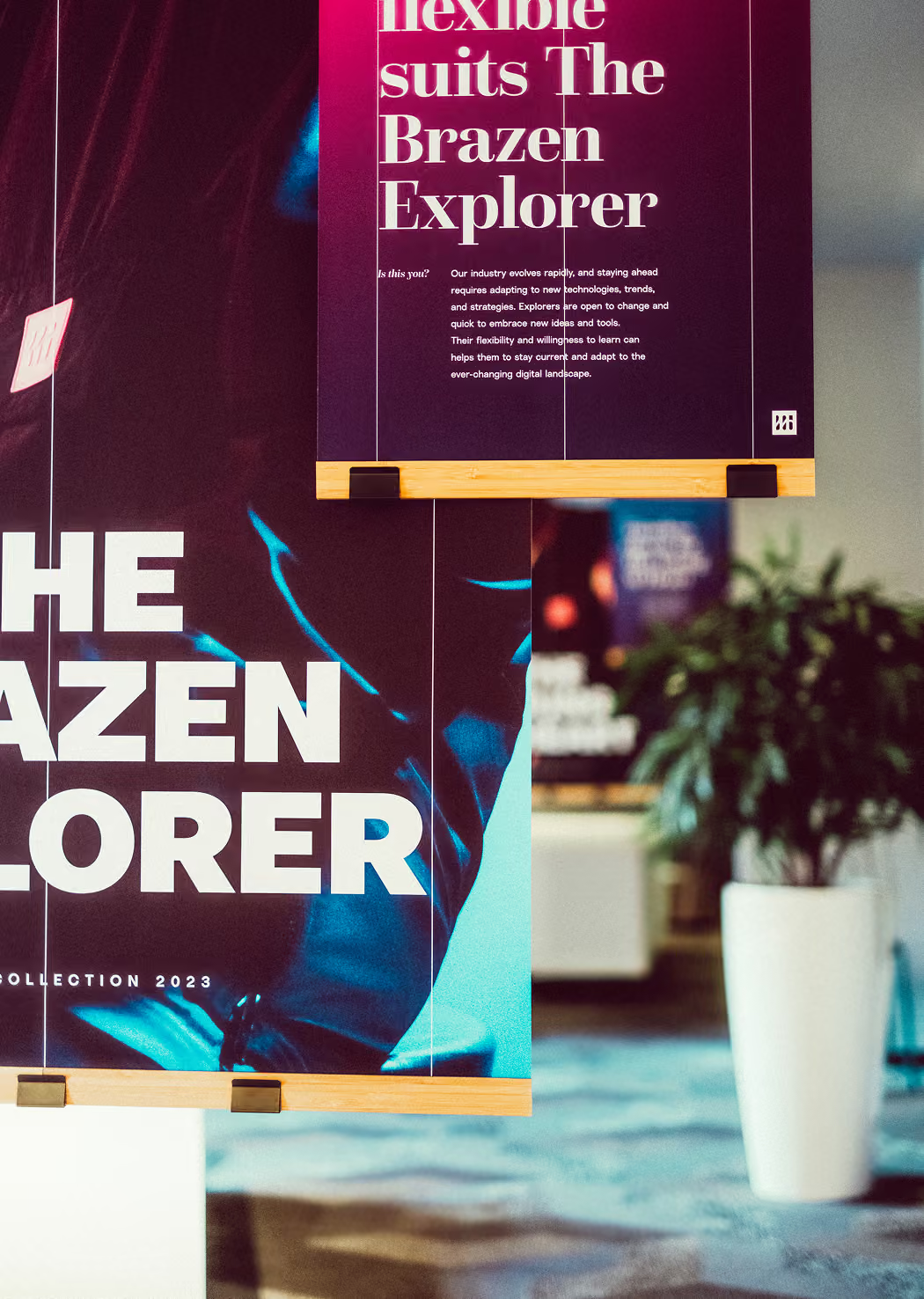
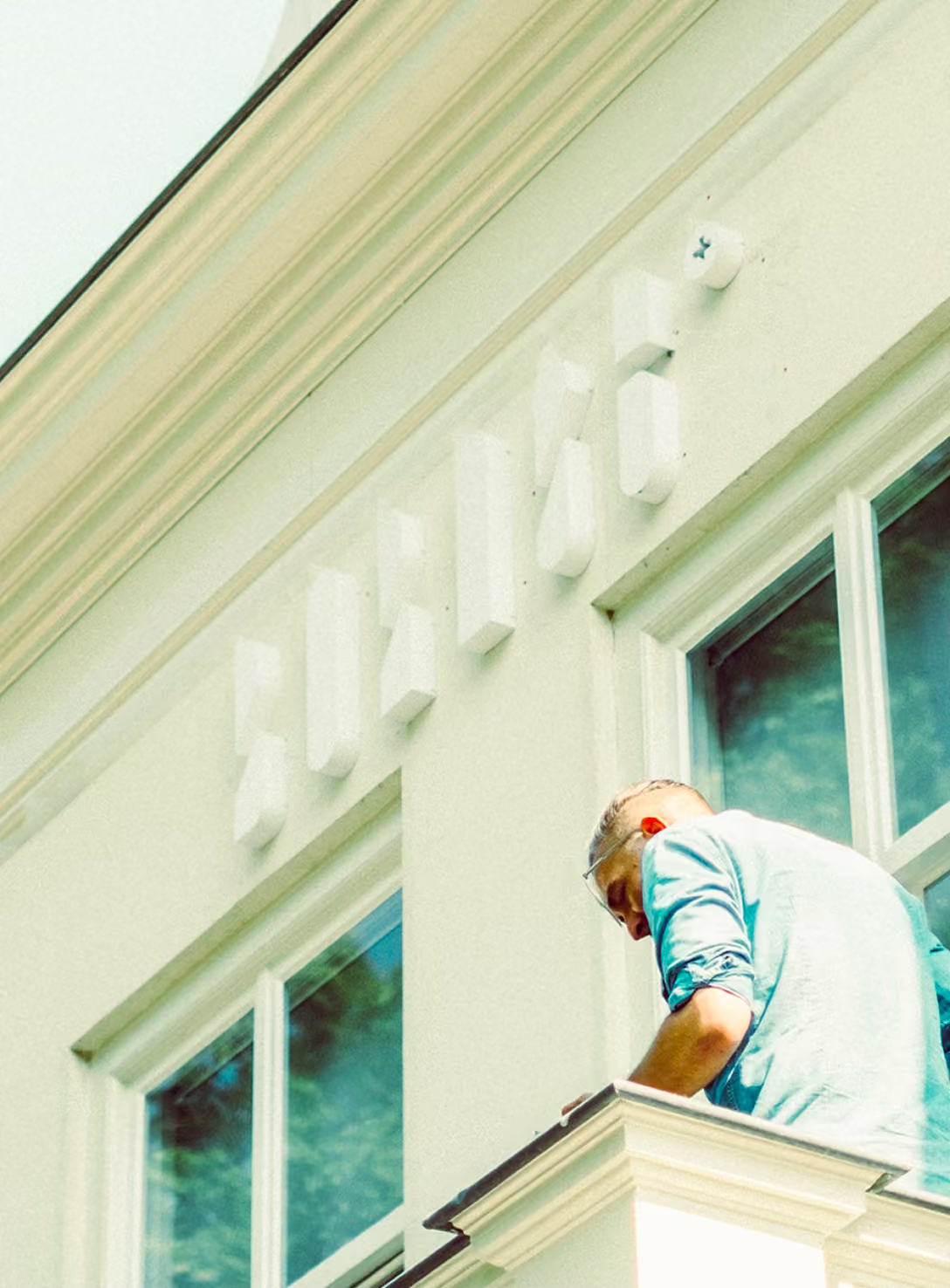
The hardest brief is always your own. The goal was to make Born05 look more refined and classic at its core, to let the work speak for itself. The answer was a system leaning heavily on tried and tested Swiss-style. With a typography and layout system quiet enough to carry years of output without fighting it. Reinvented once with enough flexibility to remain  tight in the long run.
My role
ART DIRECTION
Brand Design
Photography
concepting
One voice, many forms
From pitch
decks to
merch drops
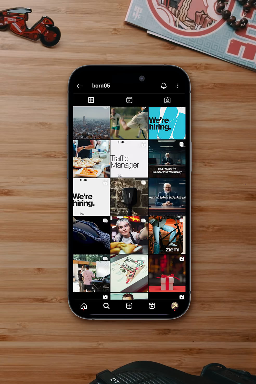
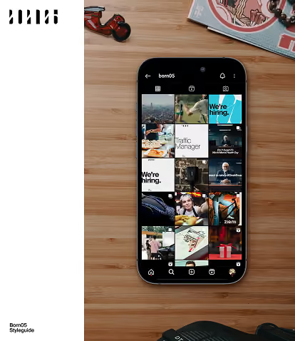
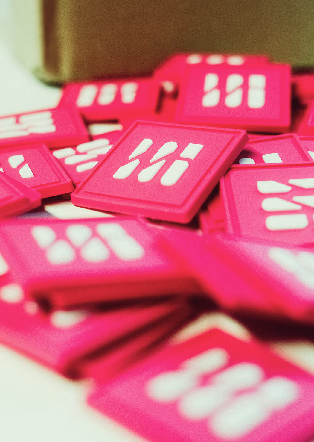
The same identity has to carry everything from a buttoned-up pitch deck to our annual streetwear-inspired merch drop, with a social presence holding the line everywhere in between. The system was built to stretch across all of that and still read as one thing, so wherever Born05 rolled up, it always looks the part.
Behind the scenes
Capturing
the real life
studio vibe.
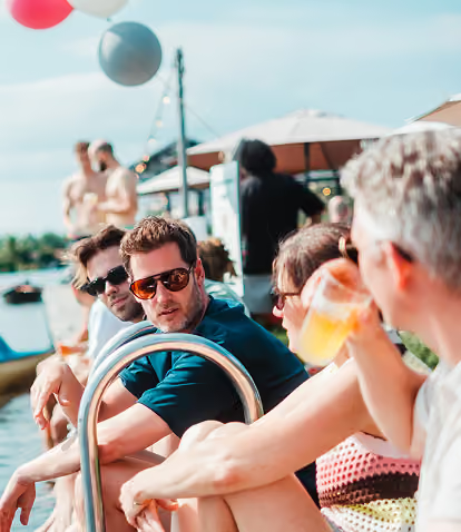
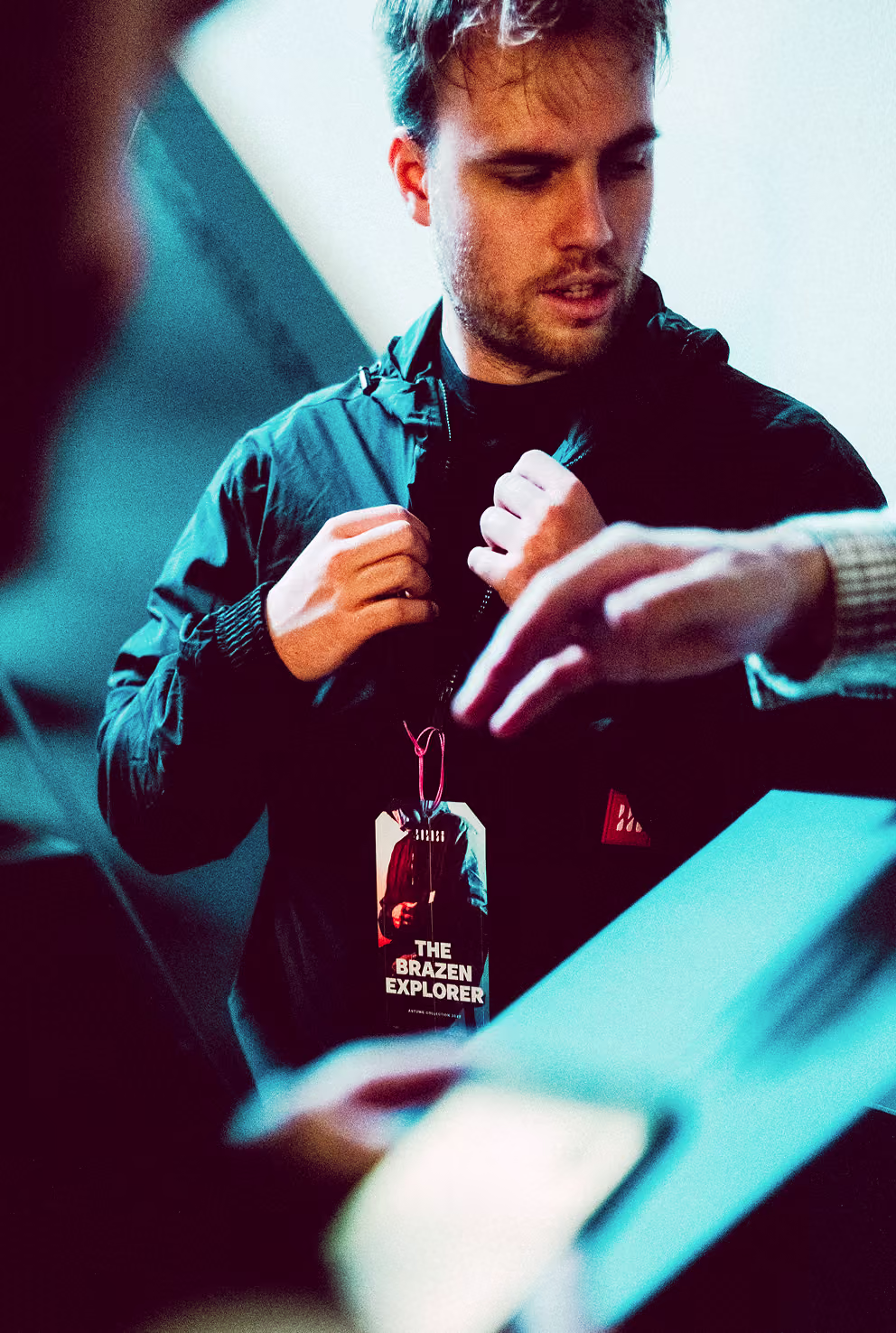
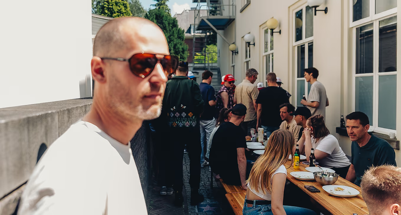
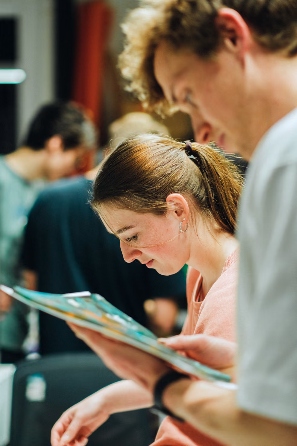
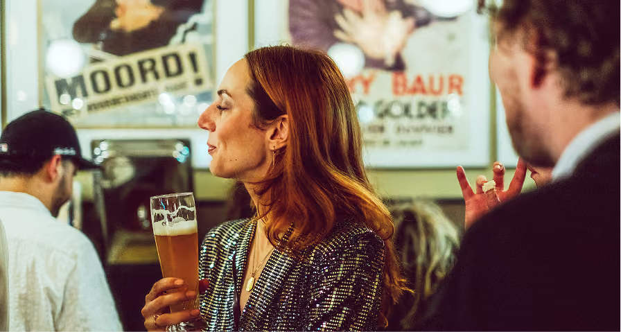
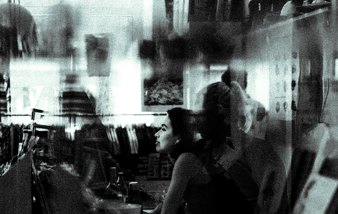
A studio is its people before it’s its output. I always kept my camera close, capturing true moments instead of staged shoots. Over the years it added up to a running record of life inside our studio, the late nights and the quiet focus, the in-between moments nobody sets up for. That record became part of the brand itself, the human texture sitting behind the finished work. A steady reminder that everything polished on the outside starts with real people at it's core.
Credits
Creative
TIMO WILBRINK
michael kouwenhoven
Realisation
the entire team
at born05
ART DIRECTION
Brand Design
Photography
concepting
SCROLL right TO EXPLORE
↓
BRAND ILLUSTRATION
2025
ASICS Illustrations.
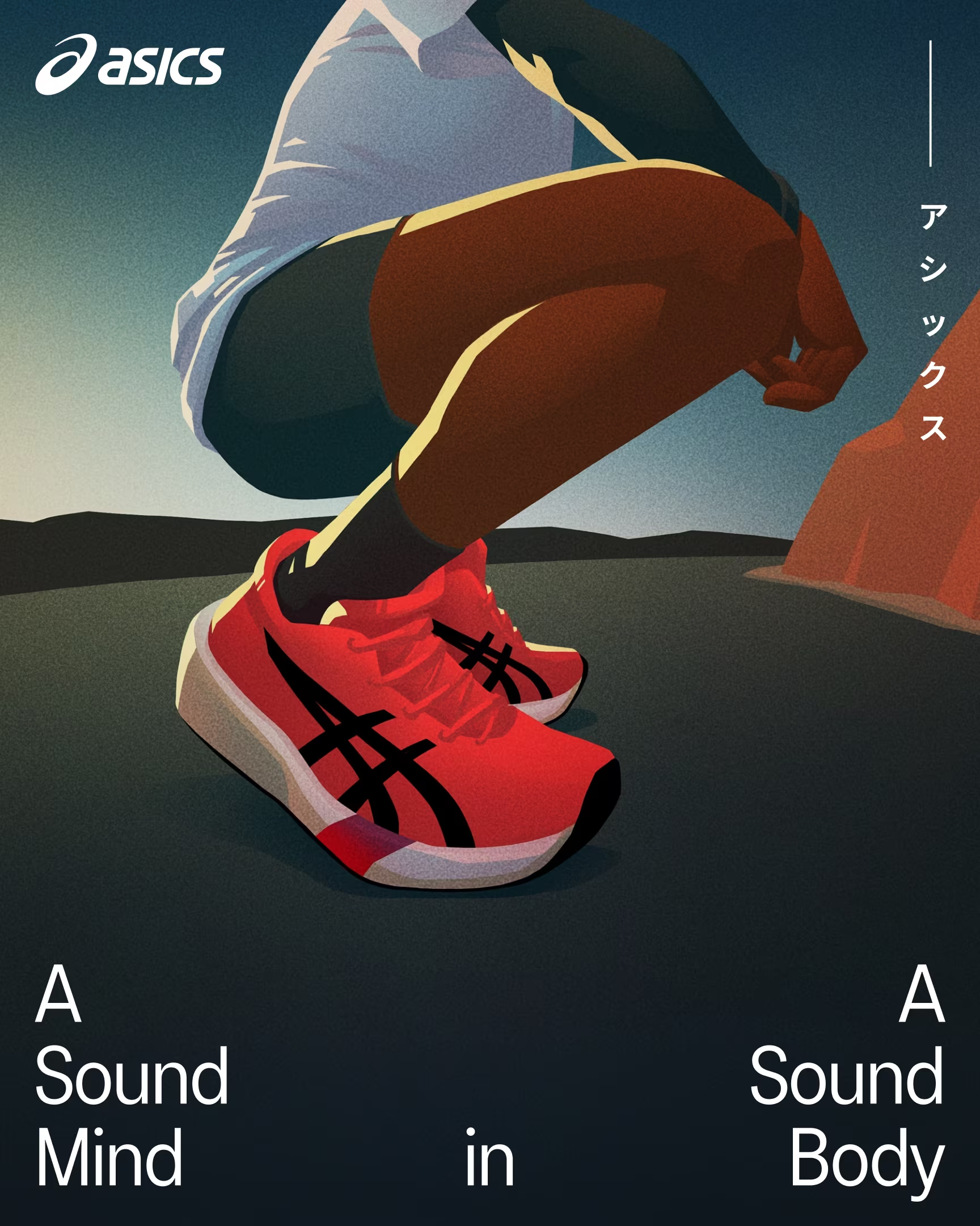
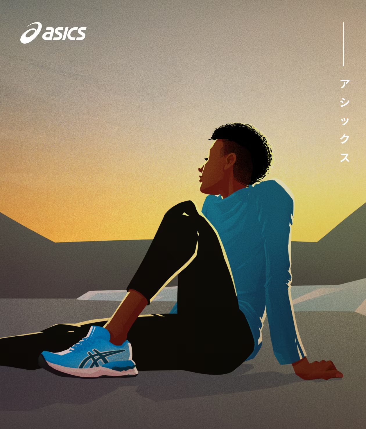
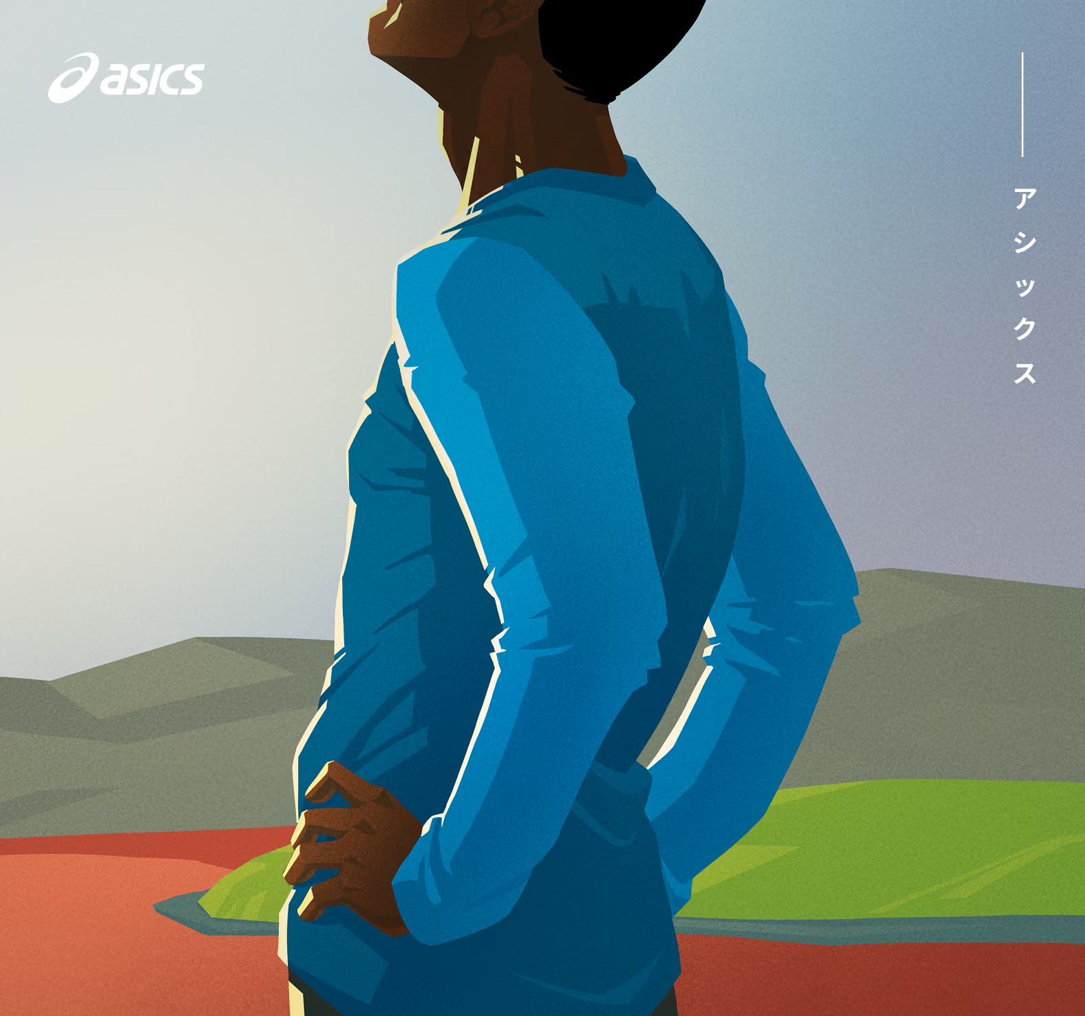
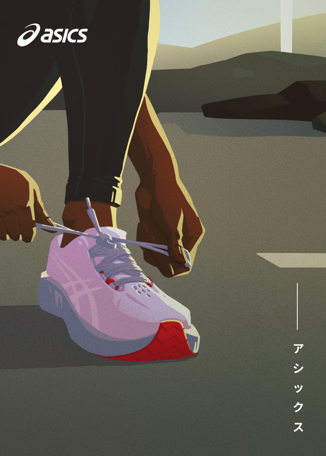
ASICS Sound Body, Sound Mind.
ASICS
Platform Illustration for
Sound Mind, Sound Body
Consistency by illustration
Illustrating

ASICS
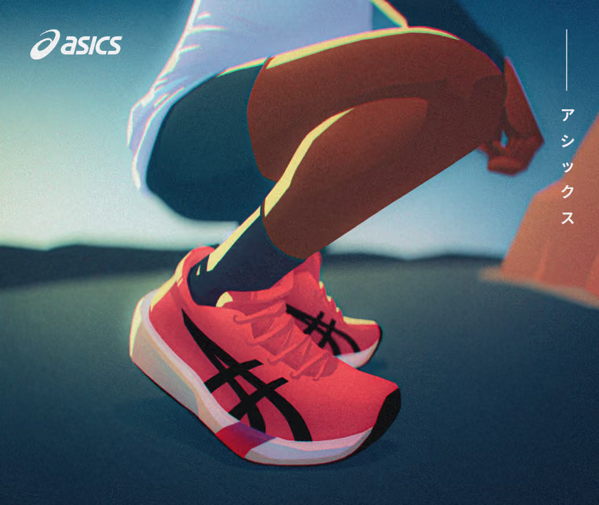
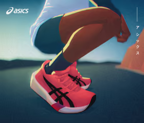
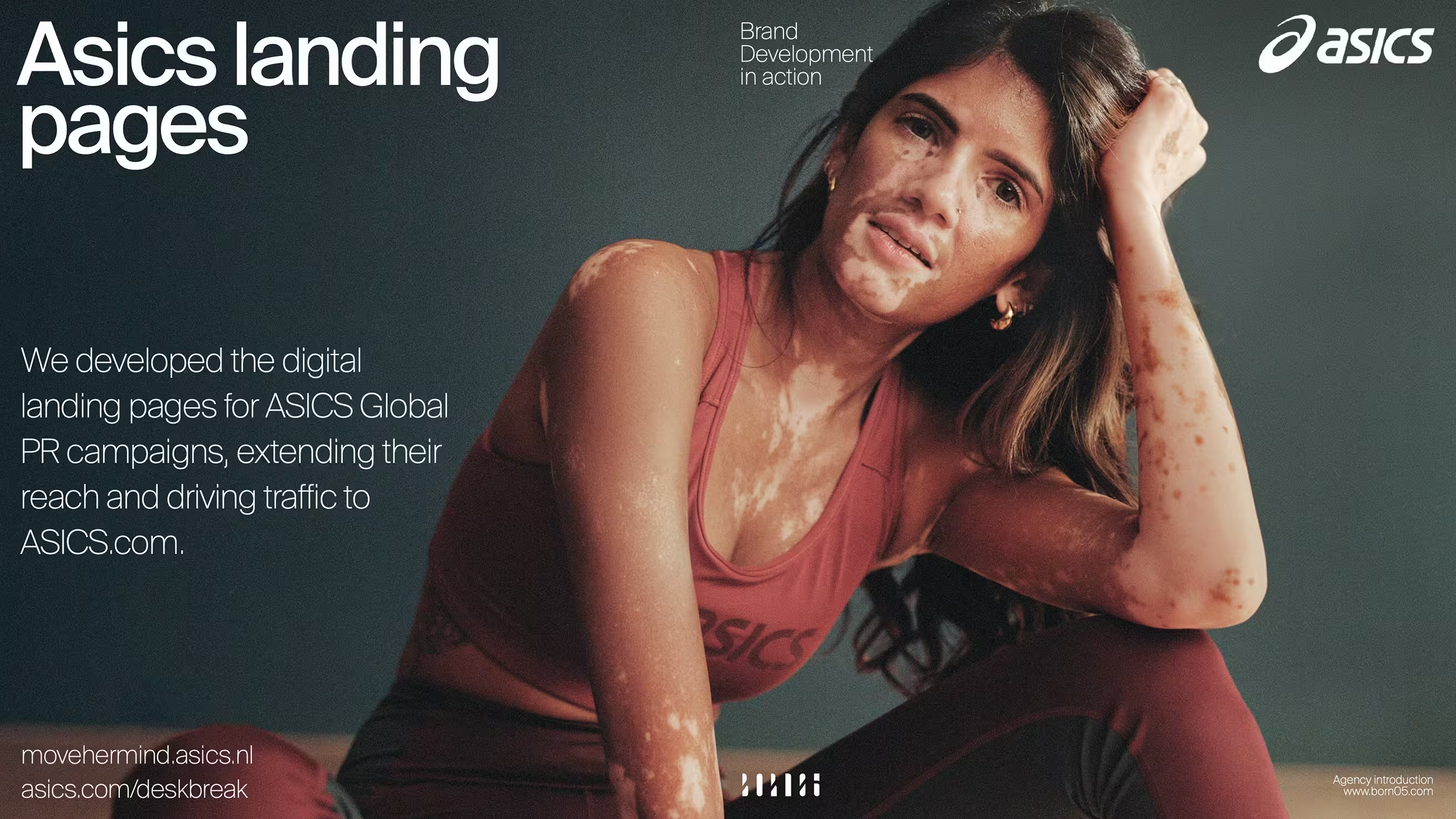
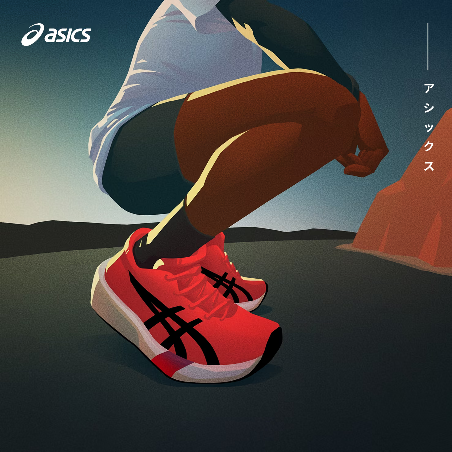
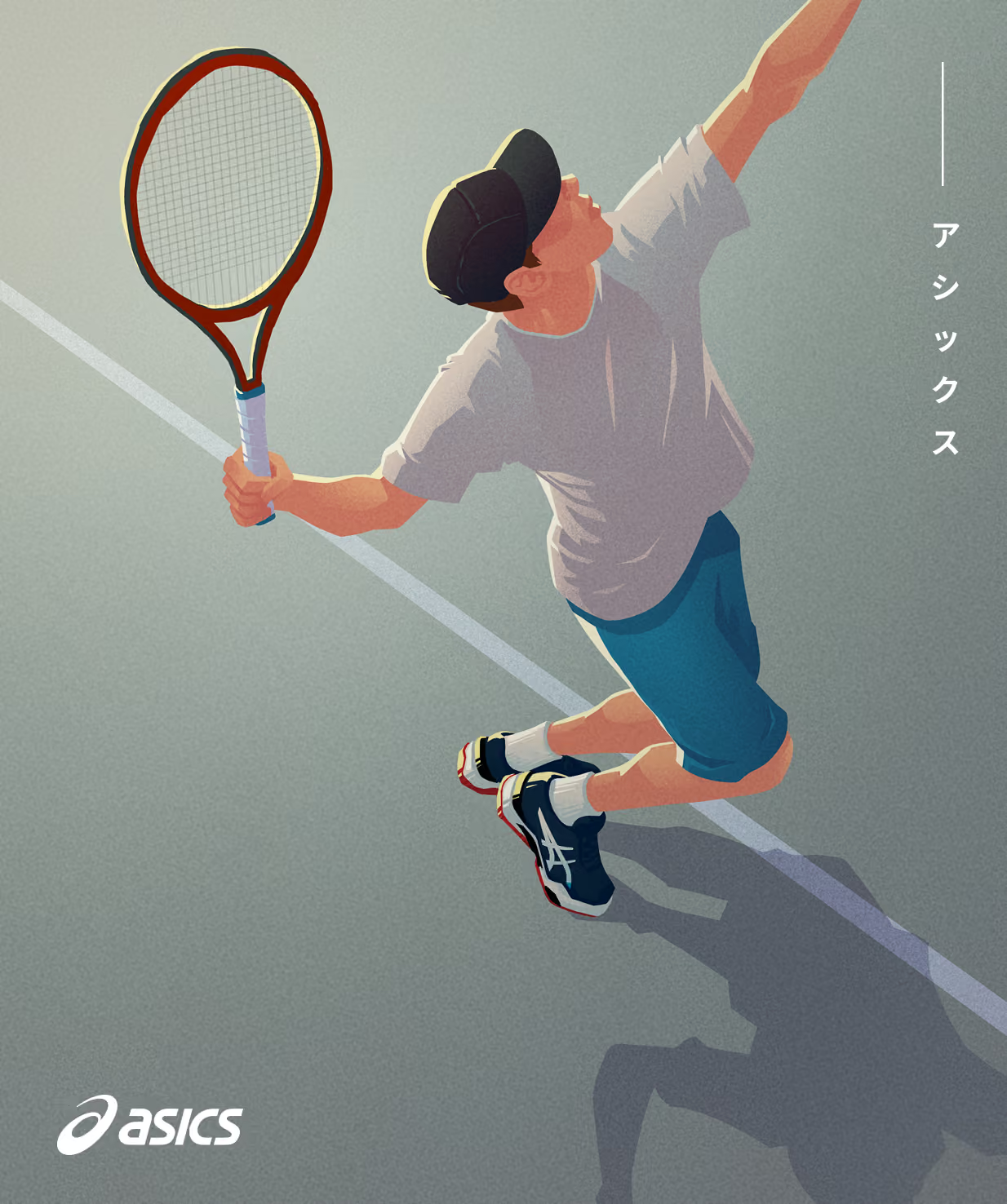
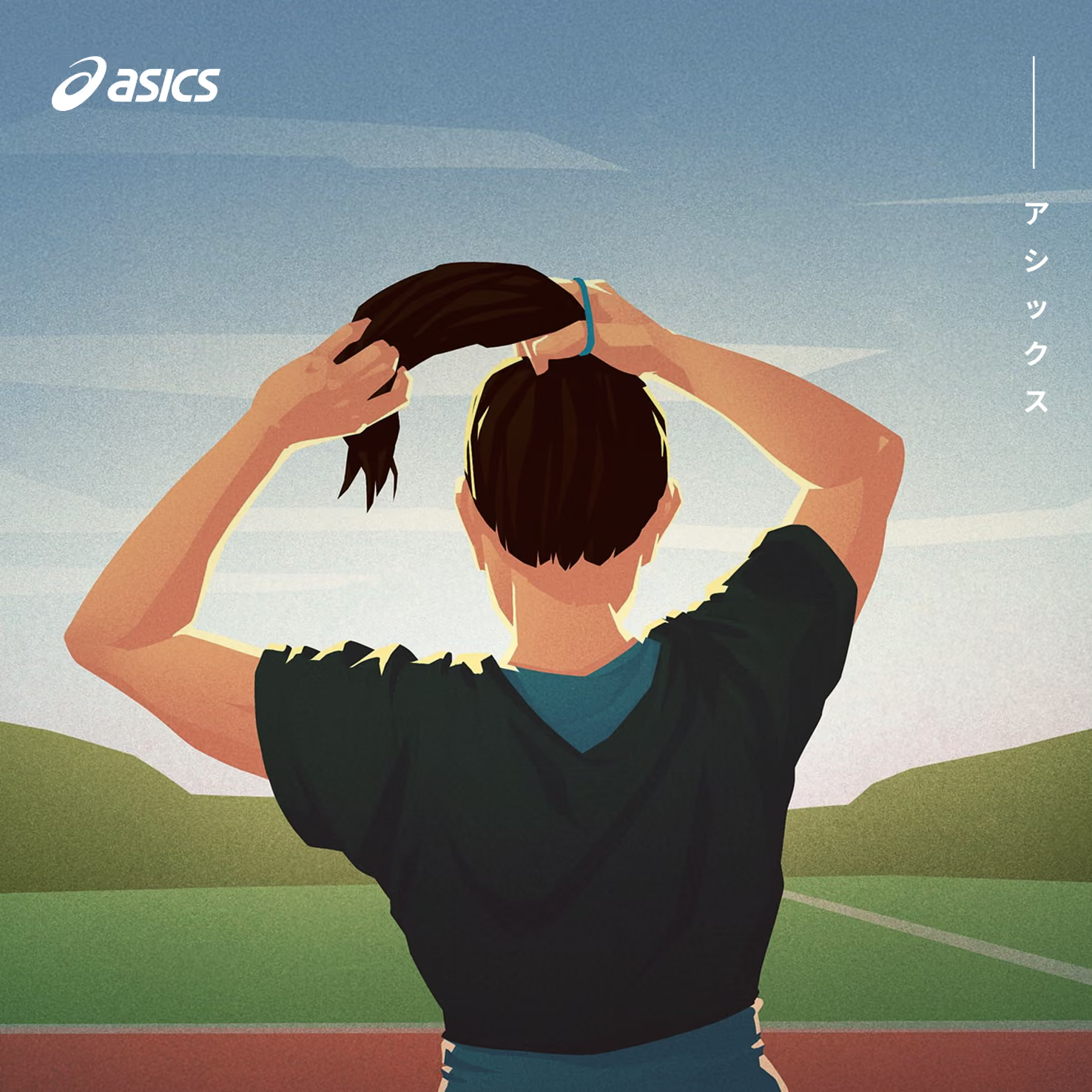
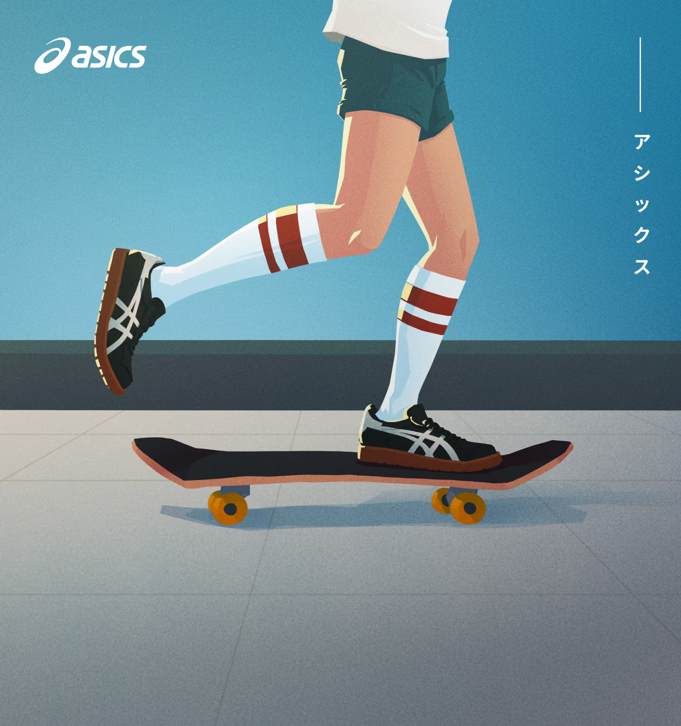
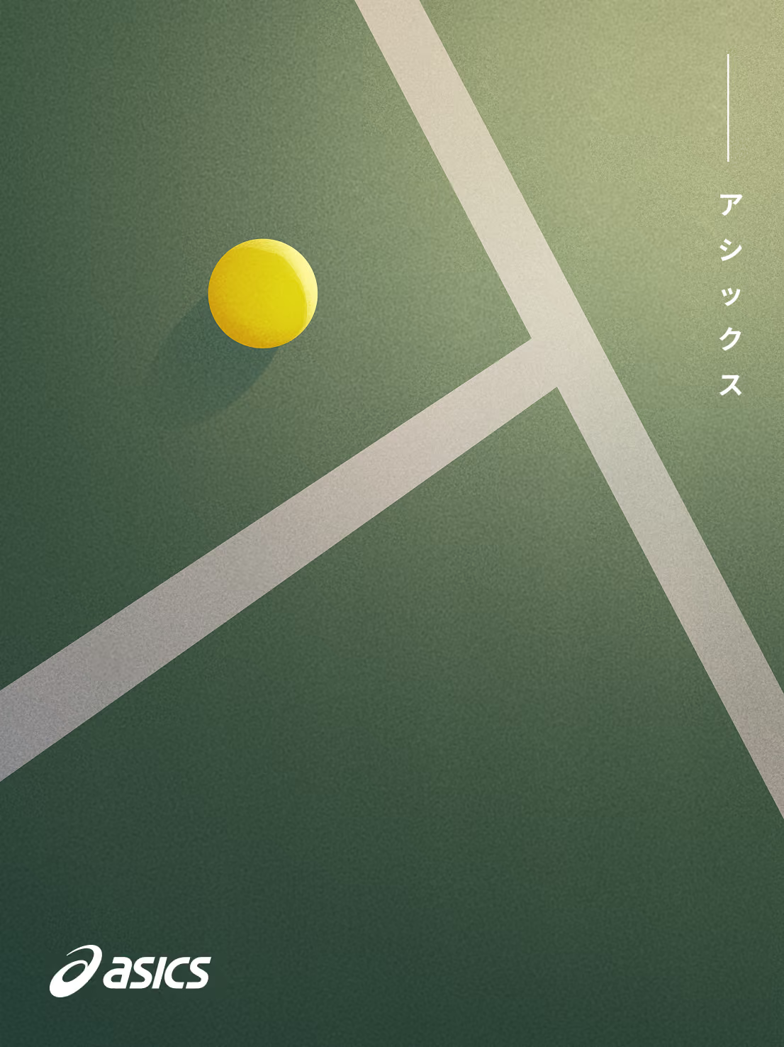
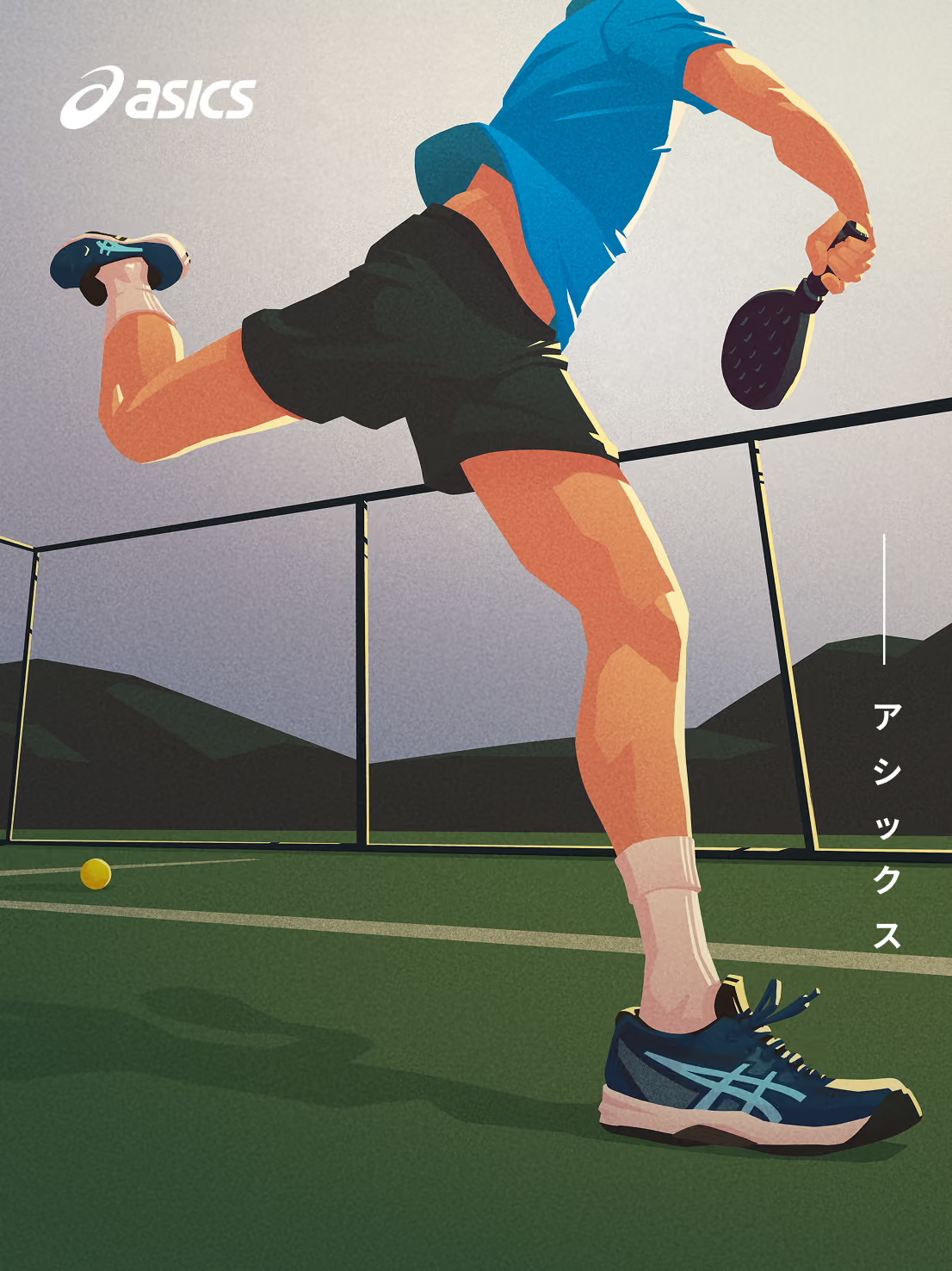
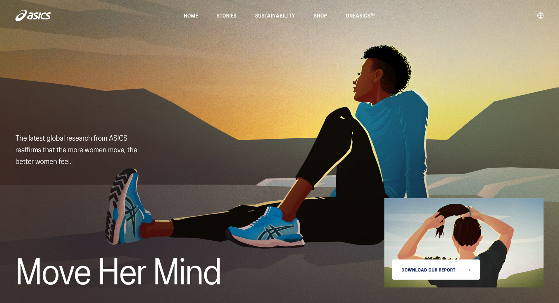
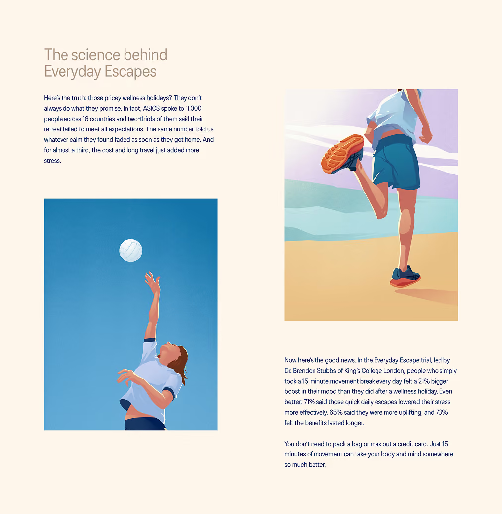
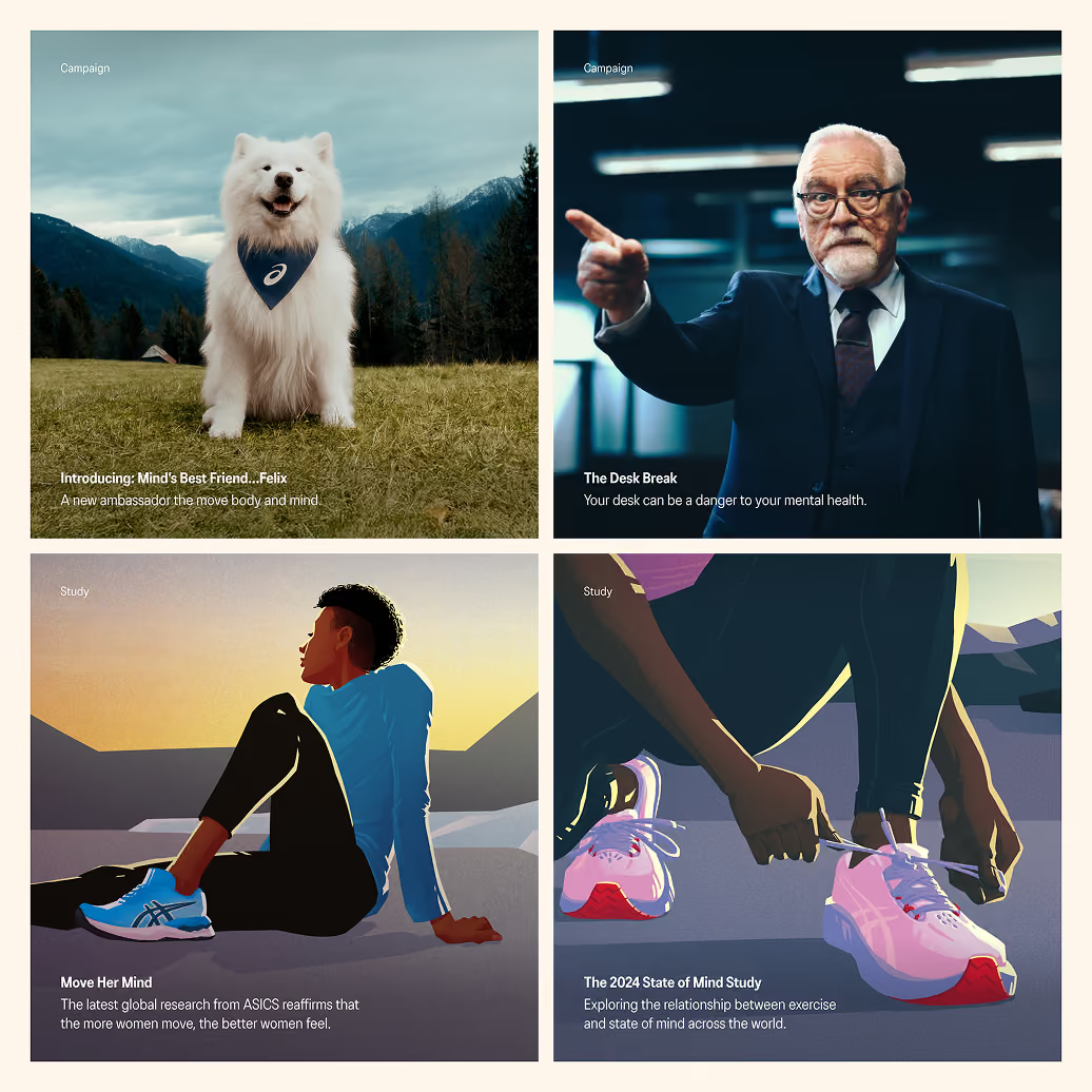
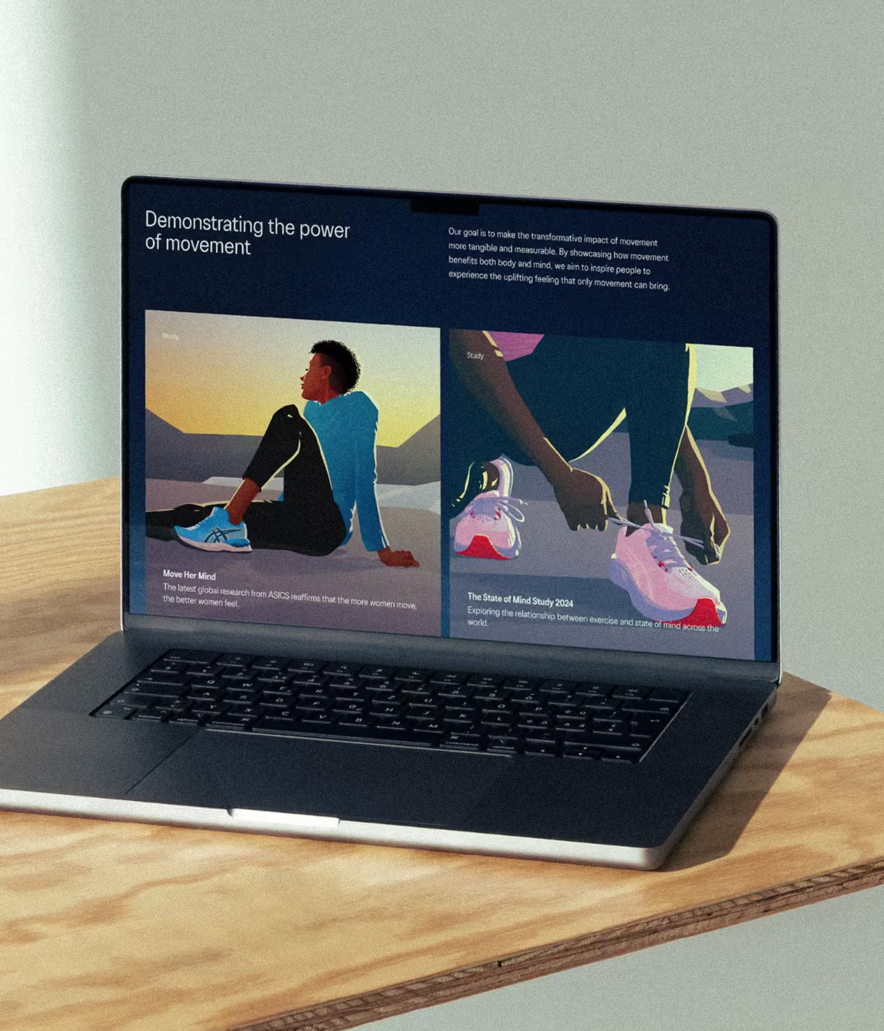
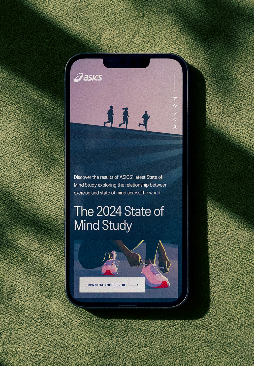
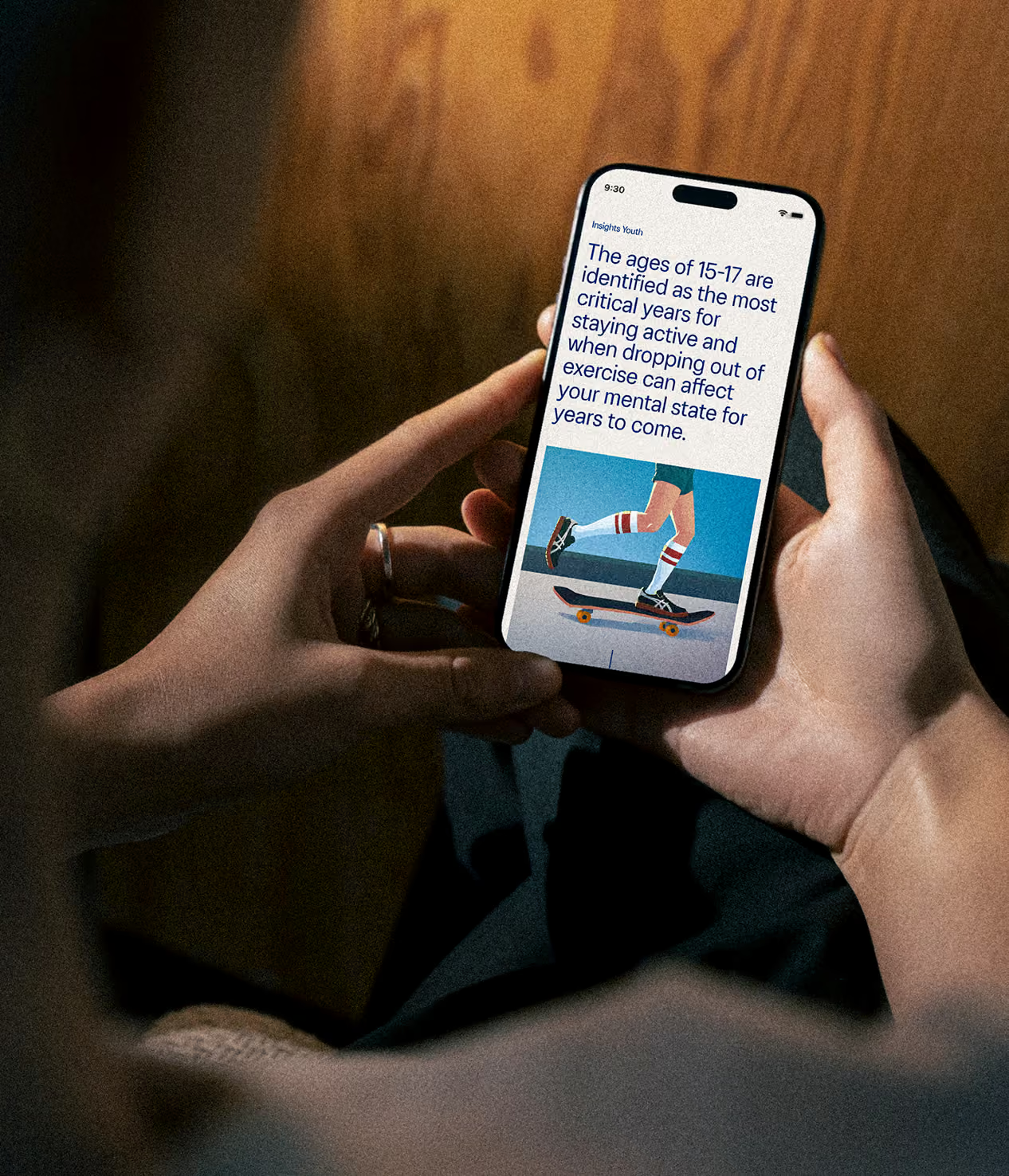
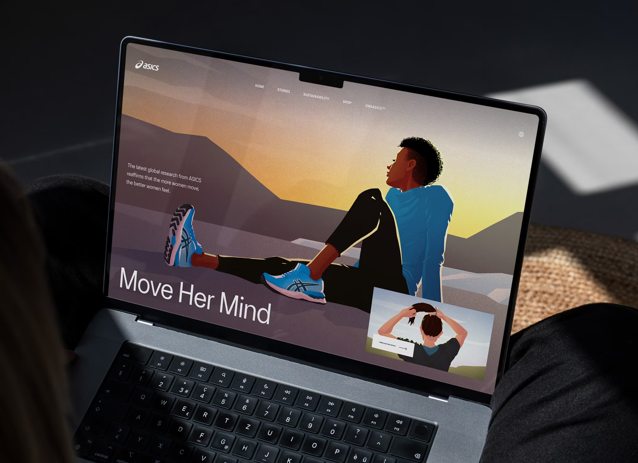
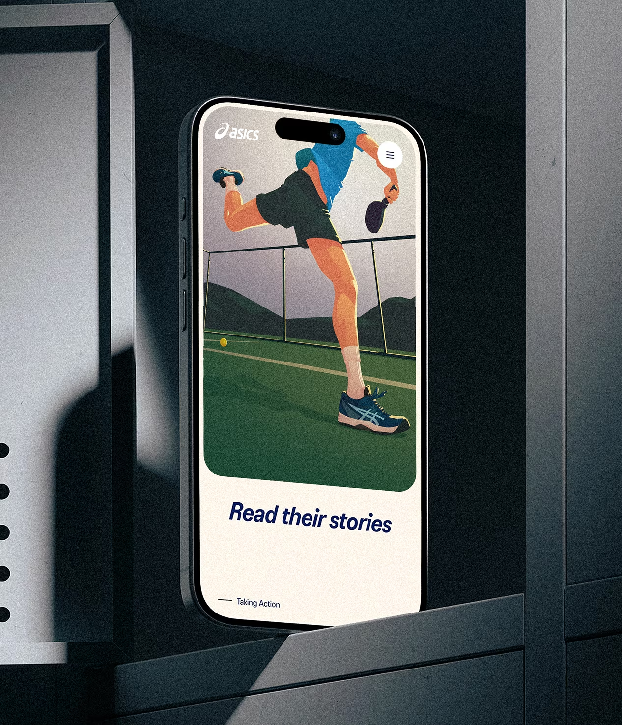
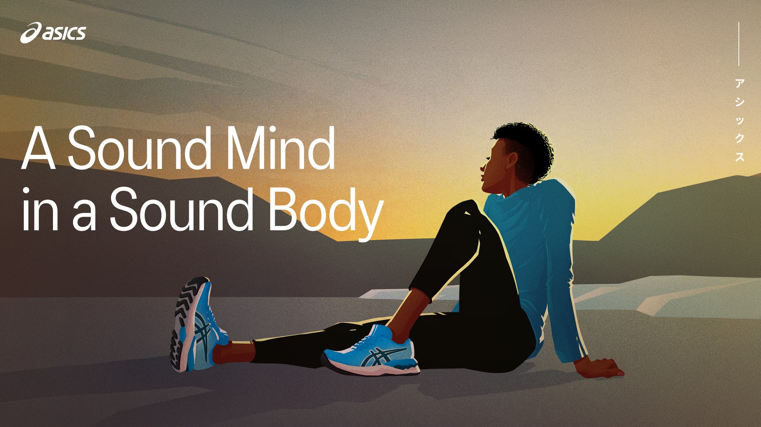
Sound Mind Sound Body is ASICS' platform for movement and mental health. To extend its visuals without leaning on stock, we opted for illustration. A drawn layer that supplements the existing imagery and keeps one coherent look across the platform. Filling the gap photography leaves behind, it gives each campaign room to feel distinct while still reading as part of the same whole.
My role
Style development
Illustration
Credits
Digital Design
Vincent van Rouwendal
Development
Michiel van der Plas
Rens Philipsen
Style development
Illustration
SCROLL right TO EXPLORE
↓
SELECTED WORKS
VOLUME II
“Trying different things
is more important than
getting it right”
The strongest visuals are rarely born from rigid planning or formula. By keeping the process open to chance, space is created for unexpected moments, that often are far better than what was originally envisioned. The art lies in spotting those moments and reshaping the work around them.
Currently at
ace agency
Located in
Amsterdam area
20+ years of
Agency experience
CAMPAIGN Design
2023
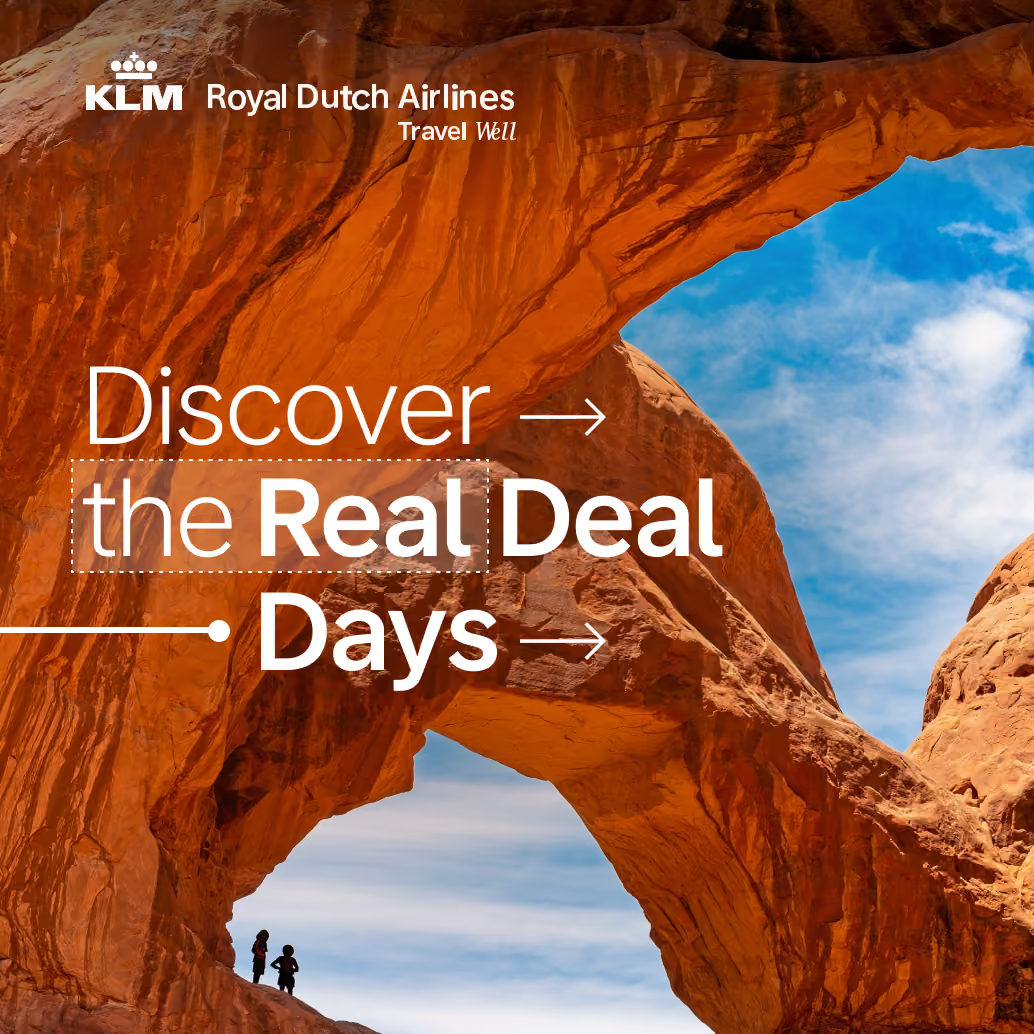
KLM Real Deal Days.
KLM Royal Dutch Airlines
INTERNATIONAL AD CAMPAIGN
FOR THE KLM REAL DEAL DAYS
Travel Well
Discover
the Real
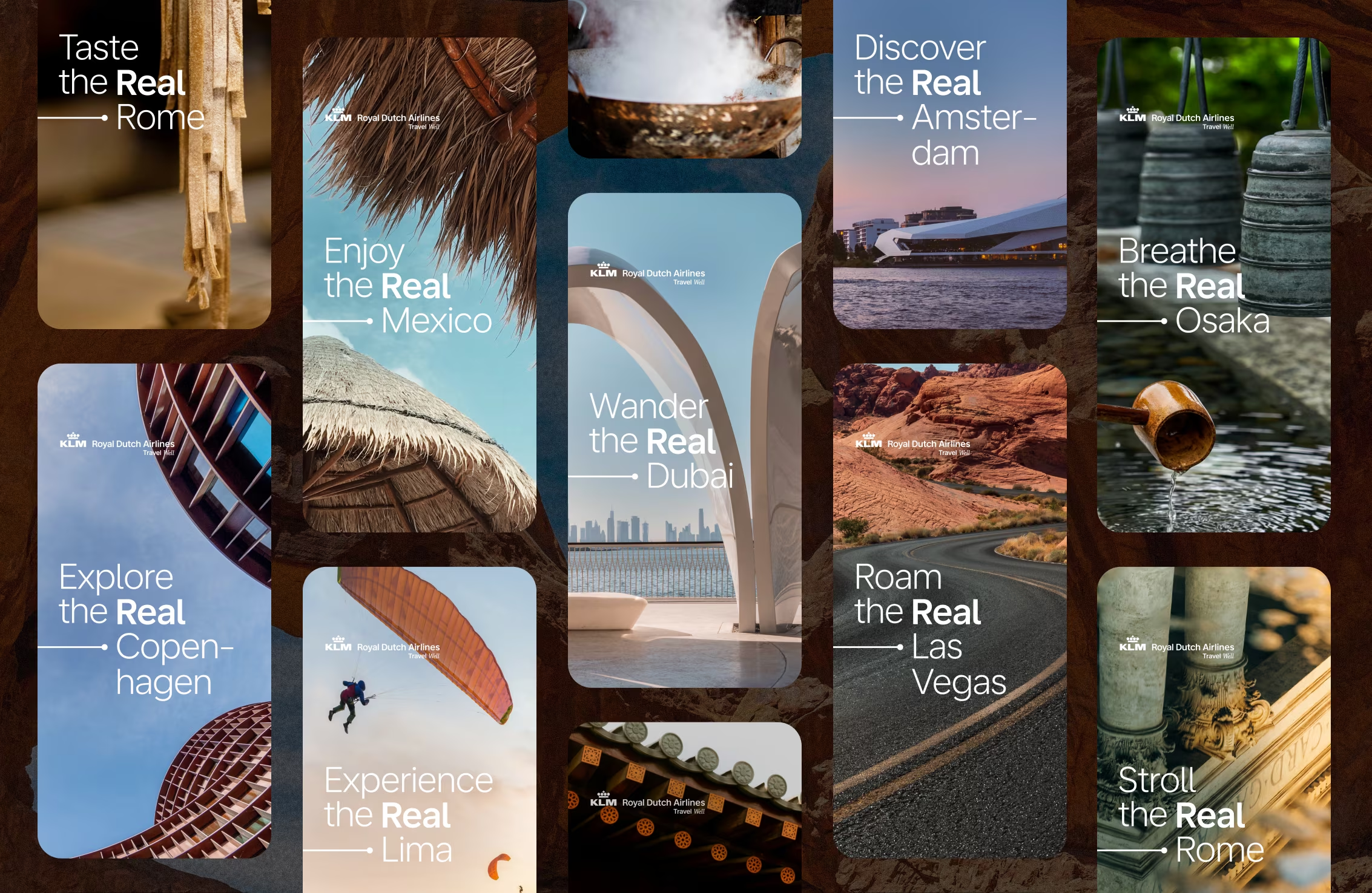
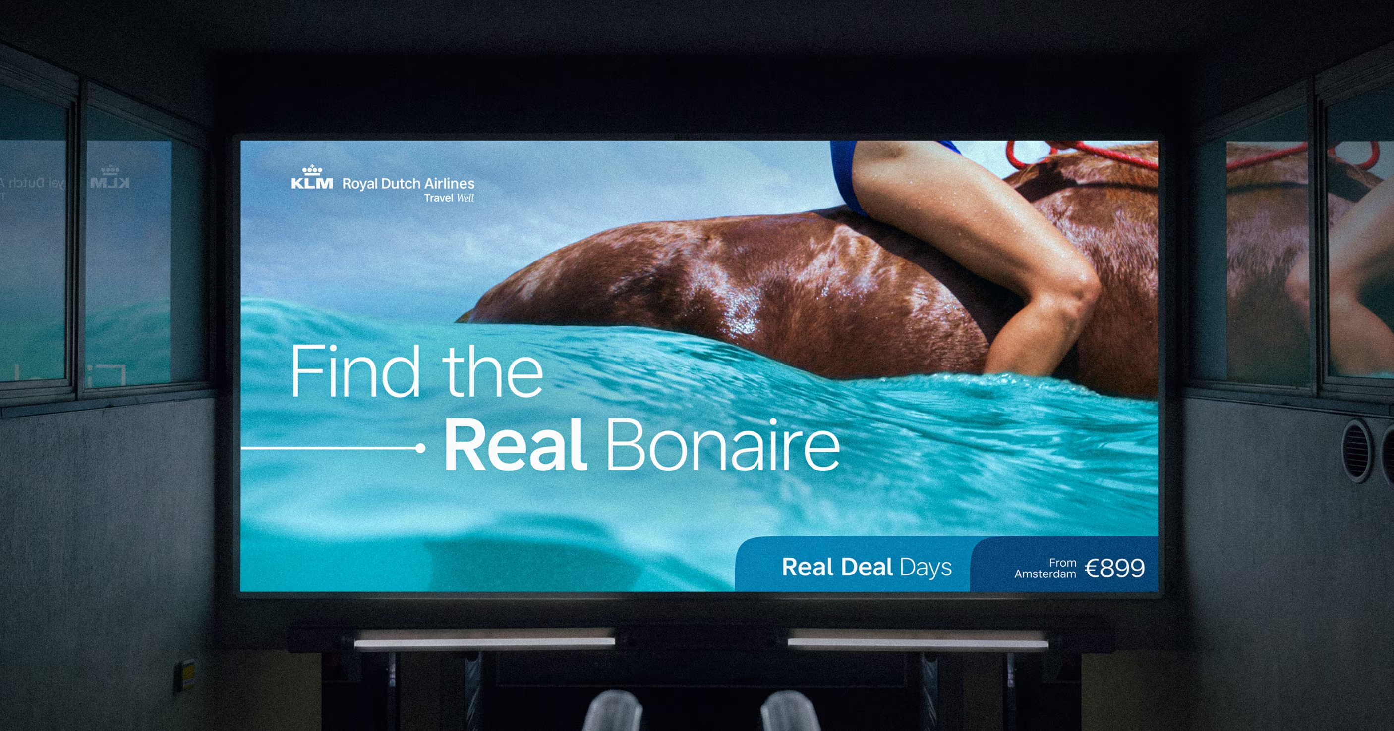
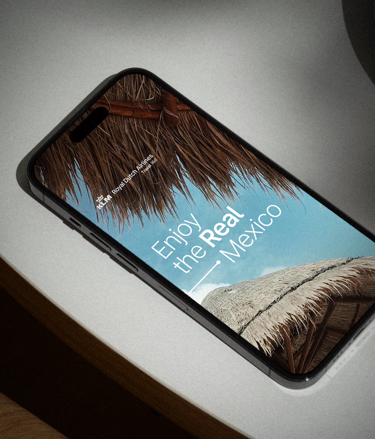
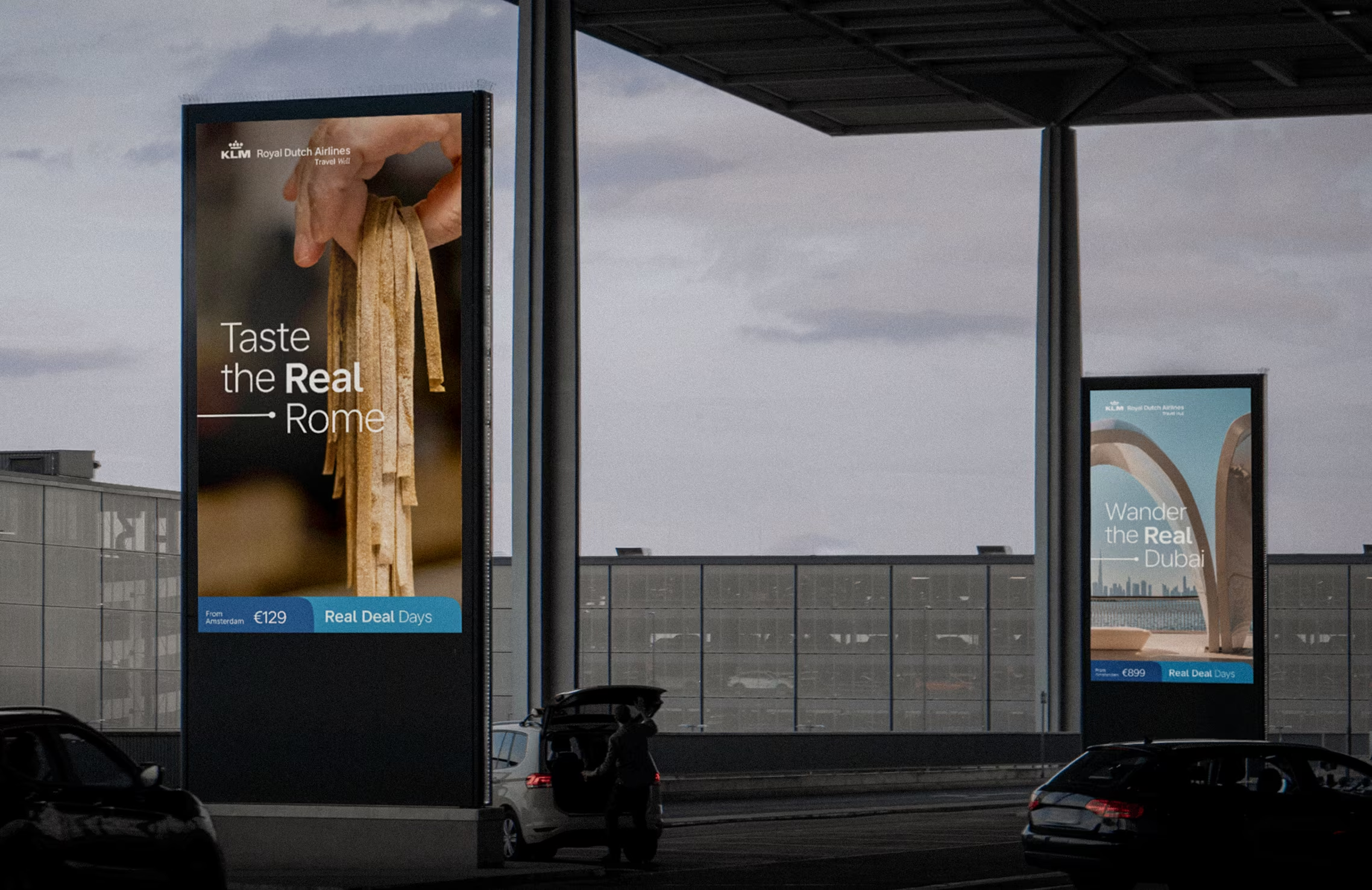
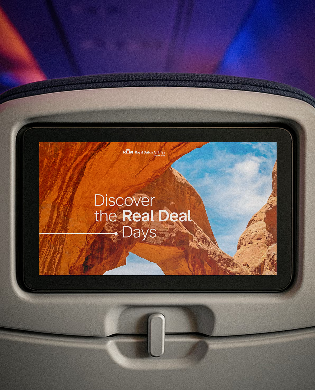
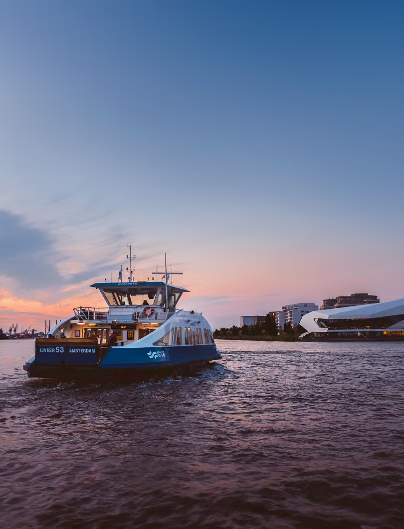
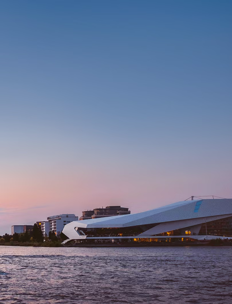
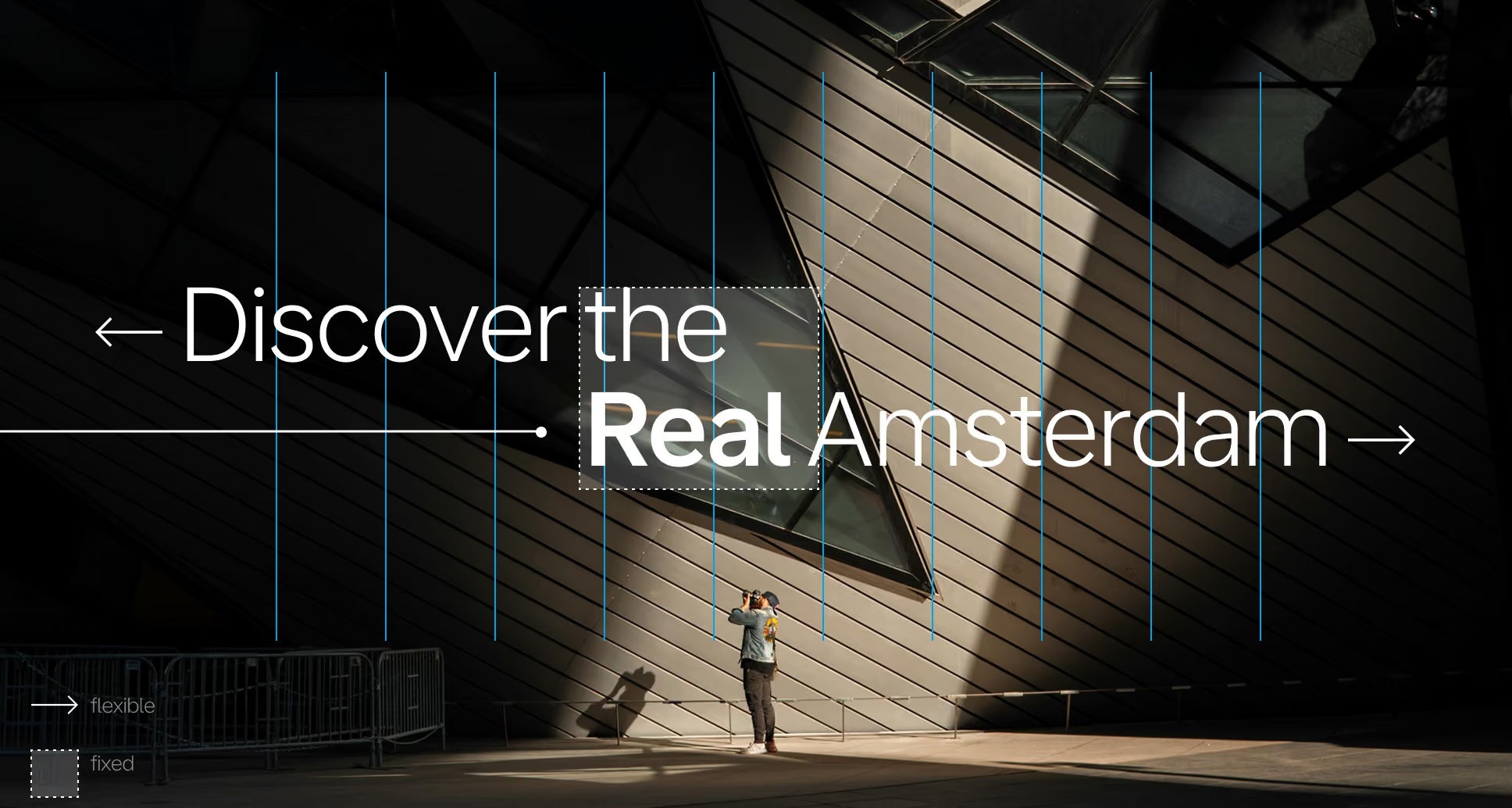
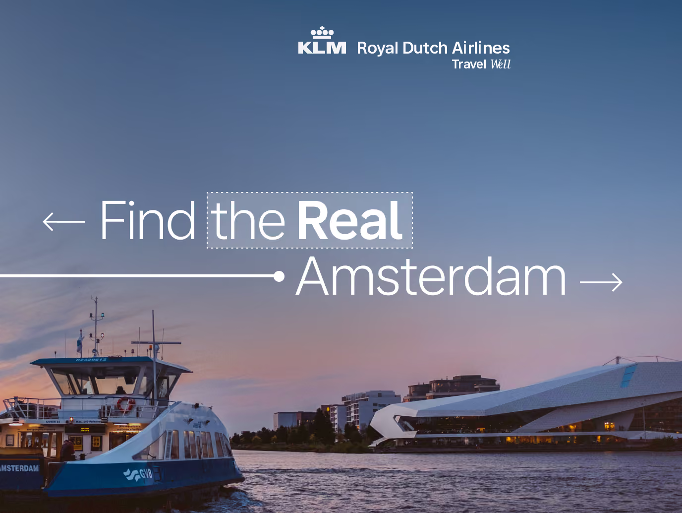
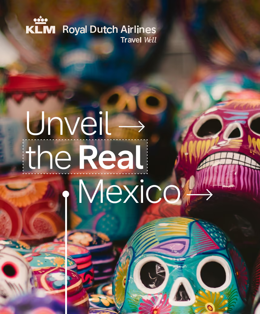
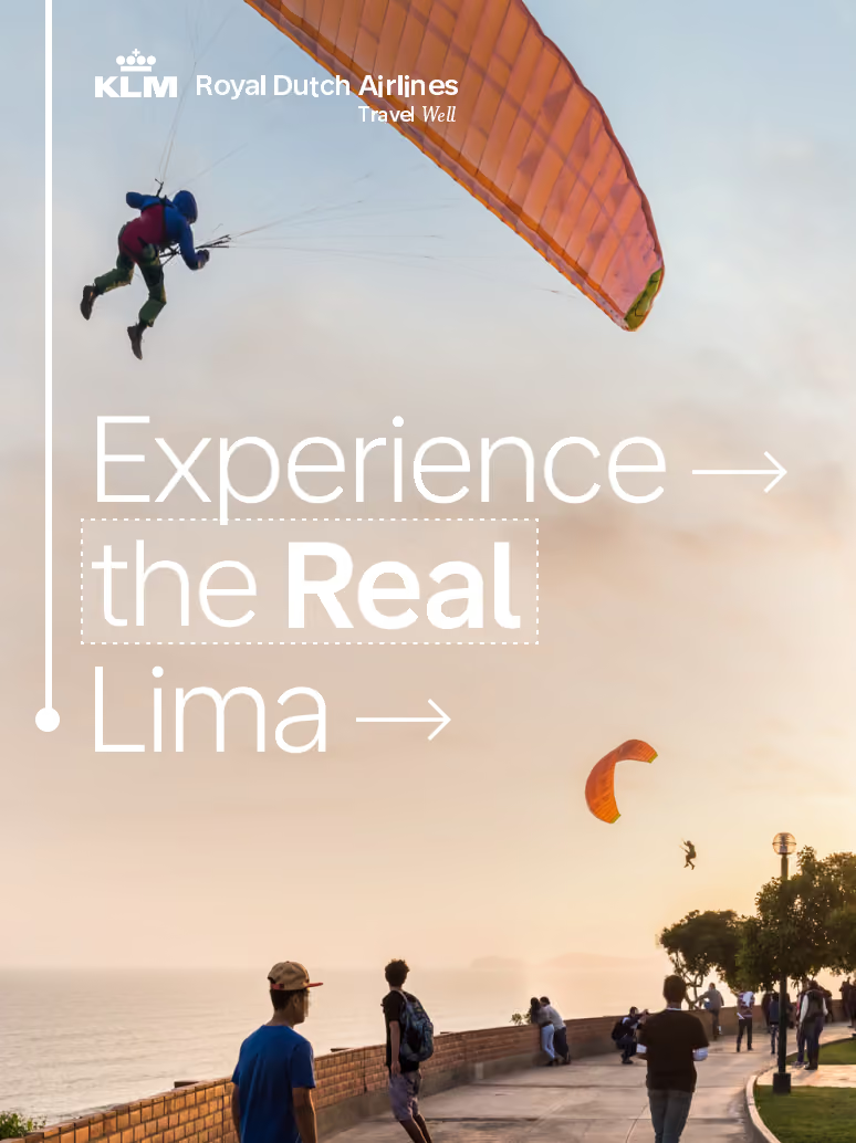
KLM needed to connect their Travel Well proposition with their annual Real Deal Days campaign. We took the established campaign and turned it into a simple, repeatable idea: Discover the Real [Destination]. Forget the tourist traps and explore destinations in a deeper, more authentic way. The food, the hidden corners and the moments that make a place worth the trip. Automated execution dropped a different destination into the design system, scaling from Rome to Kyoto without ever losing its distinct look.
My role
ART DIRECTION
CAMPAIGN DESIGN
COLOUR GRADING
IMAGE CURATION
DESIGN SYSTEM
unconventional cropping
Worth a
second
look.
The idea only works if the images feel like the message. So the direction pushed away from the safe, centred travel shot you have seen a thousand times. We selected for unexpected crops, off angles and tension left in the frame, compositions that make you look twice instead of scanning past. It does two things at once: it creates the visual interest that pulls attention in a busy media landscape, and it enforces the whole "off the beaten path" premise.
A system that holds
Flexible
enough to
stay tight.
The challenge underneath the campaign was structural. A different destination, image and message in every execution usually turns a campaign into visual chaos. So we built a design system loose enough to swallow all that changing content while being strict enough to keep it sharp: a fixed typographic treatment, a consistent way of setting "the Real [Destination]," and a grid that let bold imagery and shifting copy sit in the same tight, recognisable layout every time. Dynamic content in, coherent brand out.
Credits
Creative
TIMO WILBRINK
michael kouwenhoven
Graphic design
Zeferino De Fretes
Motion Design
Jesse Otten
ART DIRECTION
CAMPAIGN DESIGN
DESIGN SYSTEM
IMAGE CURATION
SCROLL right TO EXPLORE
↓
BRAND MOVIE
2025
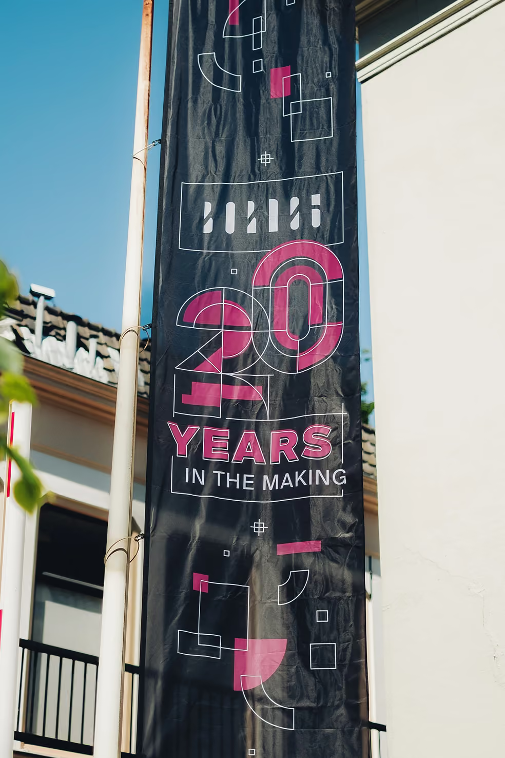
20 Years in the Making.
born05
A BRAND MOVIE honouring
20 years of craftsmanship
twenty years of Born05
An ode to
making.
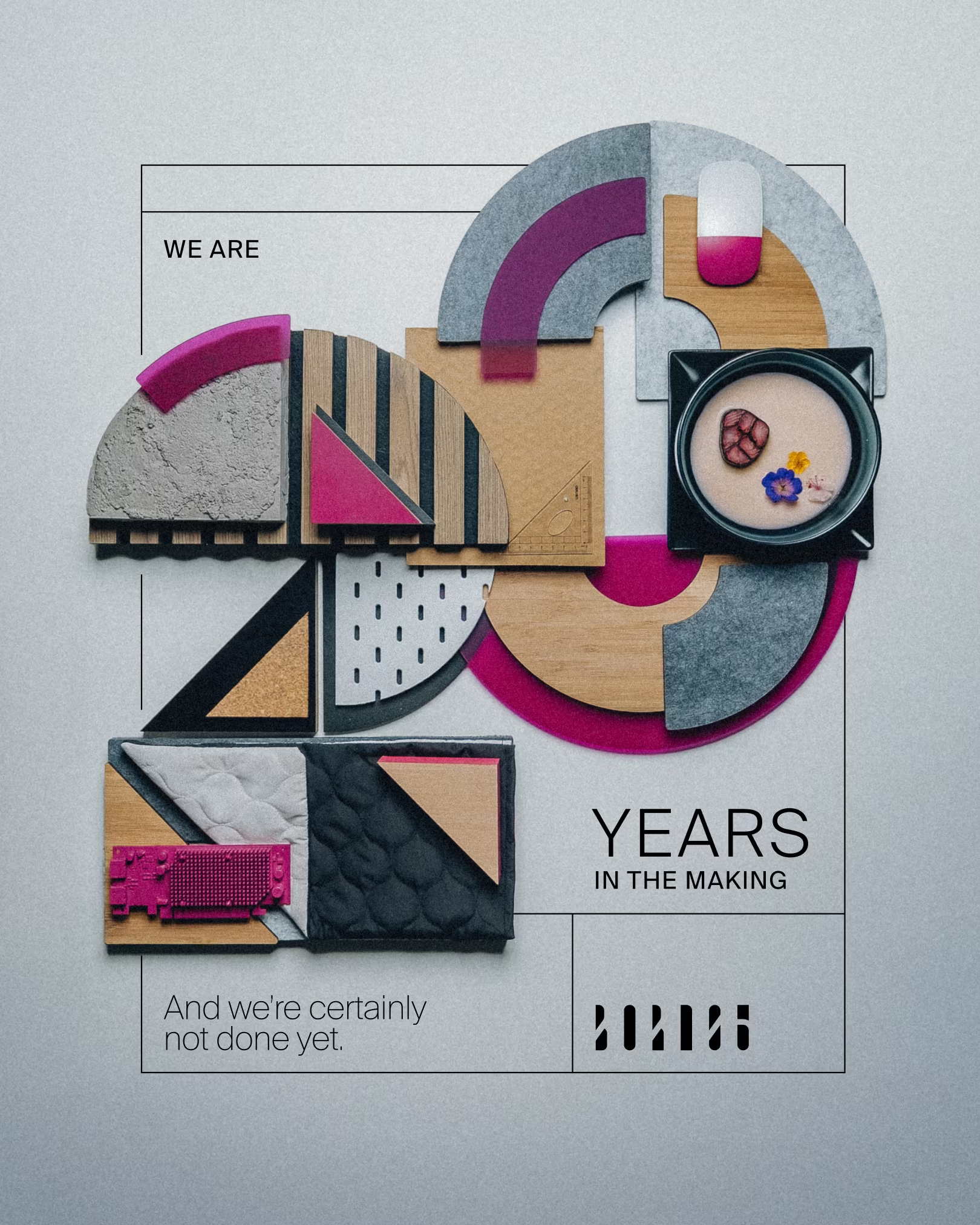
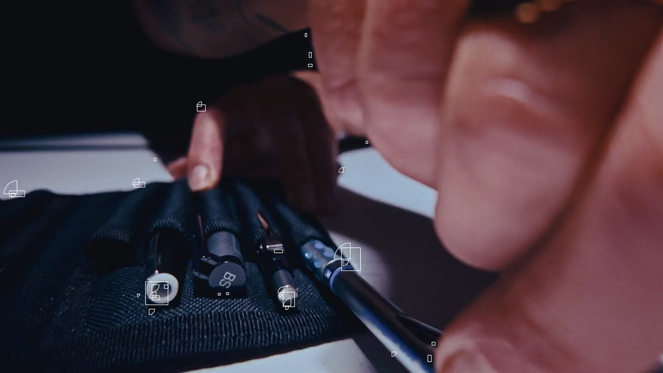
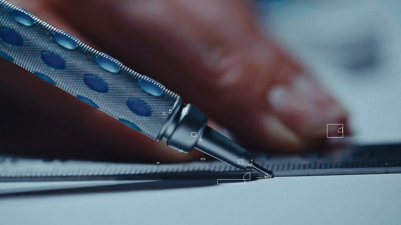
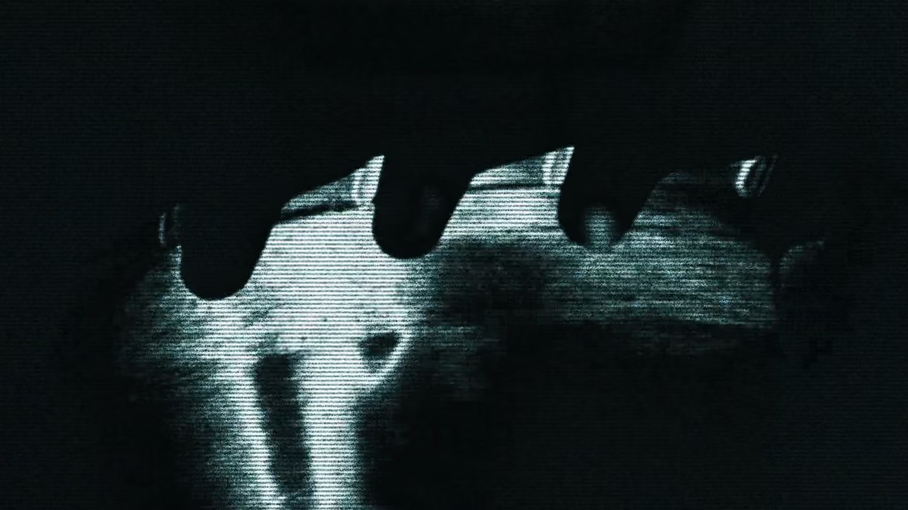
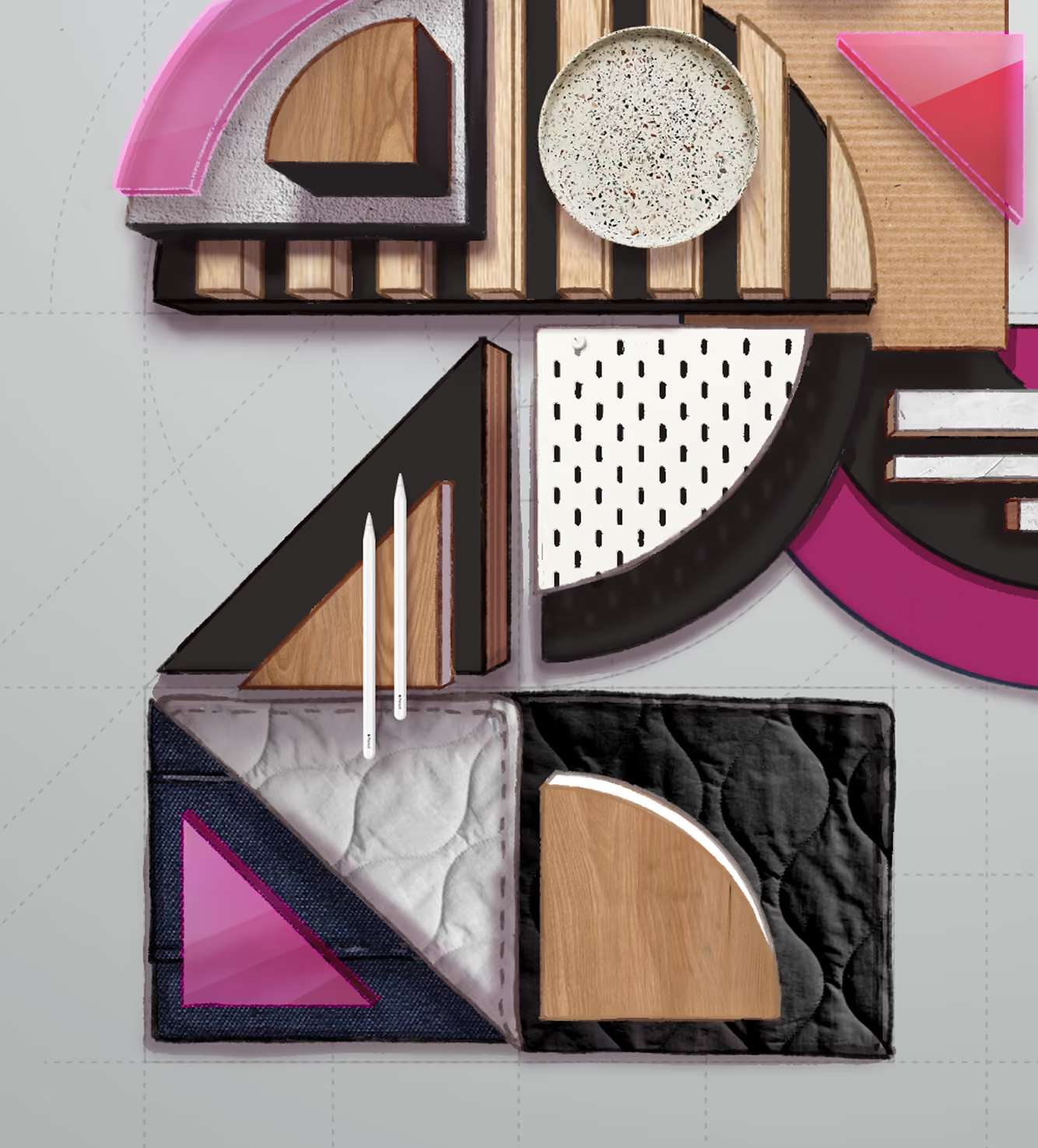
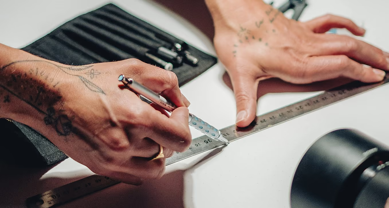
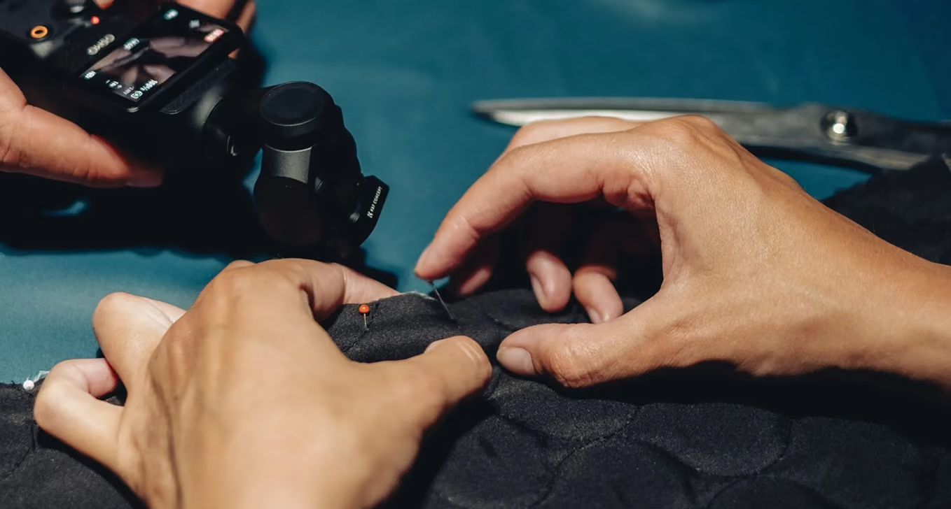
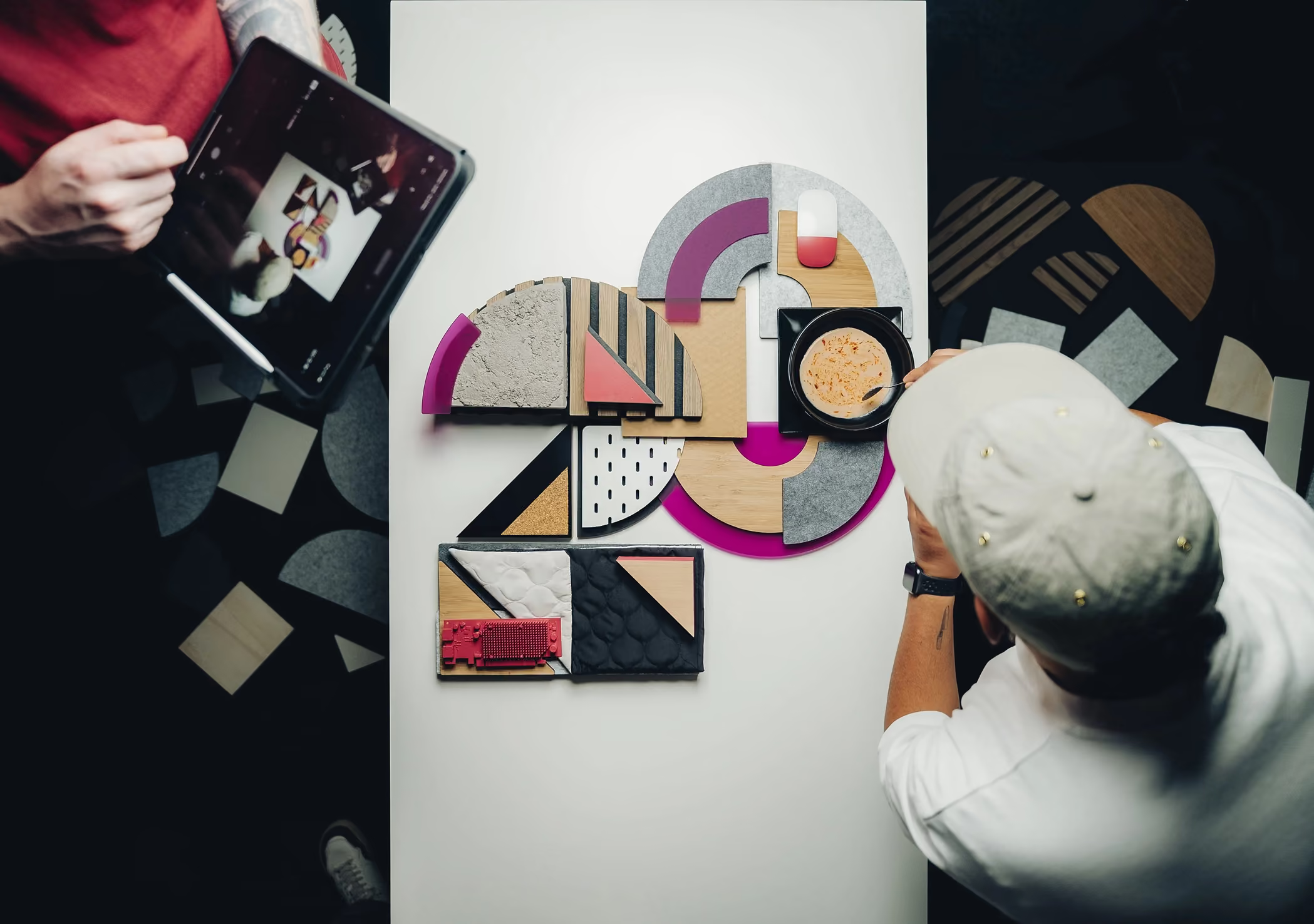
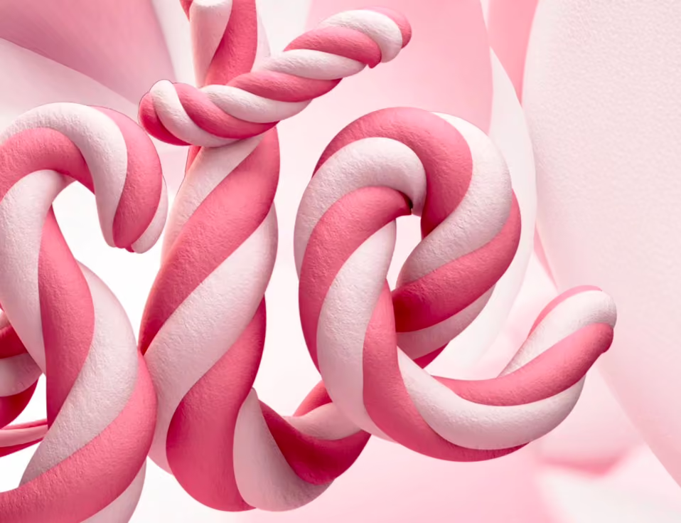
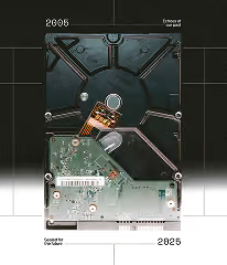
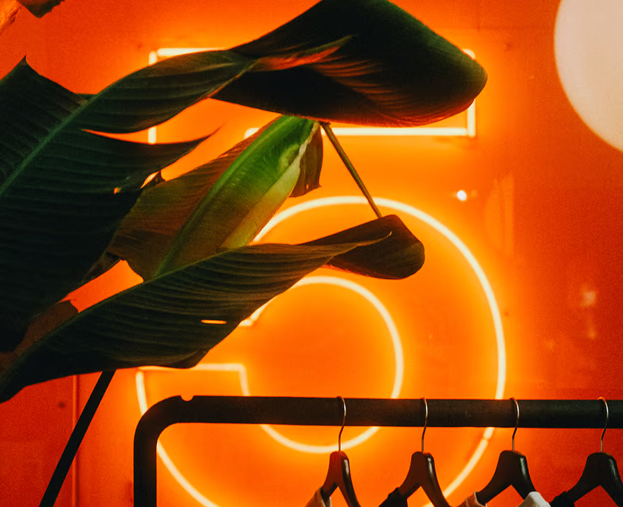
Twenty years is easy to mark with a logo and a line. We made an object instead. The anniversary number was built by hand, piece by piece, in real material and real texture, then lit and shot as the hero of the film. Two decades of making, made again.
My role
ART DIRECTION
CONCEPT VISUALISATION
PHOTOGRAPHY
COLOUR GRADING
music composition
AUDIO PRODUCTION
TouchDesigner
Glyphs
pulsing to
the beat
The identity’s core shapes became the building blocks. We wanted to drive the motion of these shapes with a strong pulse. To retain optimal control I scored the track myself, so we could decide what signal got fed into TouchDesigner. This way the system reacts in real time and every movement lands straight on the beat.
Credits
Creative
Timo Wilbrink
Michael kouwenhoven
CAMERA
FREDERIK POT
Production
Jesse Otten
Motion graphics
Lennard Nijenhuis
CONCEPT
ART DIRECTION
COLOUR GRADING
music & audio production
SCROLL right TO EXPLORE
↓
SELECTED WORKS
VOLUME III
“Captivating images
should raise more
questions than they
answer.”
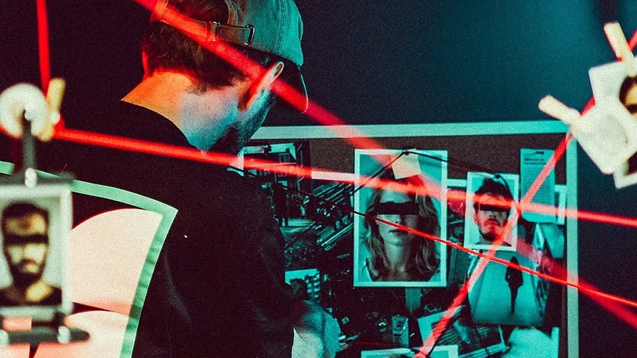
If it’s easy to digest, it’s easy to dismiss. A clean read slides past and is gone. So I build visuals that make people stop. Frames that provoke before they explain. Images that ask a question instead of answering it. Stopping power isn’t only about grabbing attention, it’s about making attention hold. What makes you pause is worth more than what you take in at a glance, and that pause is where the image starts to resonate.
Currently at
ace agency
Located in
Amsterdam area
20+ years of
Agency experience
CUSTOMER LOYALTY
2024
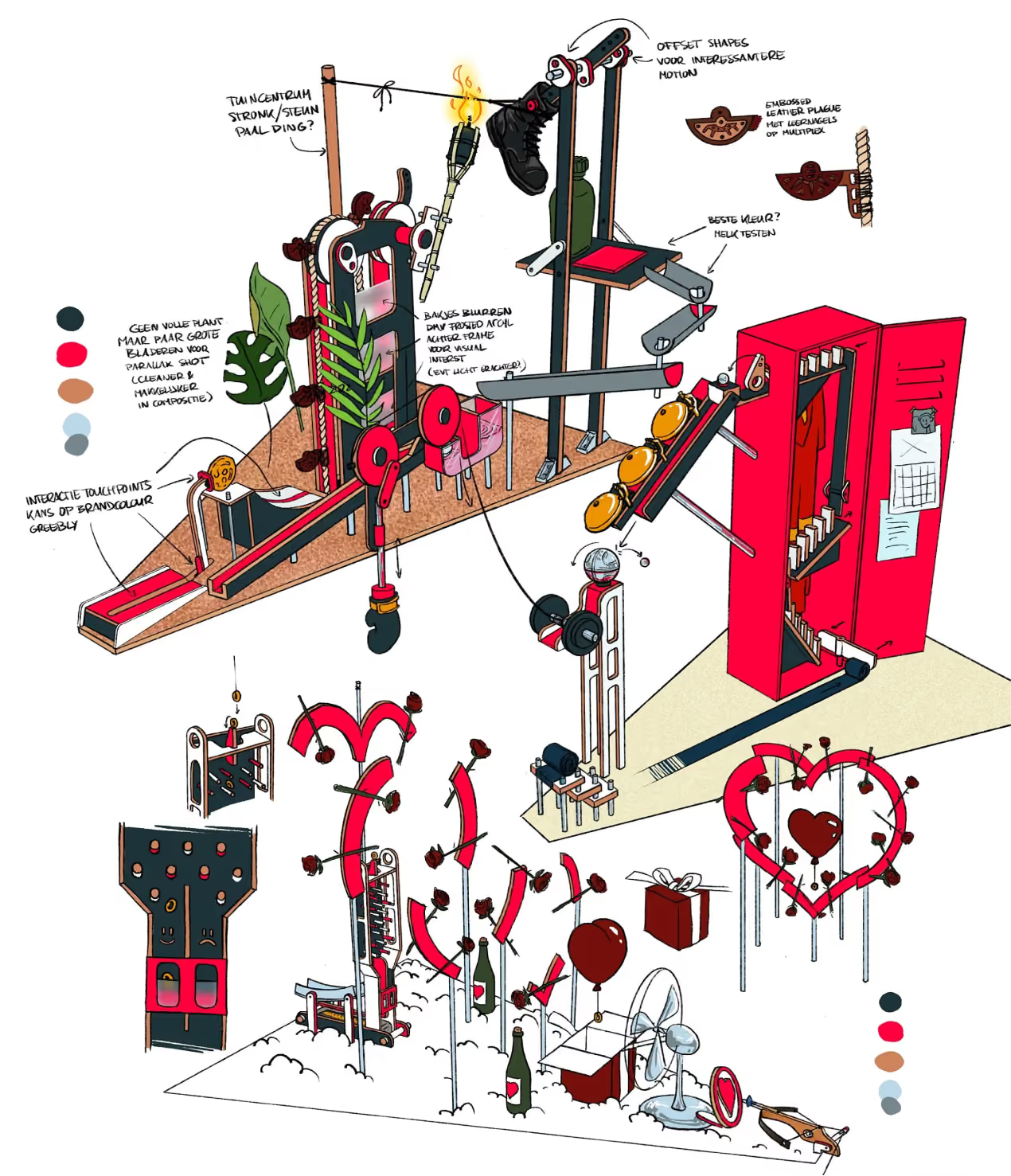
Videoland Rube Goldberg machine.
Videoland Rube Goldberg.
Videoland
CELEBRATING YOUR
BIRTHDAY THE HARD WAY
Why a Rube Goldberg machine
Put in some
extra effort.
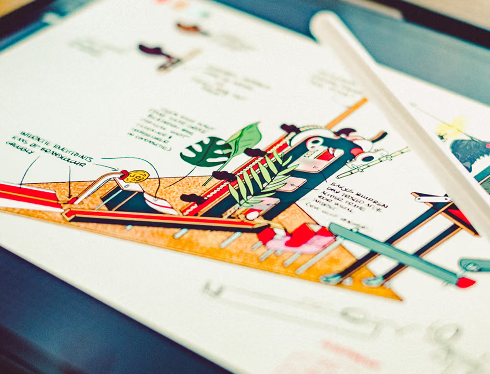
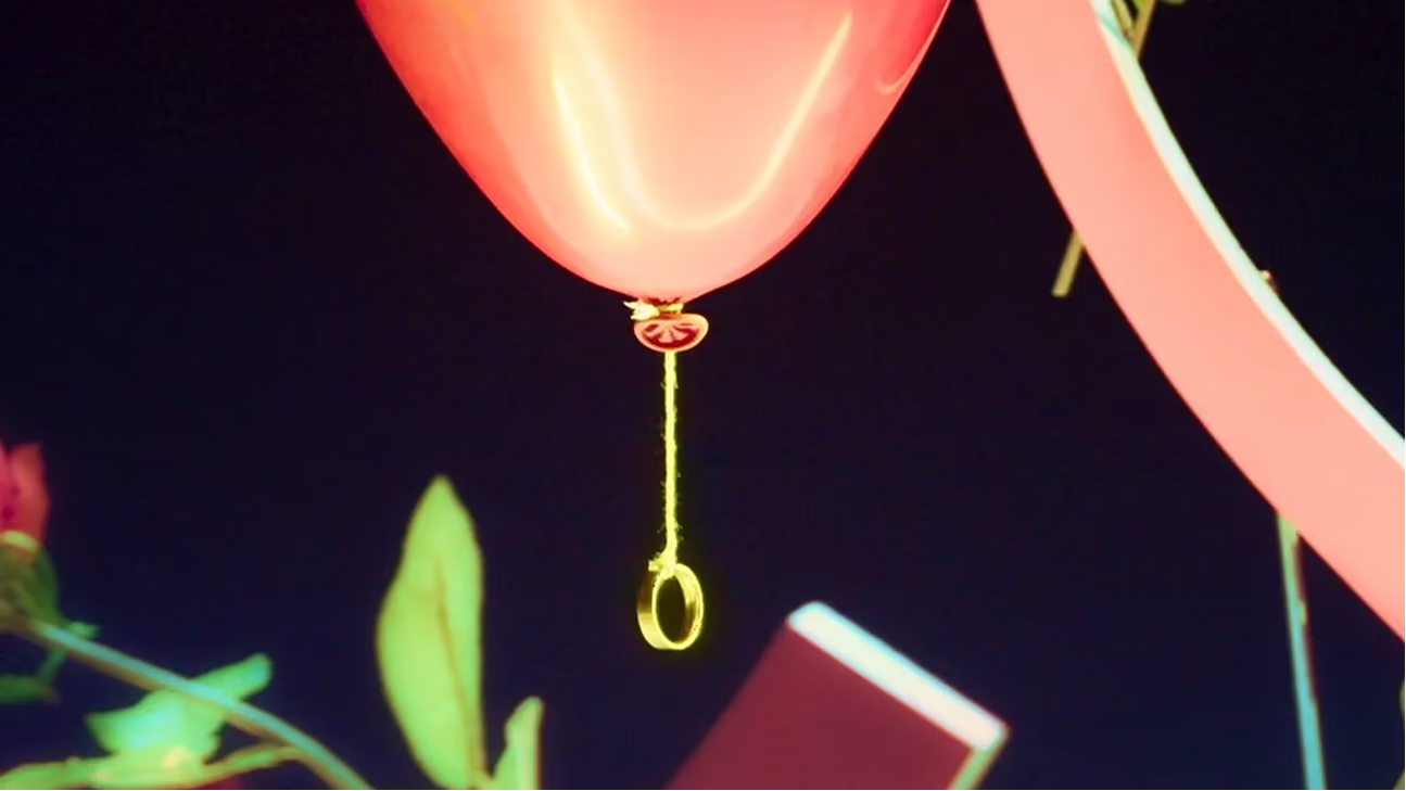
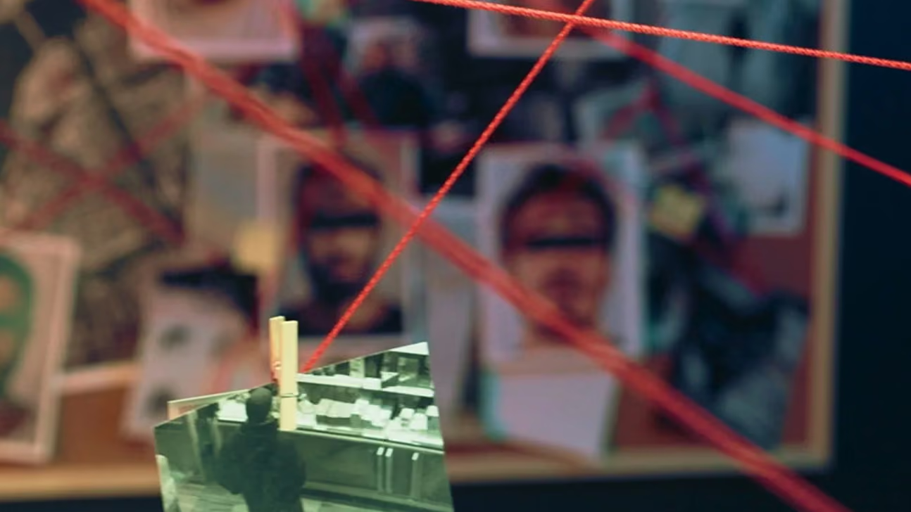
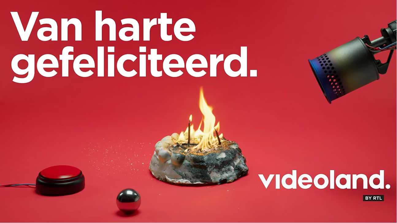
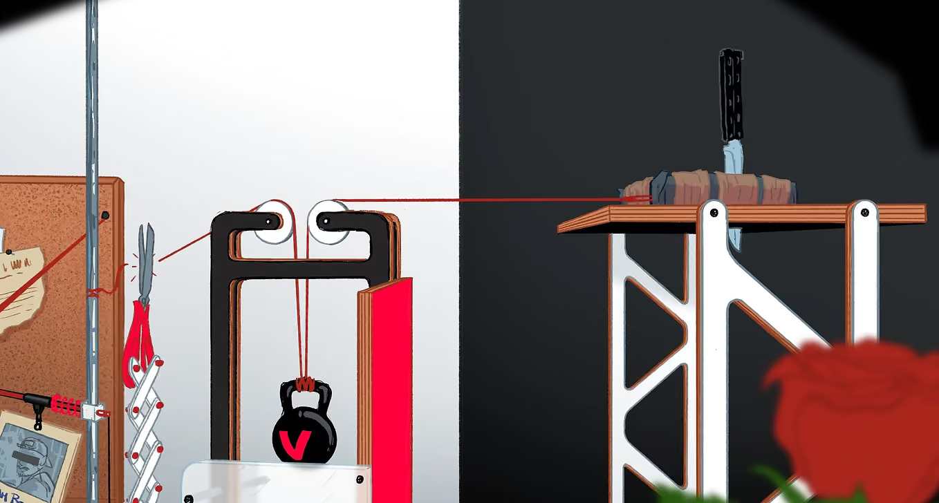
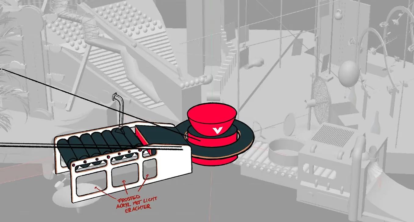
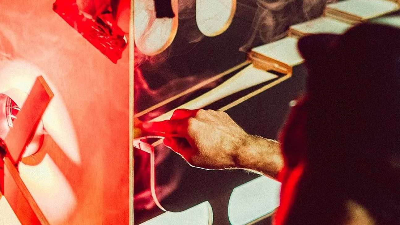
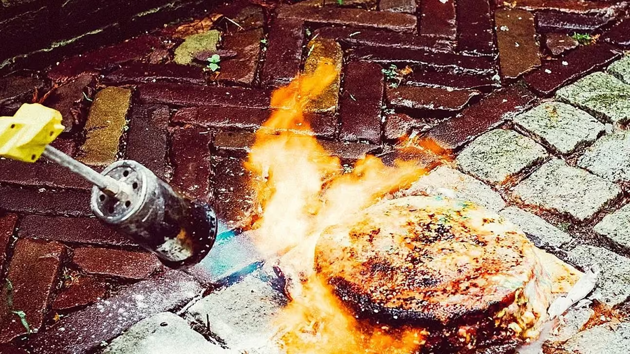
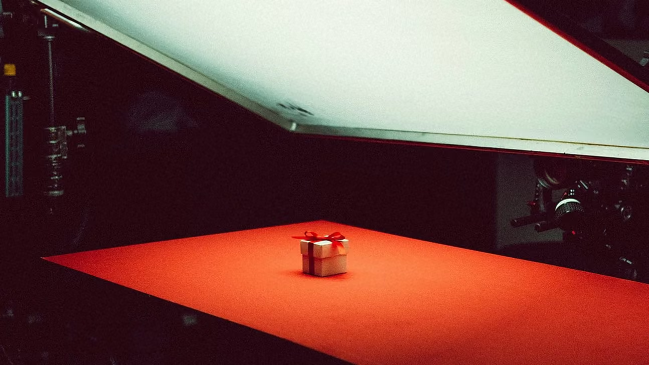
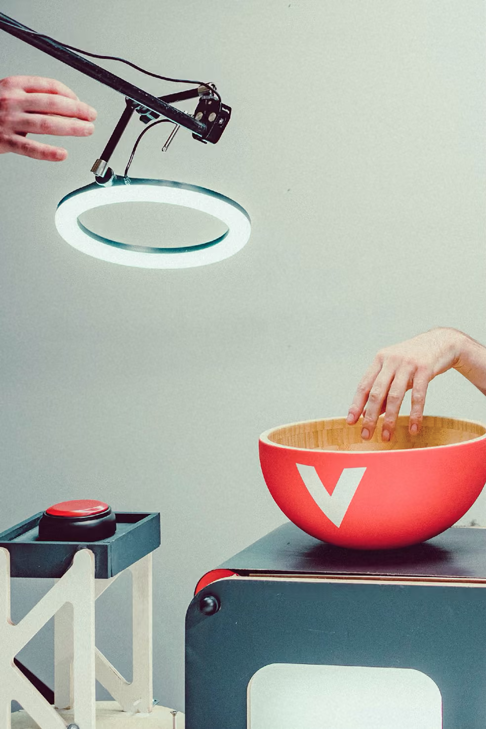
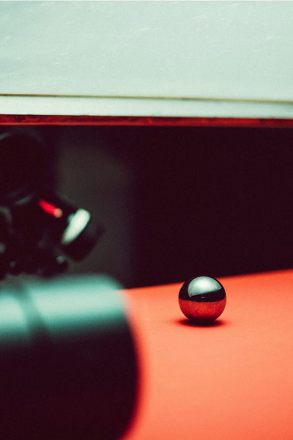
Instead of another automated happy-birthday CRM blast, we asked the opposite question: what if celebrating your birthday actually took some effort? That premise led us straight to a Rube Goldberg machine, an absurdly complicated contraption built to do one simple thing. In this case, bake a cake. The overkill was the point, and it turned a deletable email moment into something worth watching.
My role
ART DIRECTION
CONCEPT VISUALISATION
COLOUR GRADING
PHYSICS CONCEPTS
BUILD SKETCH-UPS
Built by hand
Actually
building the
thing.
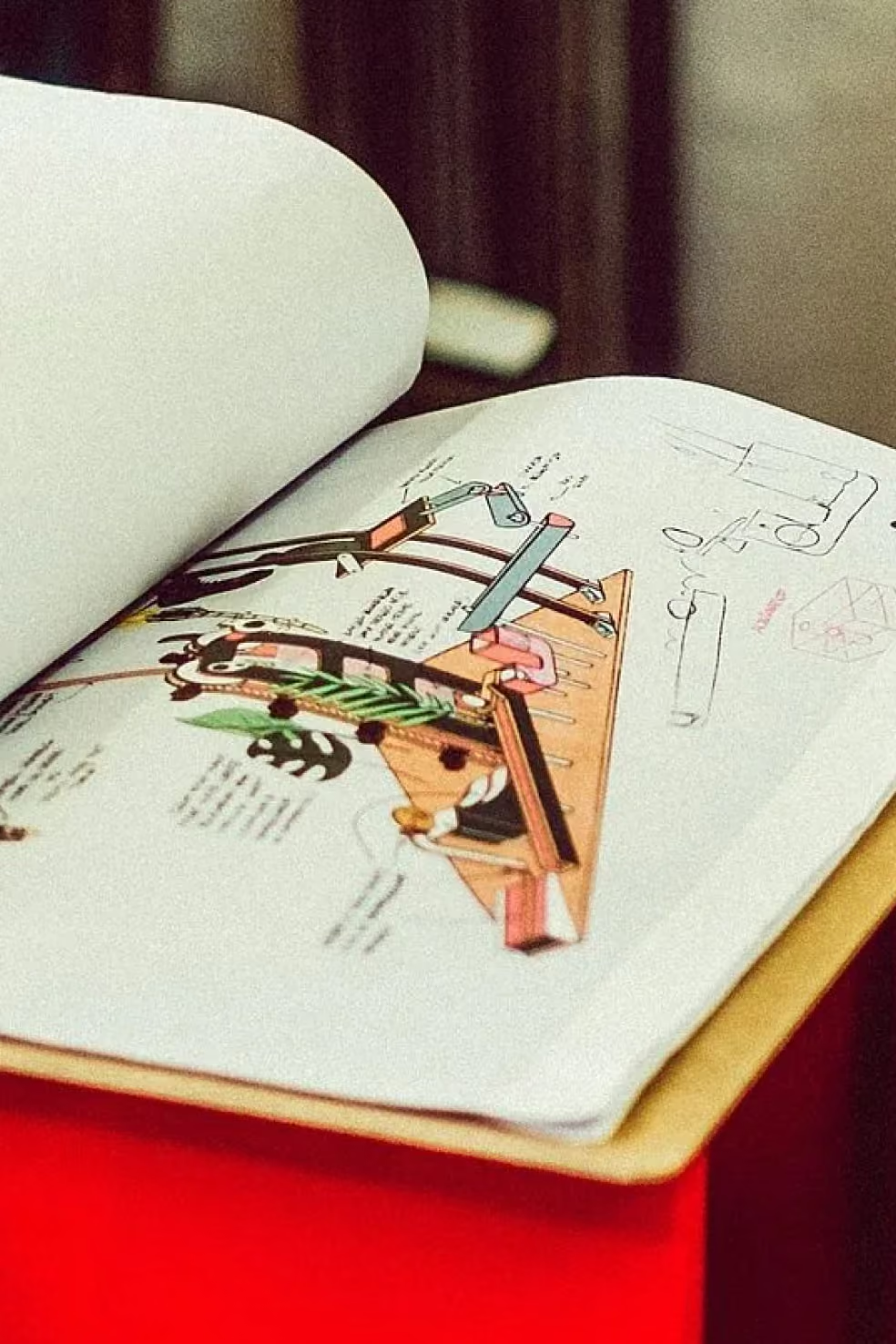
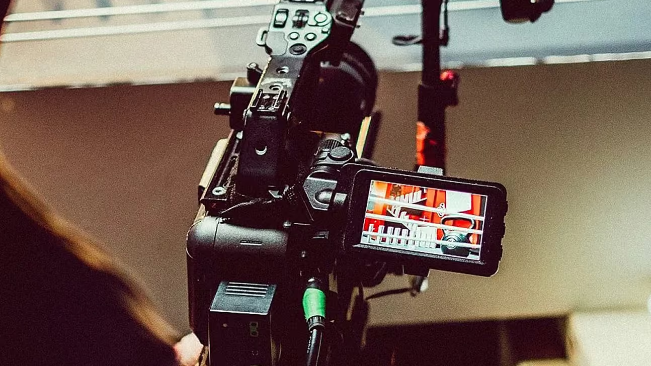
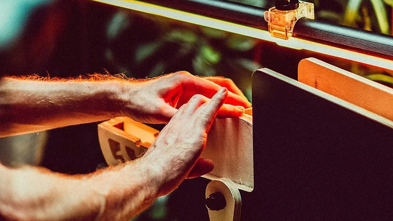
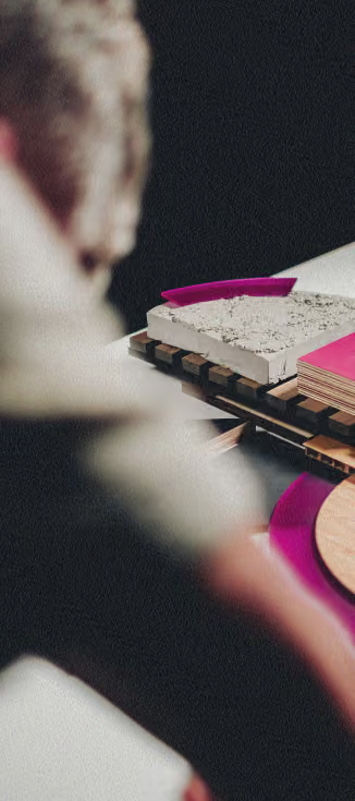
We sketched, designed and constructed the entire machine from scratch, then ran it for real. Every ramp, lever and trigger had to physically work, take after take, until all the pieces of the puzzle fell together. Props and set pieces pulled from Videoland's own productions were woven into the sequence, so the machine doubled as a nod to the platform it was celebrating.
This project was true co-creation. Alongside That's Rad Studio, we sketched, built, shot and ran the whole machine together, one crew shaping every shot, light and mechanism side by side. Together bringing to life an idea that only worked if it actually physically worked.
Credits
Creative
TIMO WILBRINK
Fabrication & Production
That’s Rad Studio
Editing
Jesse Otten
Sound Design
Renger Koning
ART DIRECTION
COLOUR GRADING
BUILD SKETCH-UPS
PHYSICS design concepts
SCROLL right TO EXPLORE
↓
BRAND DESIGN
2024
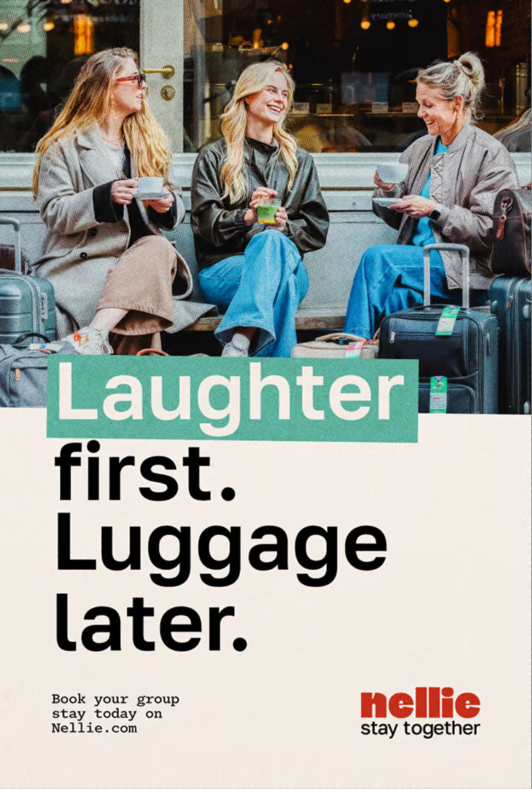
Nellie Group Hotels
NELLIE HOTELS
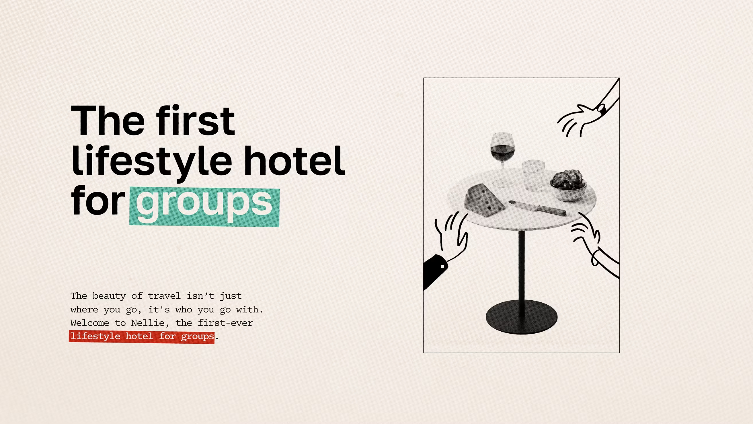
Branding the first
lifestyle hotel for groups
The first of its kind
Built for staying
together.
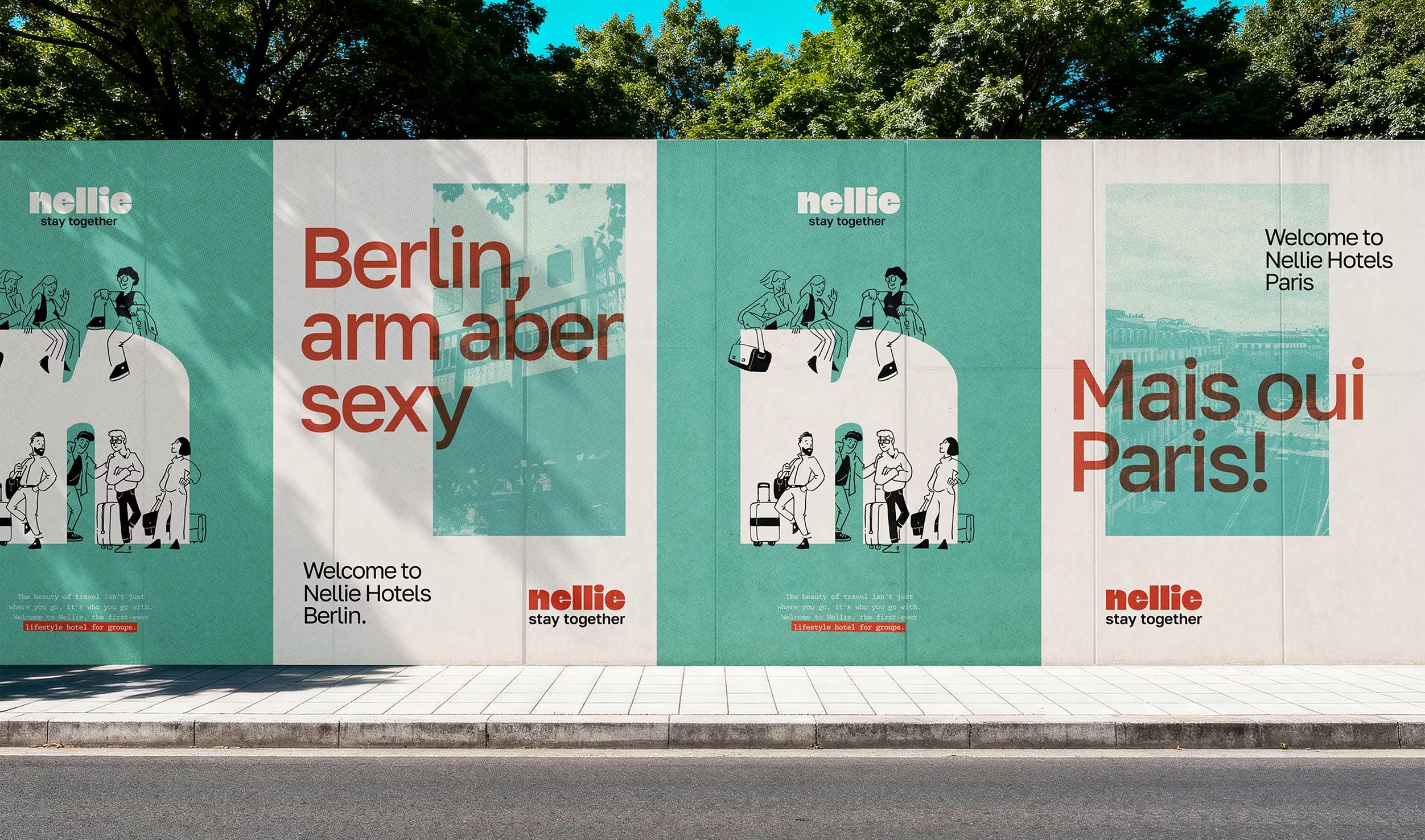
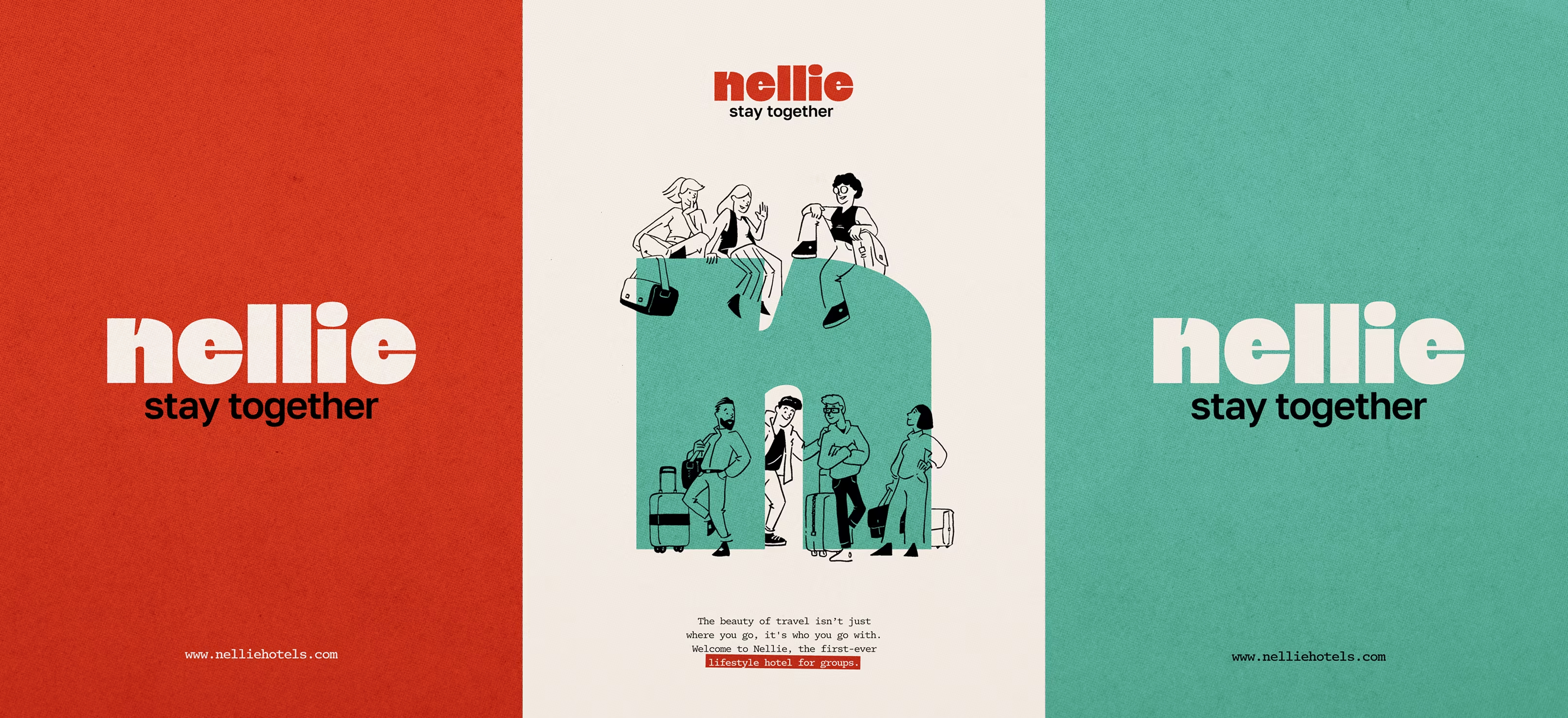
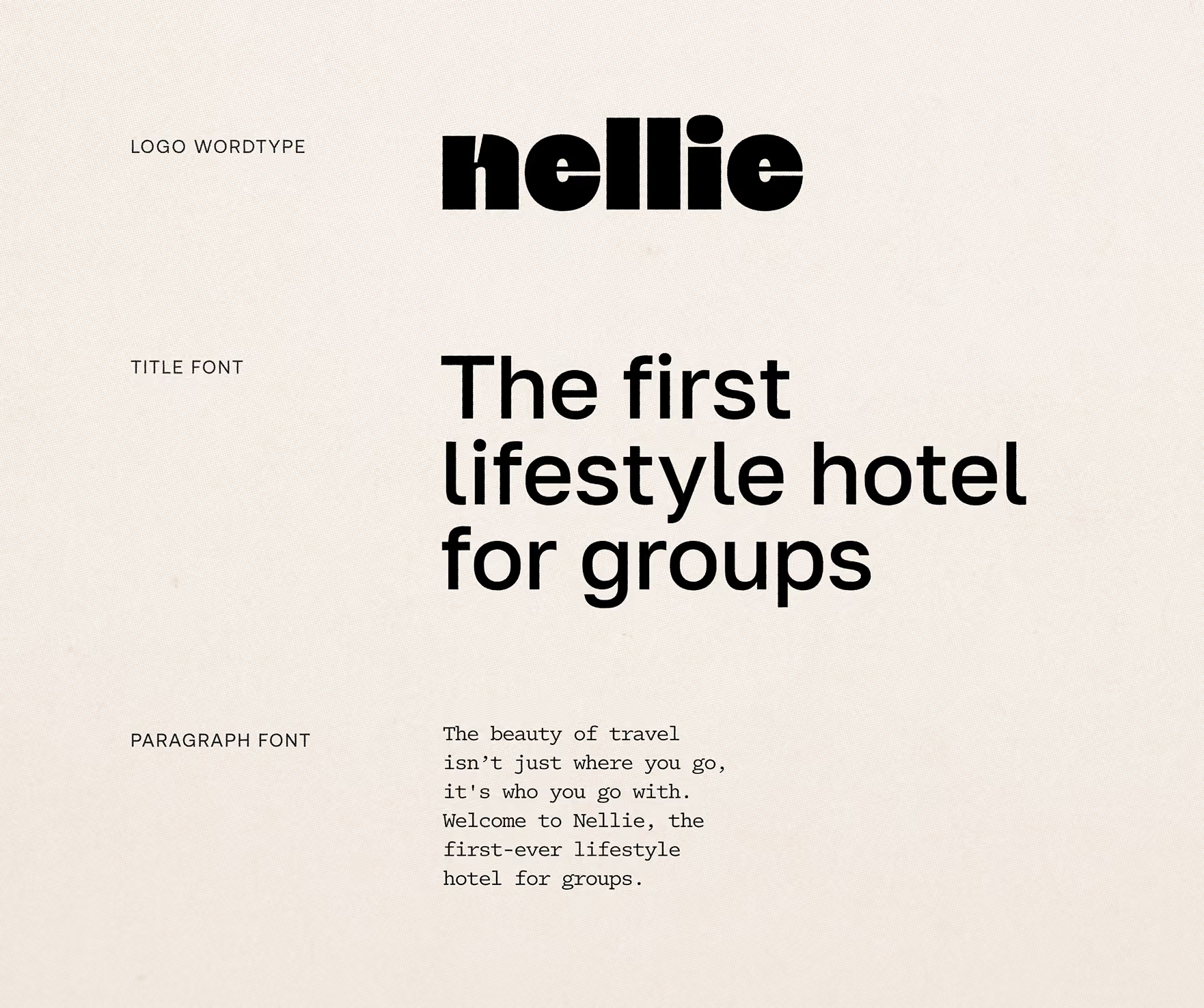
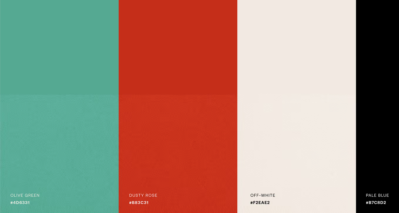
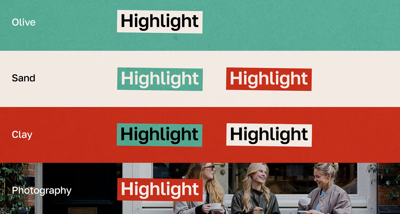
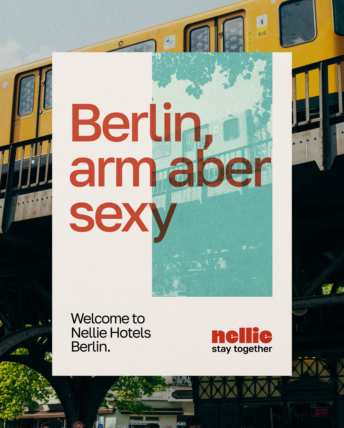
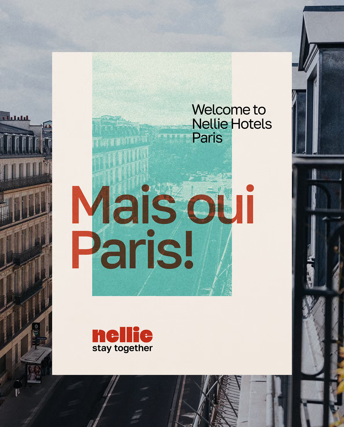
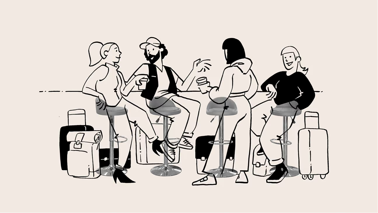
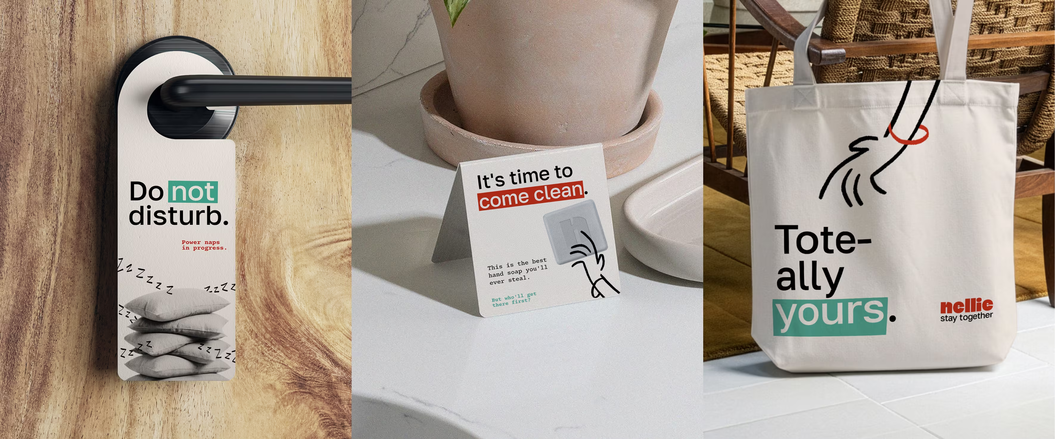
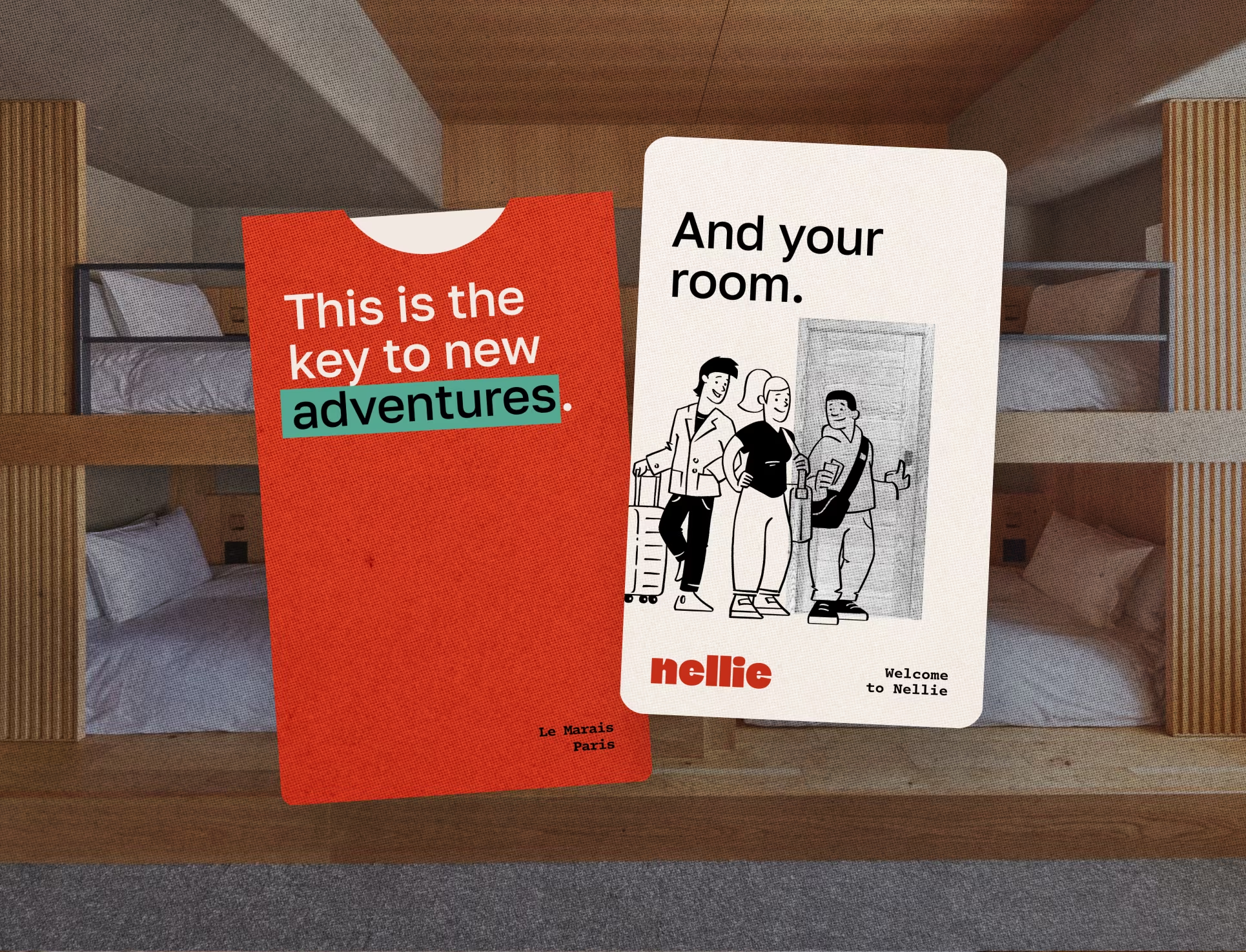
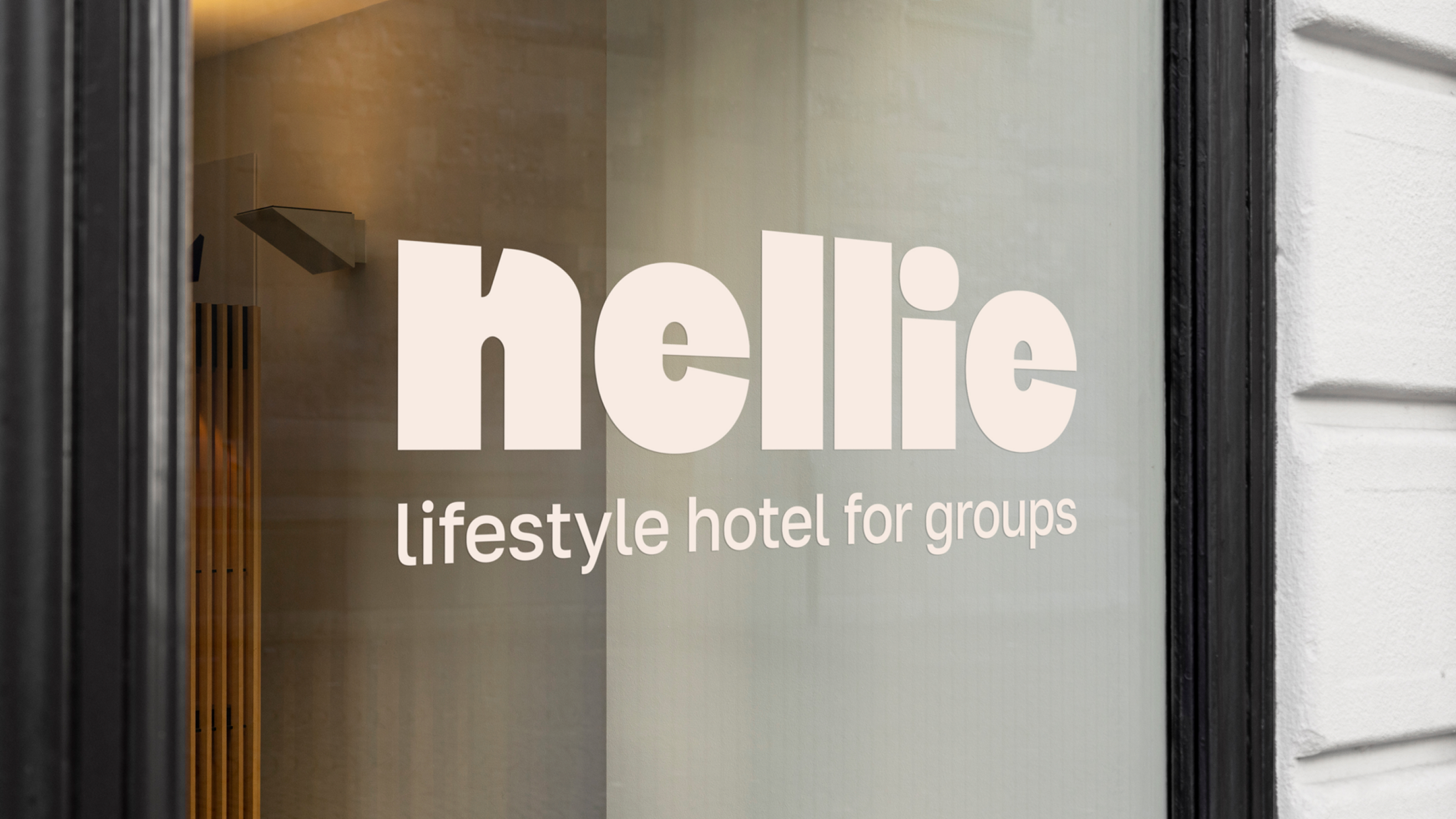
Nellie is the first lifestyle hotel built entirely around groups. Friends in town for a concert or a marathon, colleagues at a fair, families making a few days of it. The identity had to make that feel easy and elevated at once, affordable without looking it. We built a refined system rooted in Scandinavian simplicity, calm and uncluttered at its core. One brand, from the logo and lockups down to the smallest descriptor.
My role
ART DIRECTION
brand identity
Illustrations
graphic design
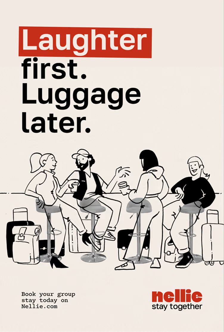
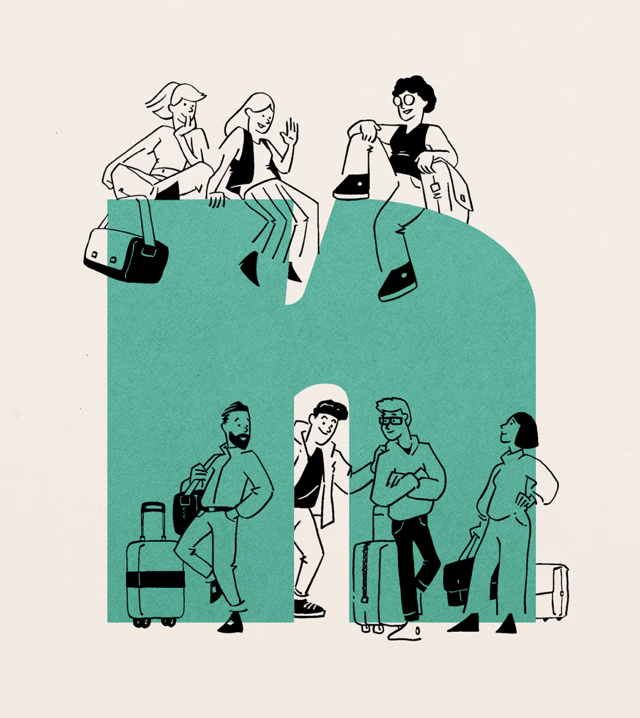
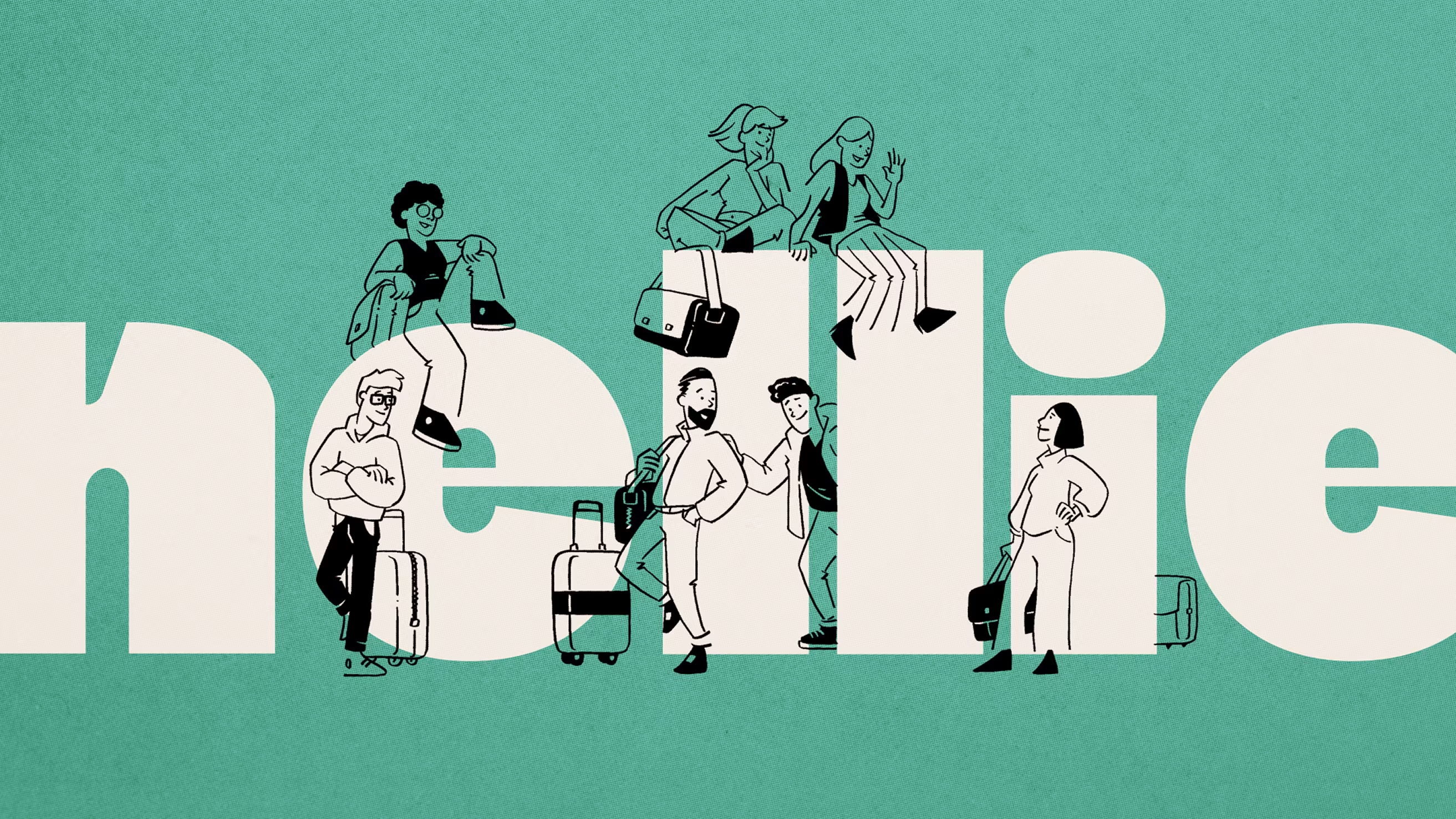
The personality layer
Characters you
recognise.
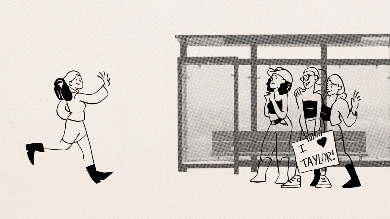
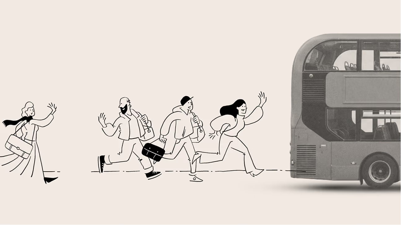
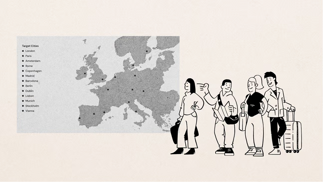
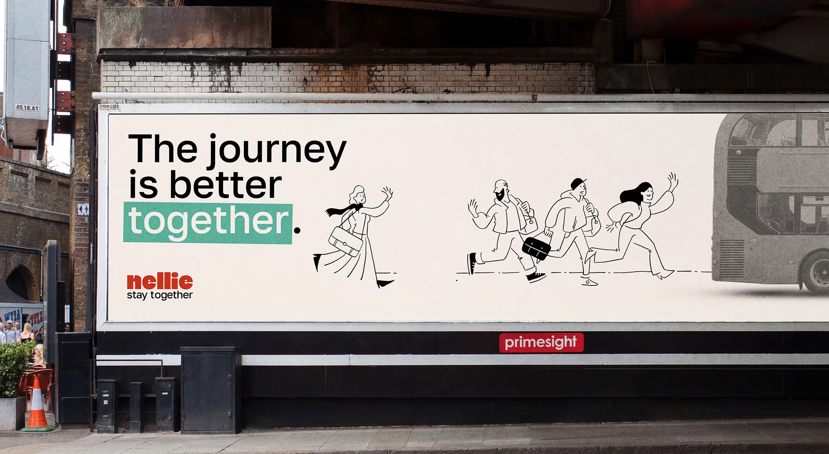
A refined system can read as distant, and Nellie needed a face. Enter a hand-drawn cast of characters, recognisable and easy to relate to, carrying a personality the logo and the grid can’t hold on their own. They also set the register without having to say it. Group travel comes with an obvious cliché, and characters like these keep Nellie about real people travelling together: friends, families, colleagues.
Credits
Creative
TIMO WILBRINK
sr graphic design
caryn oberholzer
Creative copywriter
Simon Harrington
ART DIRECTION
brand identity
Illustrations
graphic design
SCROLL right TO EXPLORE
↓
Expertise
Art Direction
Visual Design
Brand Identity
Illustration
Campaign Design
Photo- &

videography
Experience Design
Concept Visualisation
Physical Design
Pitch Decks
Collaborations
ASICS
Samsung
ABN Amro
Lamborghini
KLM Royal

Dutch Airlines
ASN Bank
RTL | Videoland
Segway
Bentley
Philips
Expertise
Art Direction
Visual Design
Brand Identity
Illustration
Photo- &

videography
Campaign Design
Experience Design
Concept Visualisation
Physical Design
Pitch Decks
Collaborations
ASICS
Samsung
ABN Amro
Lamborghini
KLM Royal

Dutch Airlines
ASN Bank
RTL | Videoland
Segway
Bentley
Philips
Get in touch
Want to know more about my work,
my process or have an interesting project
where my skills could be of use?
‍
Feel free to reach out through email of LinkedIn.